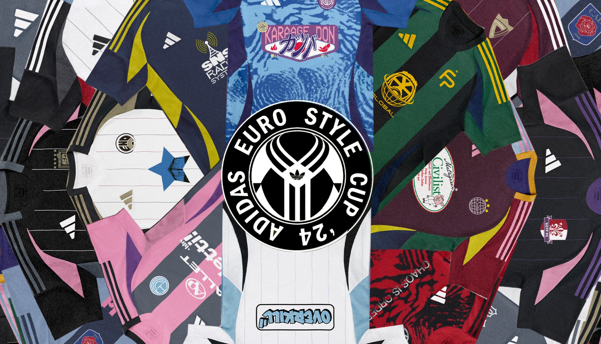
With a summer of international football on the horizon, adidas are set to turn the spotlight on a different source of creativity, inviting 16 of the most culturally connected and relevant retailers from across Germany and the rest of Europe to compete in the ‘Euro Style Cup ’24’.
The majority of football fandom will have its eyes firmly fixed on either Euro ’24 or Copa America this summer (or both if you’re organised enough to balance all those fixtures!), but ahead of the big kick off in both Germany and the States respectively, adidas have created a nice little opening act to whet the appetite in the form of the ‘Euro Style Cup ’24’: a battle between 16 of the most culturally connected and relevant fashion and streetwear retailers from across Germany and the rest of Europe, who will battle it out through two rounds of football jersey design challenges with the public ultimately deciding who the winner is.
The humble football shirt is arguably the ultimate spirit of creativity in the game, representing identity and self-expression. It connects fans beyond the football pitch, in recent years finding new cultural meaning through its increasingly organic links to the music and streetwear scenes. Shirt or jersey – whatever you want to call it, it is the ultimate canvas for creativity in a modern footballing context – all shirts start as the same blank canvas, and yet they all end up telling their own visual story about the culture and values of the community they represent. And it's this ethos that's behind the adidas Euro Style Cup, with the invited partners bringing their creations to life in a way that will hopefully captivate fans worldwide and their collective imaginations.
And so 16 accounts (eight home ‘teams’ from Germany and eight ‘away’ teams from the rest of Europe) prepare to do battle, initially over two rounds, with the public deciding their collective fates by voting through the adidas CONFIRMED app. Round one will see the two most voted for retailers from both the home and away categories advancing to a semi-final (round two), where the four will be whittled down to two – one victorious home shirt design, and one away. And the prize is that those two winning designs will be produced and made available for purchase on CONFIRMED and at the winning retailers, with the last two teams standing set to play out a ‘Final’ in Berlin, decked out in their kits. So, getting down to it, here’s the 16 entrants…
HOME
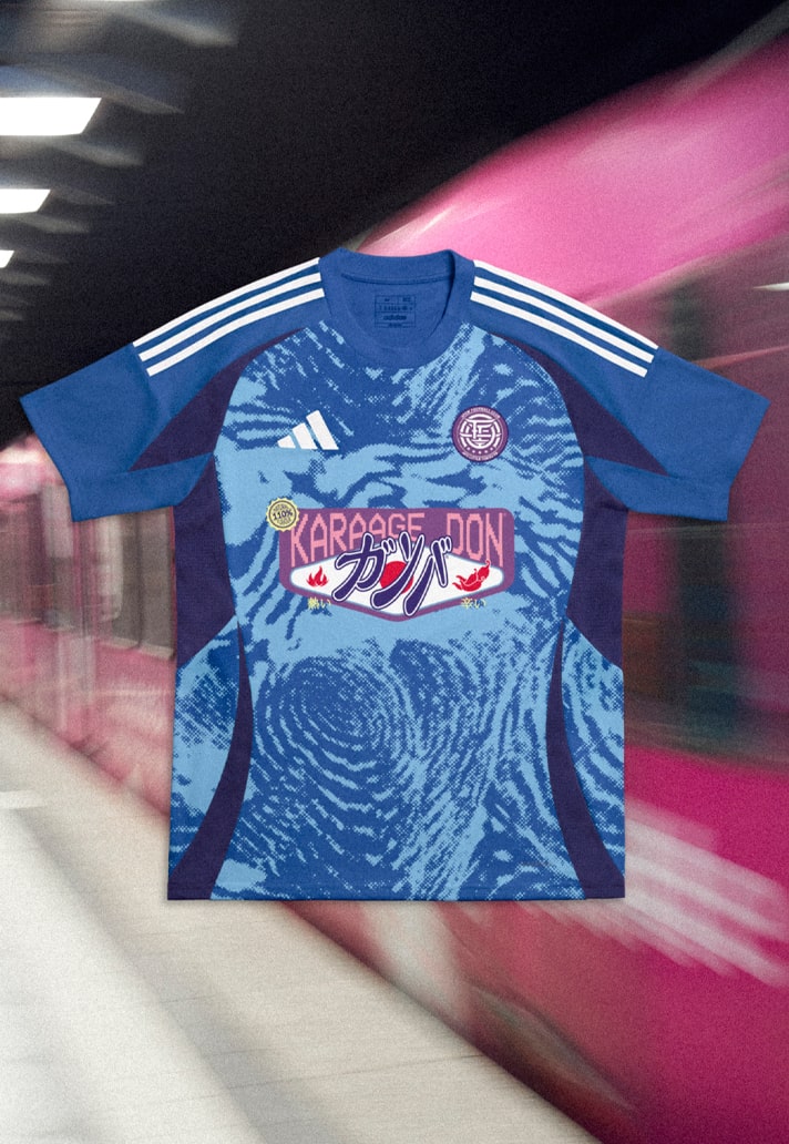
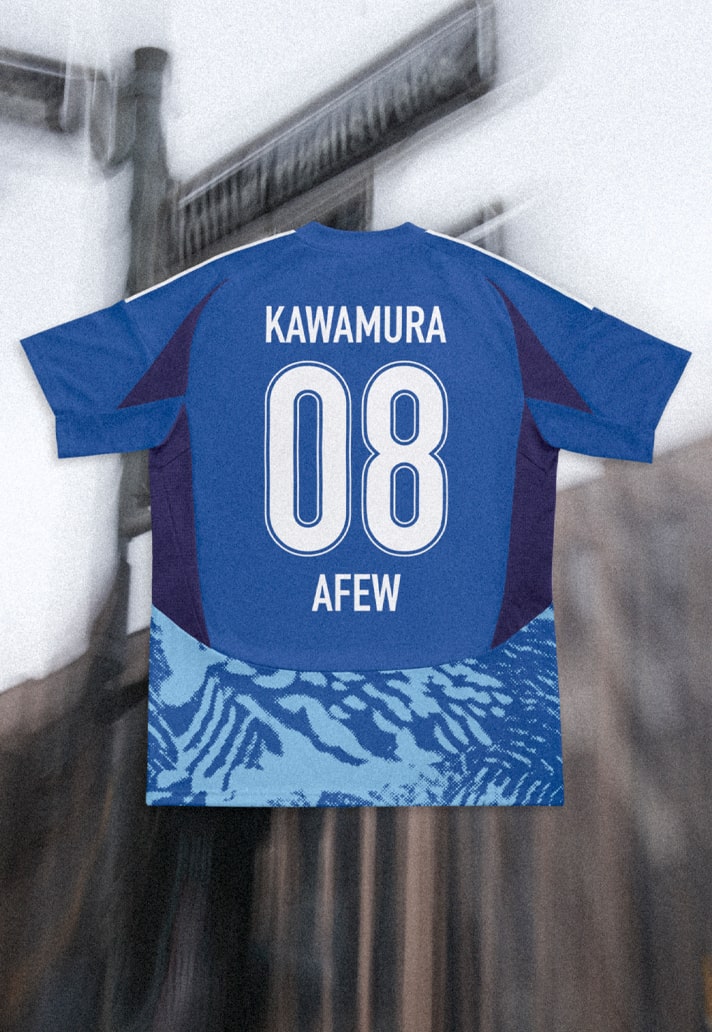
For their entry, AFEW fully embraced the influence of J-League stylings, from the Japanese food packaging-inspired sponsor, to that beautiful monogram-style crest. Little Tokyo's cultural spirit and vibrant sound is seamlessly integrated into the design, honoured through the brand's aesthetic expression.
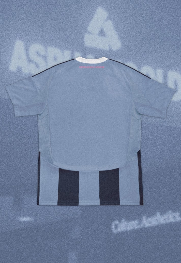
For this jersey Asphaltgold took inspiration from nostalgia, turning the clock back to designs circa early 2000s.
Color blocking gives it a modern twist, while the club emblem features a rose, symbolising the brand's love for the game.
Bonkers get right into the heart of their home city for their inspiration. The city of Frankfurt is marked by stark contrasts, within which city life moves in a gigantic grey area. The city is a historical mecca of techno culture and one of the centers of modern German rap culture, which is situated between bankers and junkies in what is one of the most colourful grey areas in the world.
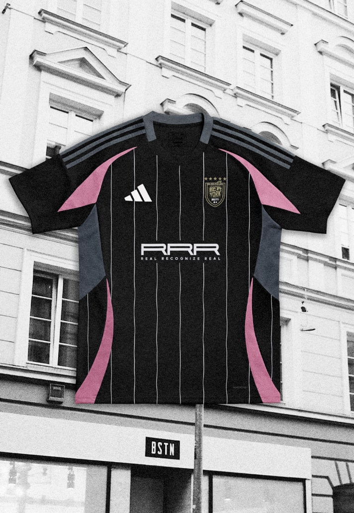
Drawing inspiration from New York for what is a stylishly elegant design, BTSN's offering sees a crest inspired by US sports teams with the integration of the Big Apple and the BSTN BRAND logo. The five stars represent the five boroughs of New York.
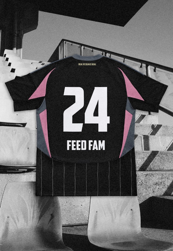
Sitting on that pinstripe canvas in the sponsor slot is the term RRR (Real Recognize Real), a phrase which is strongly anchored in hip-hop. The saying implies that those who are authentic can recognise and appreciate these qualities in others. The claim is used repeatedly on BSTN.
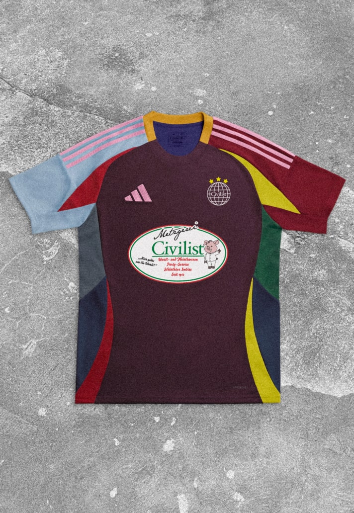
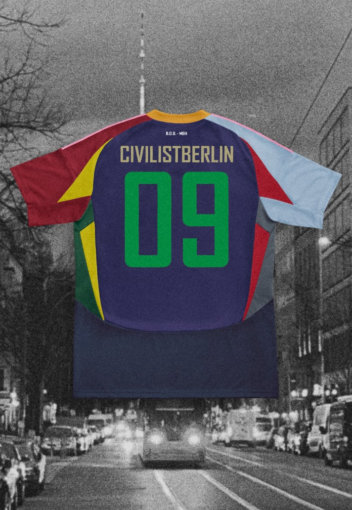
Berlin born and growing up in a city that was reunited in 1989 was the best, according to those at Civilist. Besides skateboarding, music was a huge influence for them, and for their Jersey, they used the bright colors of Berlin's Techno nightlife of the early nineties as inspiration, creating what is a unique mashup of pastel colours.
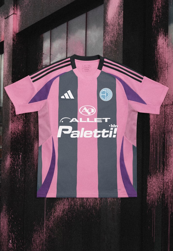
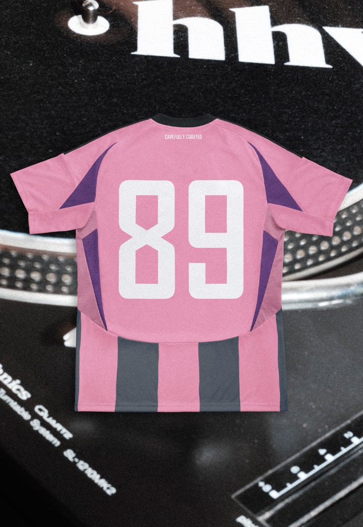
Another brand drawing on the history and culture of their home city of Berlin, HHV's crest is a nod to their origins as a vinyl store. The sponsor, "Allet paletti” is a typical Berlin saying, meaning something like “all good”. The number "89" was chosen as a reference to the fall of the Berlin Wall in 1989, which this year marks the 35th anniversary. The pink and grey pallet was chosen to represent the different vibes of Berlin: colorful and loud (pink), concrete and apartment blocks (grey).
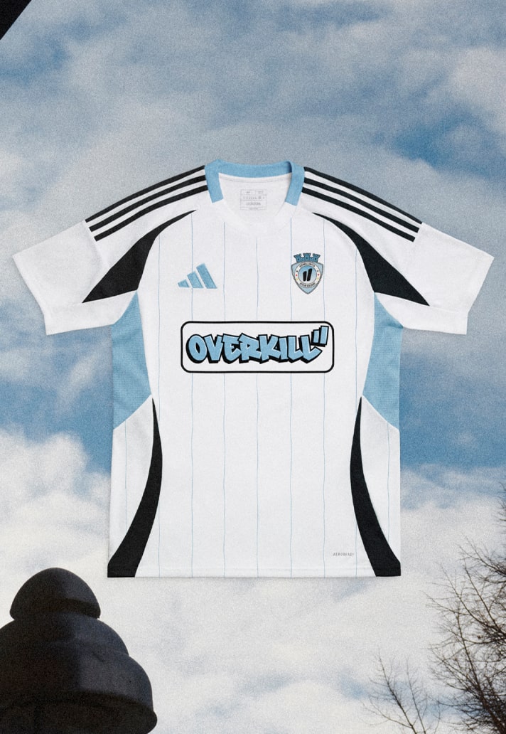
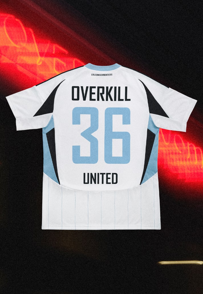
Overkill's inspiration for the color scheme of their jersey comes partly from CEO Marc's general preference for light blue, but also from the iconic jersey of the Argentinian national team. The colour also stands for the Spree and the many Berlin lakes, which are of great importance in the city.
The sponsor graphic refers to Overkill's origins, which lie in graffiti, which still has a high status and is an important part of the DNA.
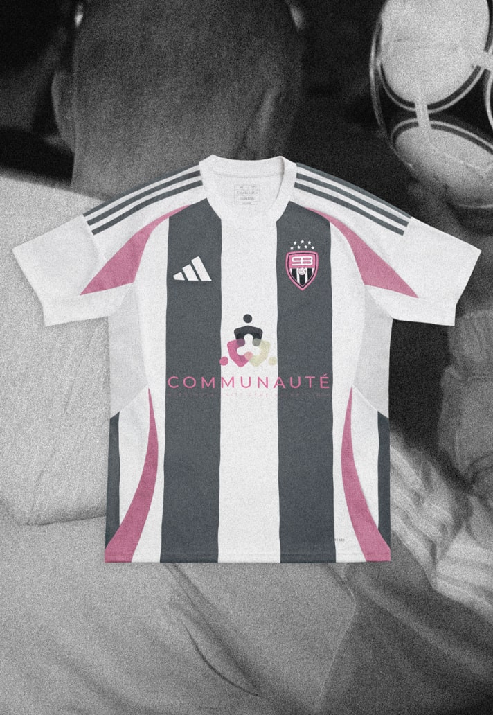
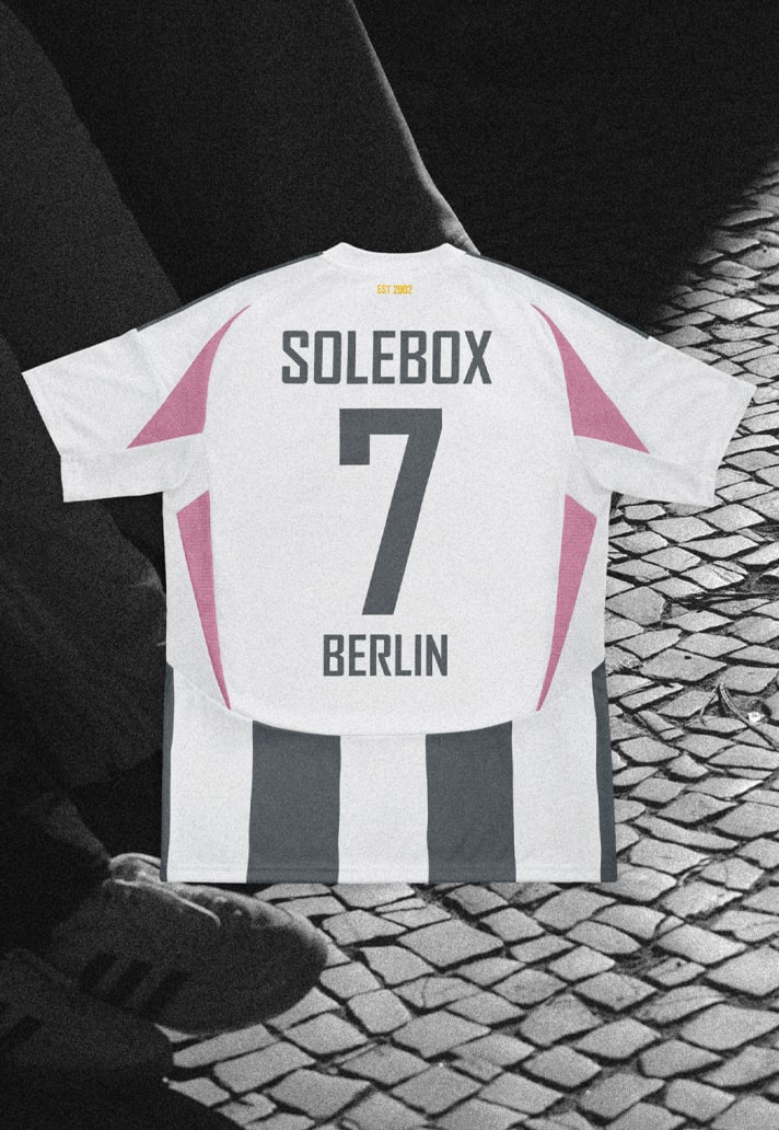
For solebox, they get right to the heart of what football is to them. "Communauté" means "community" in French, and community and equality are the fundamental values of street football; everyone has an equal right to play, regardless of their country of origin. Street football in Berlin is a diverse sport, and so the different languages on their shirt design represent the diverse communities in Berlin and the biggest football nations.
AWAY
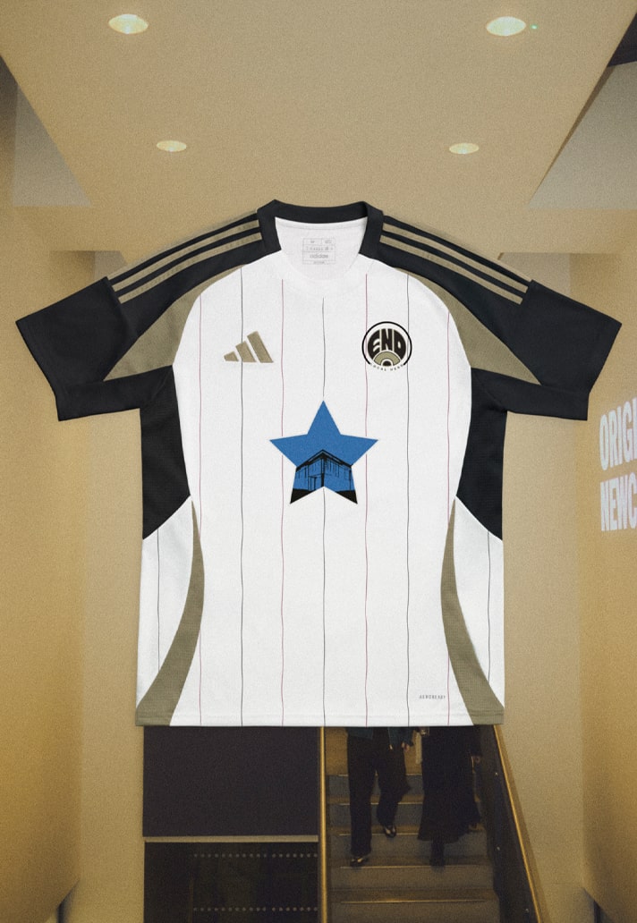
That blue star instantly brings back memories of 90s-era kits from a certain team in the northern part of England, and retro kits worn by many Geordie musicians over the years, such as Sam Fender and his band. Sam walks out on stage for every gig to 'Local Hero', which has been integrated into the kit embellishments.
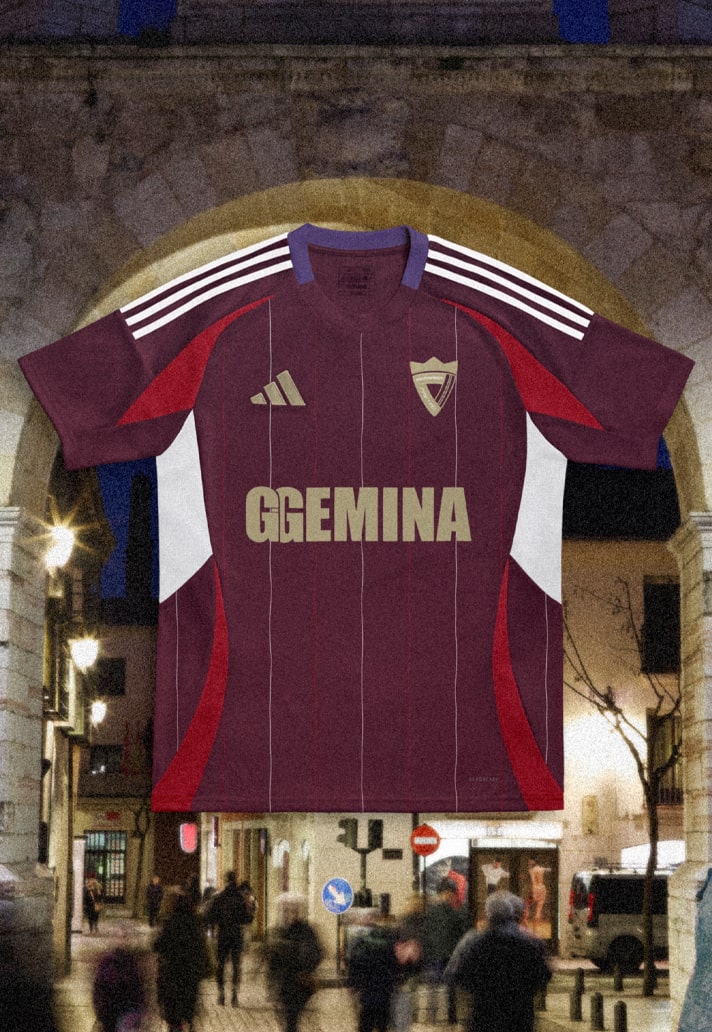
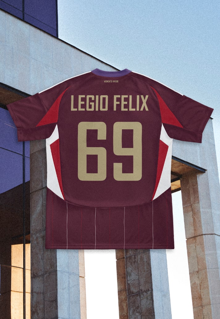
This one goes pretty deep ... see, the Legio VII, the Roman legion that gave its name to the city of León, stands as the creative nucleus of this design. León is the birthplace of FOOTDISTRICT and where, to this day, it continues to maintain its strength and inspiration. Prior to its vanishing in the fifth century, the Legio VII carved and defended realms stretching from Betica to the Danube, consistently displaying the burgundy hue in its insignia, and adapted its name to new contexts and structures.
Hundreds of years later, and a community spirit that in the 1960s blossomed in urban tribes and subcultures centered around music in the 1960s. The city was a pioneer in hosting international festivals in Spain, and the events of 1966 and 67 endowed these growing tribes with a distinct identity, laying the foundations for a rich aesthetic and musical culture, imbued with external influences. This sense of belonging, shared by the Roman legions and urban subcultures, persists in the local idiosyncrasy through festivals dyed in purple that maintain the legacy of those original ones from the 1960s – groups separated by hundreds of years and united by the dichotomy between battle-competition and enjoyment.
A play of opposites present in the very identity of FOOTDISTRICT and that, in this case, adapts to the concept of the garment. An invitation to seize the day, a feeling that still resonates almost two thousand years after the foundation of the Legio VII. Phew.
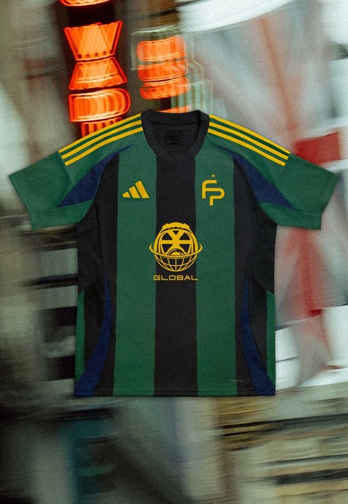
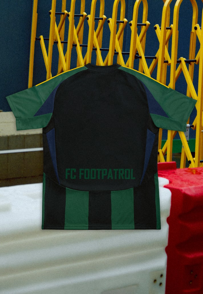
Footpatrol's design is inspired by Soho's beginning and rich musical influence, particularly from its abundance of record stores, paying homage to the appreciation of music on both local and global scales. An unusual colour scheme, but it works.
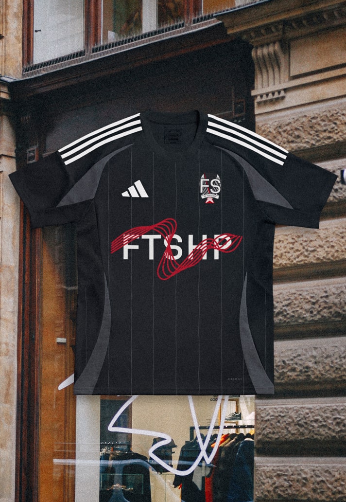
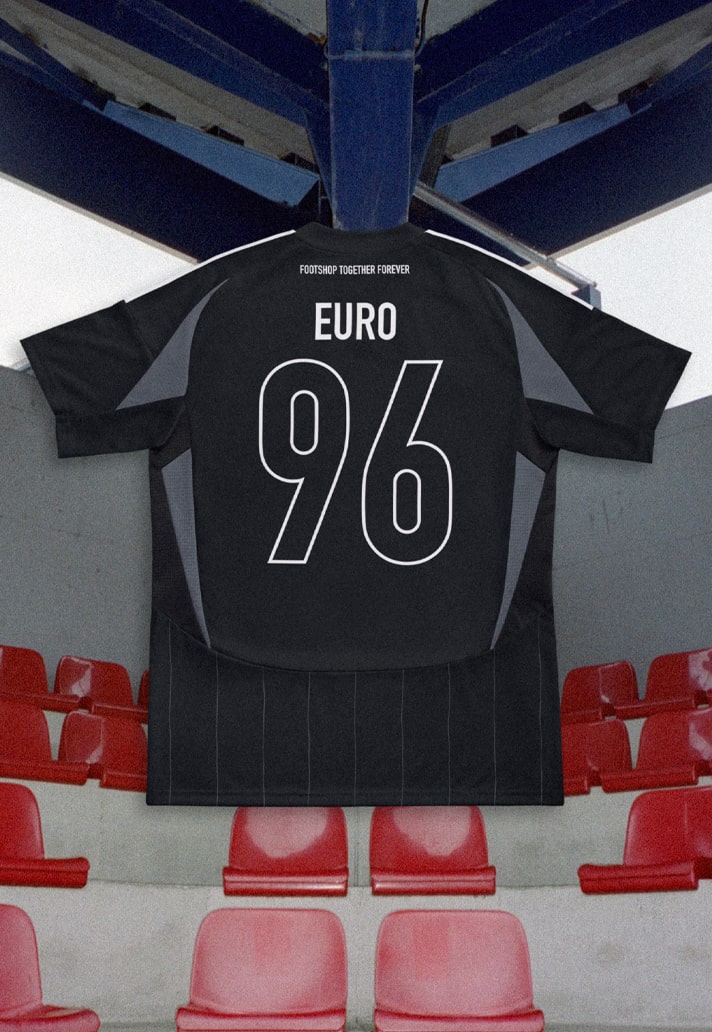
OK, so you probably weren't expecting to see a shirt design here that nodded to Simply Red, were you? Well now you've got it, and it comes from Czech brand Footshop. An elegant grey pinstripe design on black references two things: the concrete, grey aesthetic of eastern European streets, and in the silver/grey elements, that the Czech team came second in Euro1996. It plays host to a wavy Metronome graphic in red, highlighting the silhouette of the Letná's momunent (Letná is a place in Footshop's capital city well known for its music festivals and football stadium, where the CZ Nation team plays home matches). the numbering is inspired by EURO 96 – referring to the best moment in Czech football history, while the "FOOTSHOP TOGETHER. FOREVER." tag was inspired by the official EURO 96 song from – you guessed it – Simply Red.
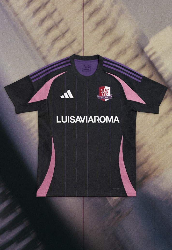
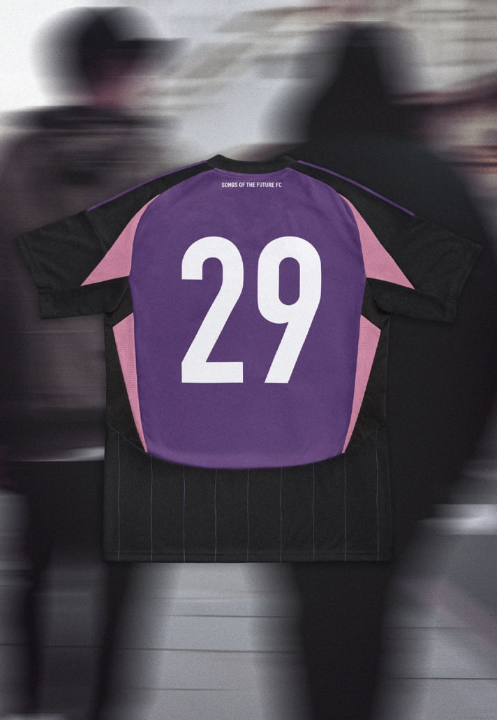
LVR goes further than just the shirt design, inventing a whole "club" aesthetic. They introduce Sons Of The Future Football Club, a harmonious embodiment of the musical pulse and vibrant spirit that define their community in Florence. The regal Purple tones on the black base present as the official colour of their football club. Purple, historically associated with royalty and artistic creativity and well known as Fiorentina's home colours, pays homage to the grandeur of Florence and its iconic Teatro Verdi.
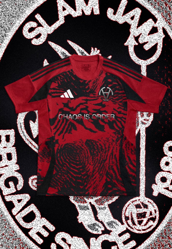
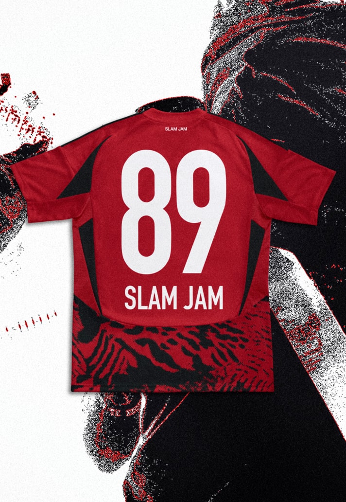
From cross-referencing the three main football jersey moments of Slam Jam founder Luca Benini (his first passion AC Milan, total football king Johan Cruyff at Ajax and pure entertainment game at Brazil's finest Flamengo), the brand added their heritage twist with the zebra print. The design references the first-ever item of Luca Benini's personal collection, bought in the late 1970's at Milanese store that the then young boy reached by train. It's a shirt that's steeped in story, but that blends the modern aesthetic, right down to Slam Jam's "Chaos is Order" logo, which is executed perfectly alongside that club crest.
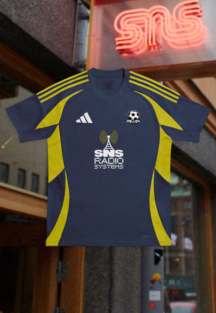
Being that they're a Swedish account, SNS looked no further than the Sweden National Colors for their inspiration, given that they felt someone had to represent Sweden in the Euros. Fair point. Clean and simple and combined with that Teamgeist shape, it's definitely a vibe.
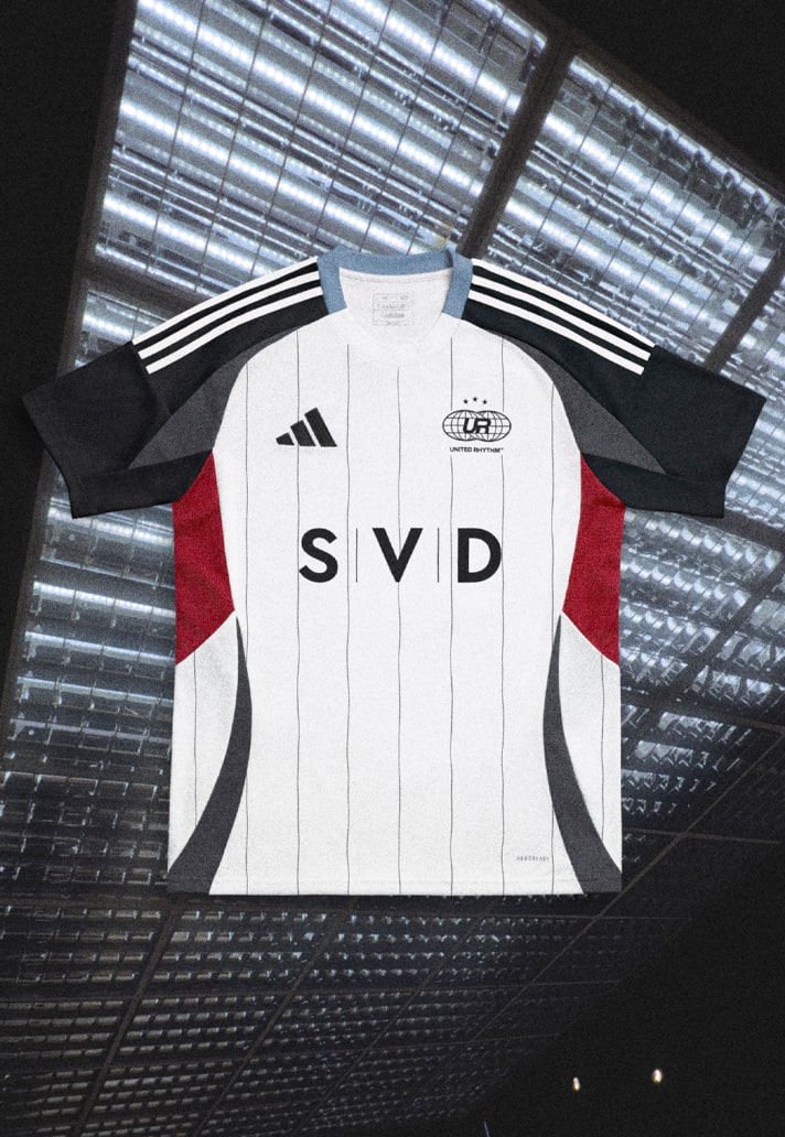
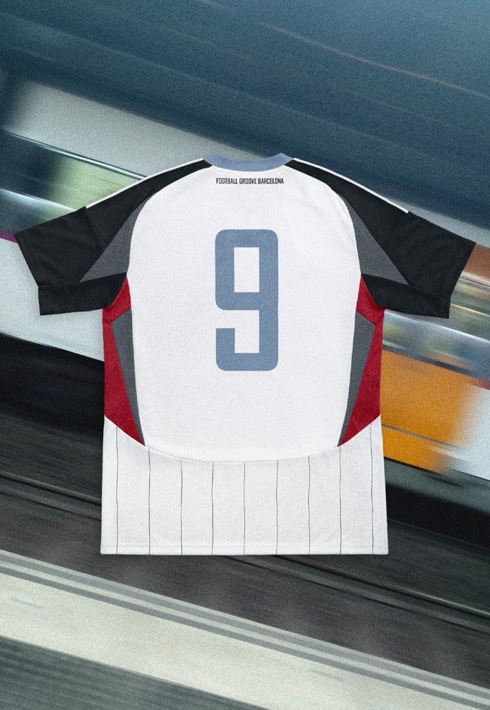
Drawing from the energy and vibrancy of their home city of Barcelona, SVD have put together a white base with pinstripes through the body. Block colours feature on the shoulders and sleeves for a contrast effect, completed by grey and red accents. The colour choices aren't ones you'd necessarily associate with Barcelona, but it's a tidy look nonetheless.
Head to adidas CONFIRMED to vote for your favourite designs.
