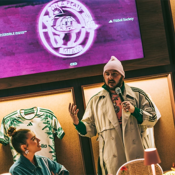
Curated by stylist Rebecca Tsuki, each of the 30 looks at the On A Plate event in Atlanta represents a moment in time, blending club identity, cultural shifts, and high fashion influences.
Pushing the boundaries of where soccer culture meets high fashion, ON A PLATE Atlanta was a testament to the power of creativity. Blending the world of football with the innovation of fashion, the show celebrated the latest MLS jerseys for the 2025 season through an exclusive runway show, masterminded by stylist, Rebecca Tsuki. Every element of each piece was carefully considered, ensuring that the integrity of the jerseys remained intact while reimagining them for the runway. The results were bold, innovative, and truly representative of how football fashion continues to evolve. Following on from our interview with Tsuki, here, we dive into the inspiration behind each individual design.
1995 – San Jose Earthquakes


Celebrating the first-ever goal in MLS history, this kit draws inspiration from Bay Area punk culture. A collaboration with Lars of the punk band Rancid—himself a Quakes season ticket holder—infuses the look with a punk-rock poster collage aesthetic. The outfit is completed with a Vivienne Westwood piece, honoring the designer’s role as a pioneer of punk fashion.
1996 – New England Revolution


This look channels the energy of Spice Girls mania, particularly Mel C’s sporty style, coinciding with the release of Wannabe. A nod to the 1996 Atlanta Olympics is incorporated, alongside references to a famous red-haired Revolution player who popularised a beaded necklace trend.
1997 – D.C. United


Taking inspiration from Alexander McQueen’s legendary Bird collection, this design reflects the fierce, emblematic bird in the D.C. United badge—a defining moment in both runway and football culture.
1998 – LA Galaxy


Inspired by the 1997 Comme des Garçons runway show, this look integrates shades of purple and ivory, mirroring the Galaxy's early kit colors and avant-garde fashion of the time.
1999 – New York Red Bulls


As the world embraced a darker, more futuristic aesthetic with films like The Matrix and Fight Club, this kit reflects a cyberpunk influence. The era’s obsession with technology—AIBO robotic dogs and Nokia 3210 Snake—translates into a sleek, retro-futuristic design.
2000 – Columbus Crew


Y2K anxiety, cyber meltdowns, and the rise of the internet define this look. Inspired by Goosebumps author R.L. Stine, the kit captures an eerie, nostalgic energy. The transition from relic tech—TV antennas, VHS tapes, and Walkmans—to the digital era of Napster is woven into the aesthetic.
2001 – Colorado Rapids


Channeling early 2000s pop culture, this look is an homage to Britney Spears and Justin Timberlake’s iconic denim moment. The Rapids’ connection to nature is reflected in elements inspired by whitewater rapids, while Bratz dolls’ bold fashion influence adds a playful touch.
2002 – FC Dallas


Honouring the club’s past as Dallas Burn, this all-red ensemble embodies the tagline Inferno from a Flame. Elements from the team’s logo, combined with Donnie Darko-inspired horn details, create a striking and symbolic design.
2003 – Sporting Kansas City


This look is a tribute to the launch of Y-3, blending high fashion with sportswear. The rise of the Nokia N-Gage gaming device in the same era adds a tech-forward edge to the concept.
2004 – Chicago Fire


A quintessentially 2004 fashion moment, this look channels the cultural zeitgeist of The Simple Life, Mean Girls, and the Motorola Razr V3. The pink iPod Mini, Von Dutch trucker hats, Juicy Couture tracksuits, and Kanye West’s The College Dropout album all play a role in shaping this aesthetic.
2005 – Real Salt Lake City


Reflecting Utah’s historic grid system—designed to accommodate horse-drawn carriages—this kit features tonal nods to the Beehive State. A reference to Edie Sedgwick’s beehive hairstyles connects the look to vintage fashion glamour.
2006 – Houston Dynamo


Marking their triumphant debut MLS Cup win in 2006 (and again in 2007), this kit embodies the club’s signature orange. The look is designed to exude royalty, majesty, and flawless elegance.
2007 – Toronto FC


With the tagline Different shades of red represent different shades of people, this look honors diversity. The fiery red ensemble takes inspiration from Alexander McQueen’s legendary red dress, famously worn by Lady Gaga.
2008 – Seattle Sounders


Honoring the Sounders’ community kit, which celebrates the fluidity of water and indigenous weaving traditions, this design incorporates aquatic patterns. Drawing from Maison Margiela’s woven aesthetic, the look captures Seattle’s deep connection to nature and craft.
2009 – Philadelphia Union


The kit’s lightning motif references Benjamin Franklin’s key experiment, symbolizing a revolution. The bold bolt design, influenced by Philadelphia’s vibrant street art scene, is further amplified through textured, graffiti-inspired techniques like glue washing.
Part 2, counting down 2010-2024 incoming...


