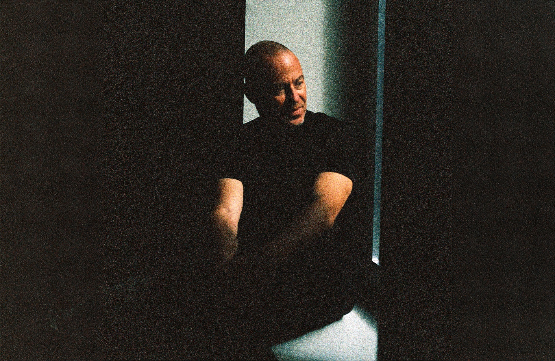
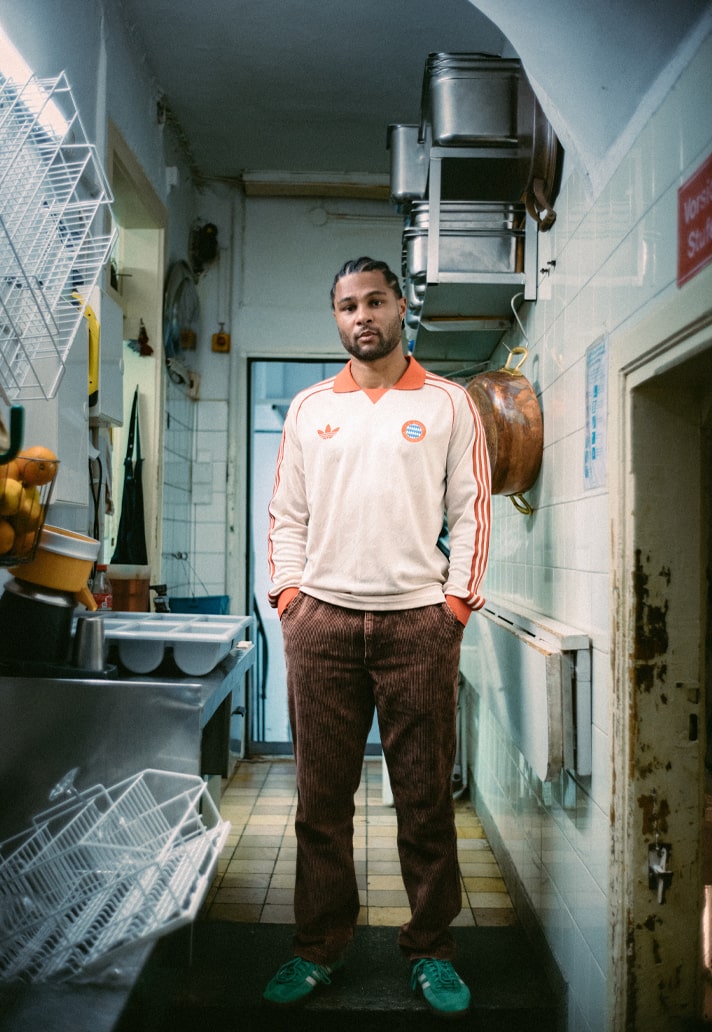
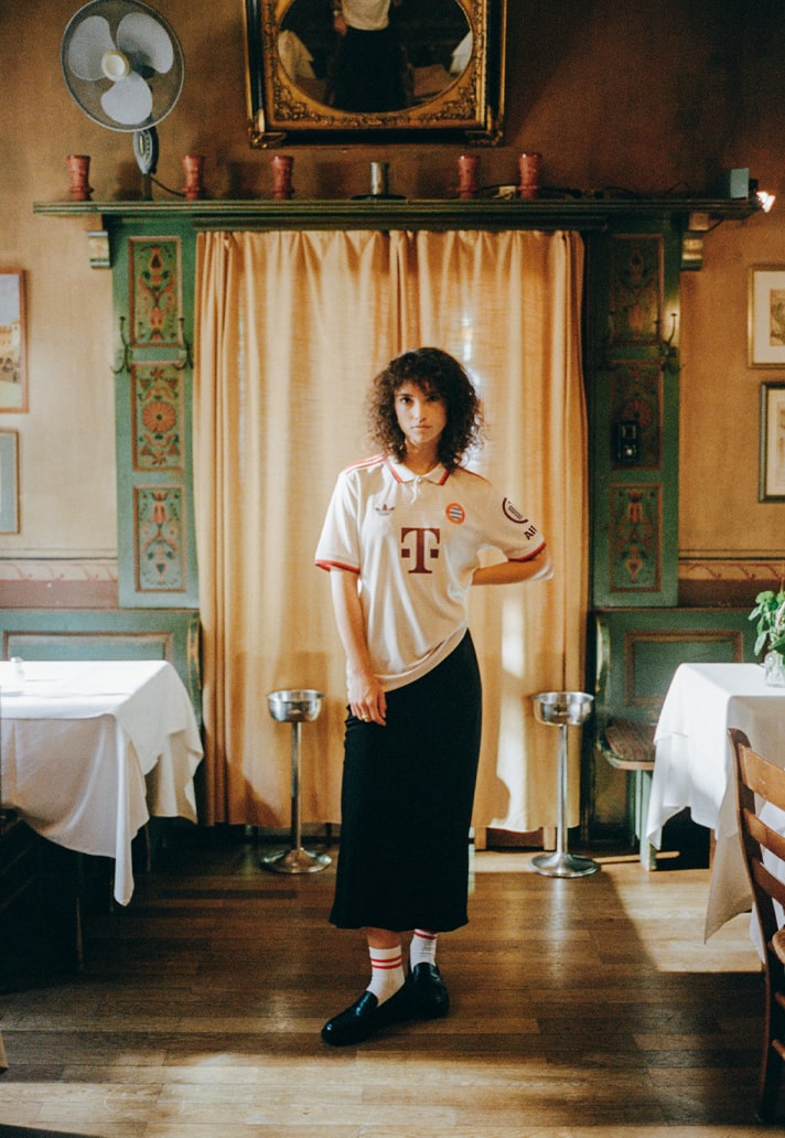
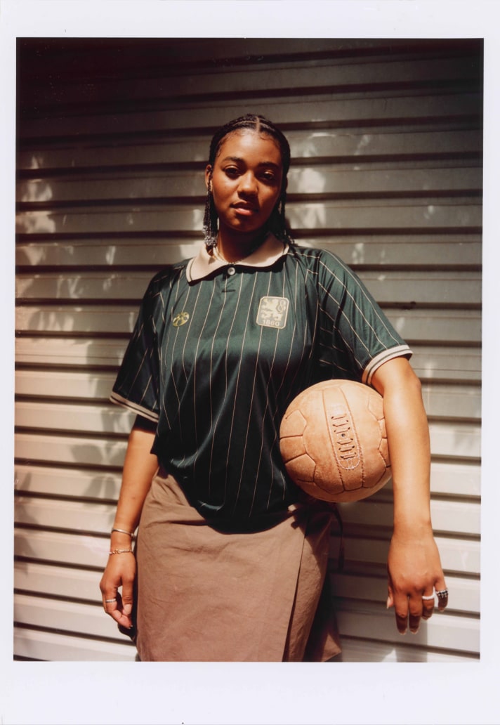
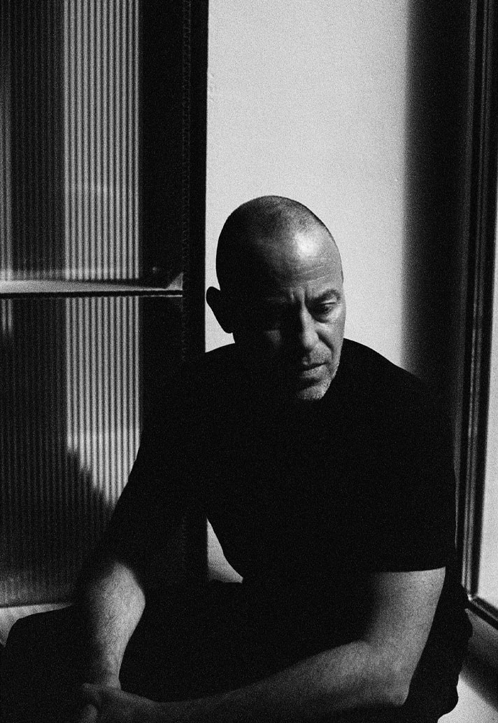
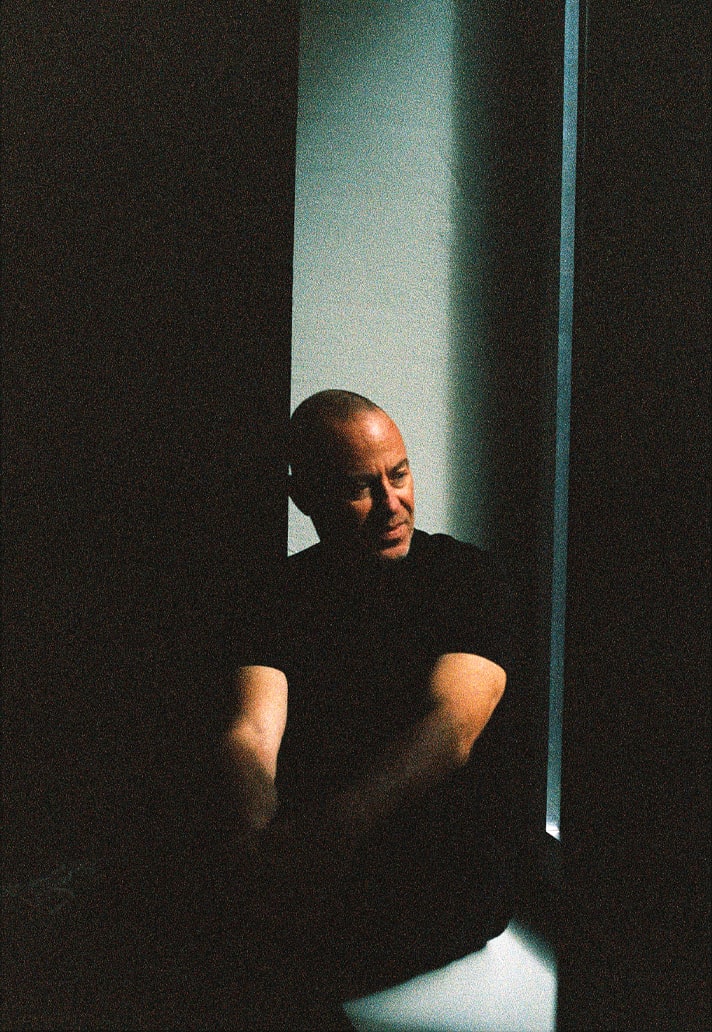
Bureau Borsche is the name behind some of the most striking rebrands and kit designs in recent football history, with their work helping to guide the very direction of modern football culture. To find out more about the design studio and their entrance into the world of football, we spoke extensively with founder, Mirko Borsche.
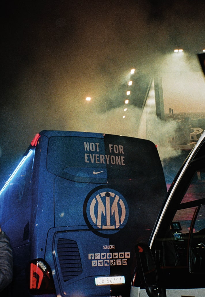
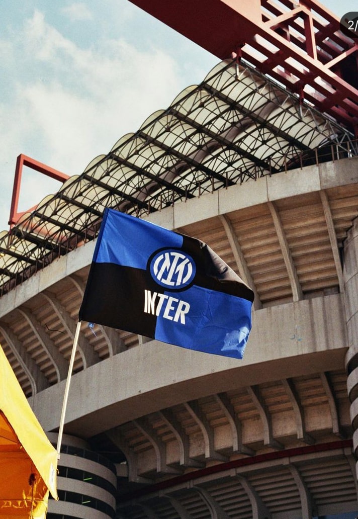
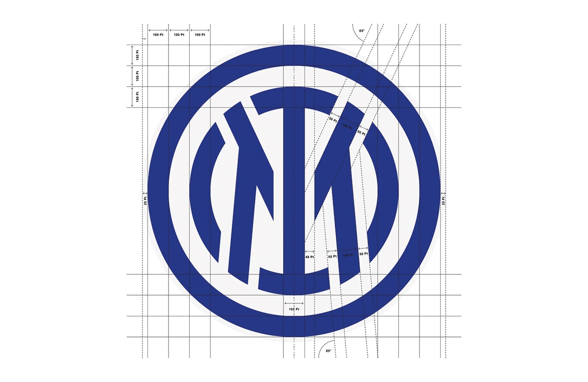
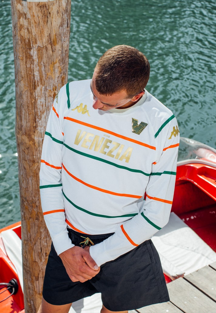
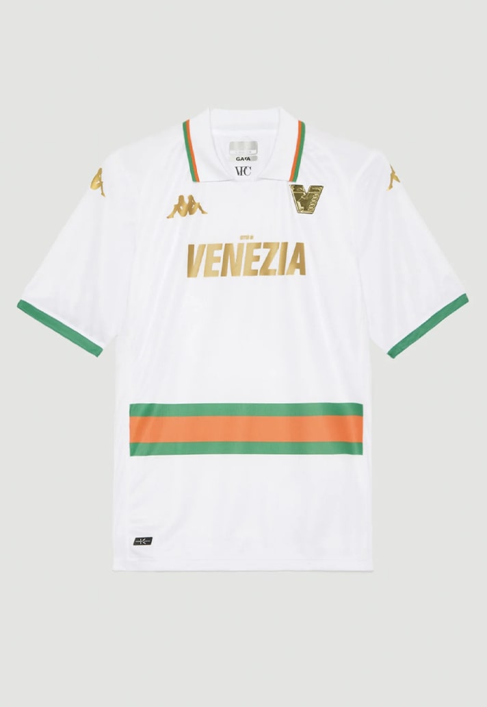
To start things off, Bureau Borsche may not be a name that your run-of-the-mill football fan will be familiar with, but from Inter Milan’s initially controversial rebrand back in 2021 to helping shape Venezia’s stylish new identity in 2022 and beyond, (a move that positioned the Italian club firmly in the vanguard of the football x fashion movement), the design studio has been at the forefront of Creative Soccer Culture. Through their work, they've quietly gone about reshaping certain aspects of football culture as we know it over the last few years, something that's been particularly evident through their sleek and clean jersey designs.
Having begun life in the realm of editorial design, gaining recognition (and with it numerous international design awards) for their work with the likes of Balenciaga, BMW, Givenchy, Louis Vuitton, Moncler and so many more, their transition to football was never really on the cards. "Bureau Borsche’s work in football really came out of nothing,” explained mild-mannered Mirko, the founder and humble creative genius behind what is one of the most treasured design studios in the industry today. “I mean, I’m a big football fan, but I never really thought there's a way of getting into the industry – it just happened.” For something that was never planned, their impact has been widely felt. The saying is that imitation is the best form of flattery, and by that token, Bureau Borsche should be very flattered, with brands across Europe taking on the clean, fashion-forward aesthetics that have become Bureau Borsche's calling card for a host of clubs across the continent.
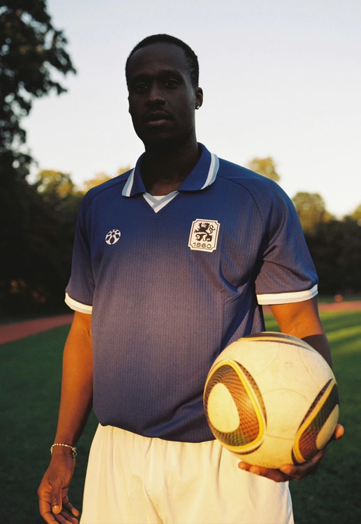
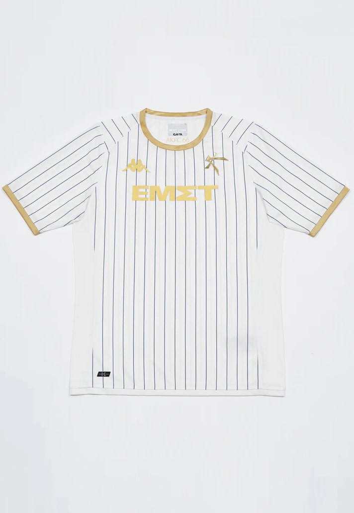
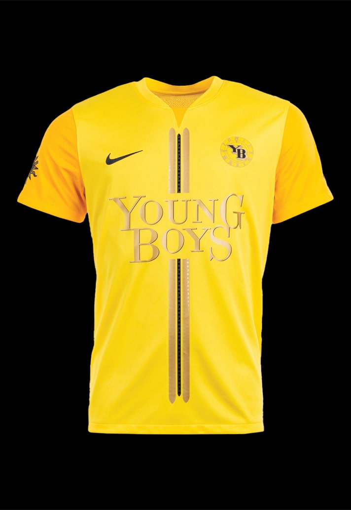
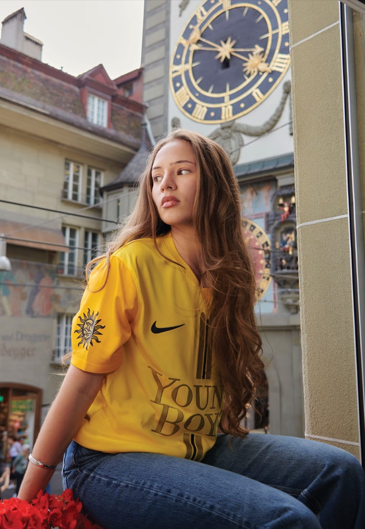
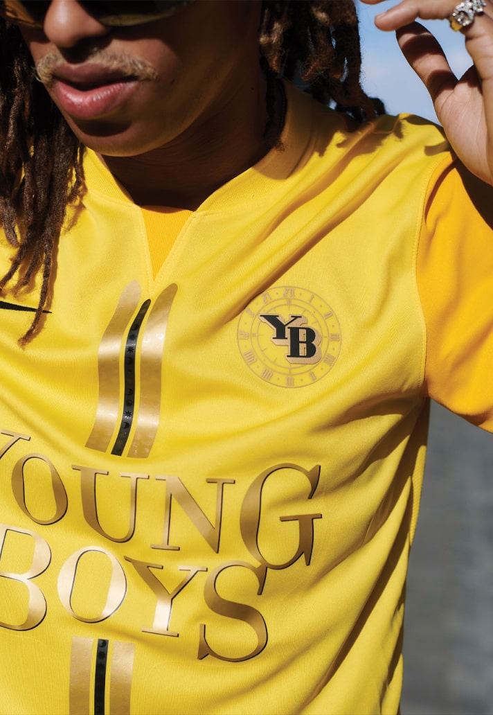
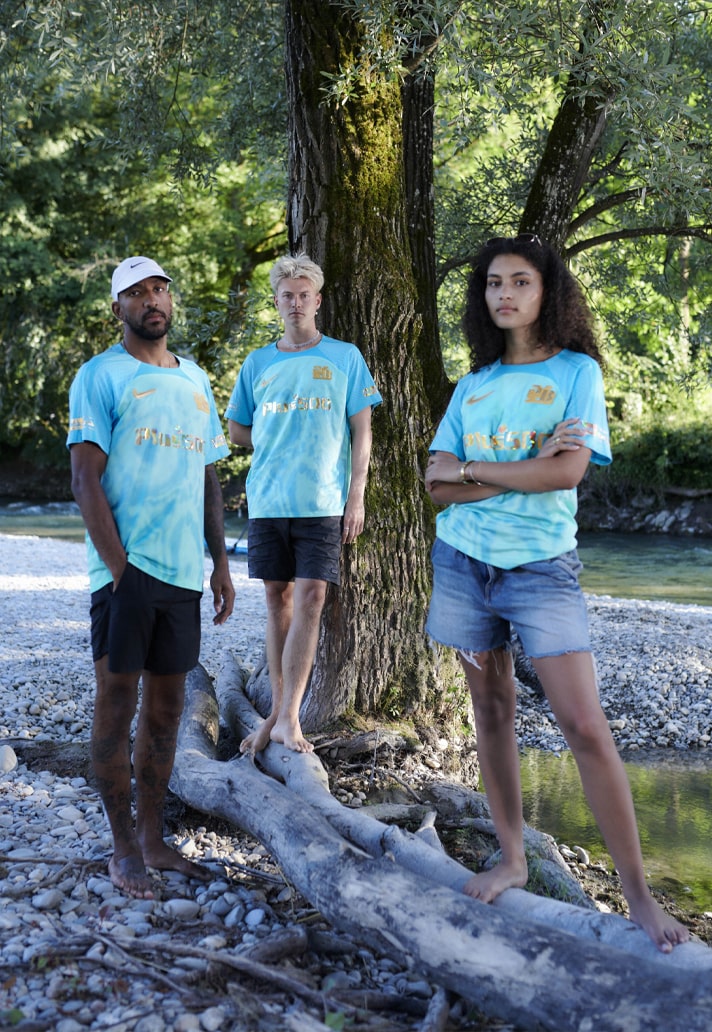
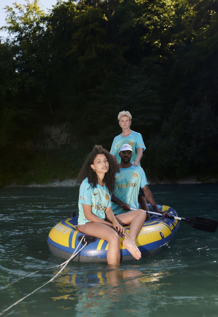
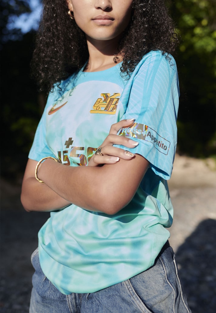
But for the design studio, there's been no looking back. What's followed from their initial introduction has been something of a legacy with Venezia, a perfect spiritual sequel with Athens Kallithea, and an ever-expanding roster of footballing clients that includes the likes of Bayern Munich, BSC Young Boys and TSV 1860 Munich with more in the pipeline. Now, sitting comfortably as one of the leading trendsetters in the field of kit design, able to boast a host of the best jersey designs in the game, it's an interesting time for the Bureau Borsche brand, recently leading to the birth of Societas: the combined creation of the founders of A Kind of Guise and Mirko Borsche they specialise in the creation of bespoke jerseys that aim to go far beyond the classic storytelling that clubs and suppliers use in the production of kits.
So just how did this world renowned design studio not only make the move into football, but get to the point where they are hugely contributing to the very direction of jersey design? And what's next, both for the brand and for the future of kit design? Speaking to us from his office in Southern Germany via the medium of an online interview, all questions were answered and then some by Borsche, as we took a deep dive into their journey.
Firstly, your work is rooted in editorial design and you have gained recognition as one of the most treasured studios in the industry, so how did the transition to football kit design come about?
I think it probably started thanks to a connection with Nike Portland after they asked us to do stuff for LeBron and all the big stars in the NBA at that time. That combined with Balenciaga contacting us out of nowhere to make a new e-commerce website and redesign of their brand. So at that point we’d been in high fashion and streetwear and sport wear, and I think over the years more and more fashion clients came by, like Supreme. Then we started doing a lot in Milan for Slam Jam. Out of that, one of the Nike guys, he remembered us and saw what we were doing, so when Inter then wanted to do a redesign on the whole brand under the former owner, Stephen Chang, somehow, our name appeared.
Then, at the same time, Venezia, who were being run by Americans, saw my work at Supreme and thought it would be cool to work with us in football. So Inter and Venezia coincidently both came along at the same time, but quite separately from one another.
For a lot of football fans, the first time your name will have popped up on their radar will have been through your work with Venezia, but as you’ve mentioned there, before that you were responsible for Inter Milan’s new visual identity. What challenges did that project throw up for you?
Italian football, as you’ll know, it's quite conservative and very traditional. It’s the most democratic sport you can have because it's through all ages, from two years to 102 years, right? All different kind of incomes, all different kind of jobs – everybody could be a football fan. So that was the most challenging thing – accepting that you’re going to do something that a lot of people are going to hate, even if you're doing the best job you you can.
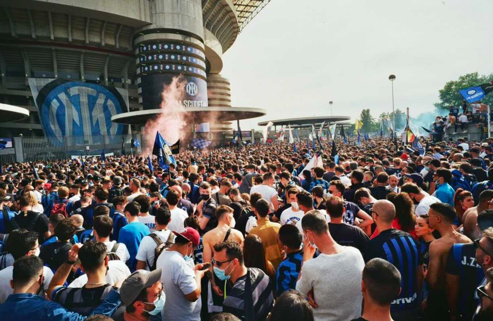
The second most challenging part was that Inter released that logo in the middle of the Corona pandemic. So they're asking us if we could be part of the press conference, which is quite unusual for a design company because normally you're always in the background, which is good.
In that case, it would have been really good for us. But we thought it'd just be the president, the owner and the marketing sitting there and a few press people, so we came over zoom, did the press conference, and then I got back into my office and my Instagram was completely full with Italians reposting my name and calling me all different kinds of names – everything you can imagine. What I later found out was that the press conference was live on Rai Uno, which is the official television channel in Italy. So it was actually a bit panicky for a while because that went on for about a week or two. I had to shut down my Insta because it was just relentless. I mean, it's not really nice hearing one bad thing in there, you know, but hearing thousands like it, that didn't stop…
Did it have you doubting yourself?
No, not what I did. But I did feel sorry, because although they weren’t addressing me in the posts – it was to friends and family – everybody was in shock. And then there’s the mafia element in Italy…then you start to think, maybe I can’t go to Milan anymore, because people know my face.
There was a bar in Munich that I liked going to, and one of the bartenders was Italian, but I didn't know he was an Inter fan, right? So this guy was coming up to me and was like, “what the fuck did you do to my club?” And there’s a lot of Italians in Munich…
So it was extremely challenging for me, and for our whole team because they were threatening me, my family, everything. And because I'm not a politician, it's really easy to find out where I live.
But then Inter won the Championship two weeks later, and everything was gone. Then the year after they were second in the Champions League, everything was gone.
And then this year they won the second scudetto with the new crest, which was also the 20th scudetto, which gave them a second star, and if they want to be proud of the second star, now they have to wear the new crest. Before that, a lot of the guys still had the old crest with the one star, but if you want to be part of the full success now you have to embrace the new crest, and that definitely helped us, I think; the new design went hand in hand with the success of the club.
With that whole experience, would it influence your decision to take on another project like that in the future?
No, I would always go the same way because I think what we did, I think it's an intelligent way, like a lot of English clubs are doing in the Premier League now. It's seeing a football club as more than a football club – it’s a brand, opening it up to all markets.
Moving us nicely onto your work with Venezia in 2022. This was huge, particularly on the back of their outstanding 21/22 kit set. How did this one come about, and was there any trepidation or nervousness in taking that on?
Yeah, absolutely. I mean, if you see something that's extremely successful beforehand already, it's daunting, right? Plus the old crest wasn't even that old, it was, like, five years old.
Ted Philipakos came in at Venezia and had an instant impact, switching from Nike to Kappa, having a lot of success with that 21/22 season. Then they brought us into the game.
At first we just did the website and the social media graphics for the club, which was all off pitch. Then Ted asked us if we could do the kits and the rebranding of Venezia with a new crest. My main concern was just the amount of kit drops there are each season, and how do you stand out and do something special? So Ted and I decided to do something extremely classy.
The 21/22 season, which everybody liked, there was a lot going on in the kit designs: you had a marble structure, small golden triangles, you had the big Venezia sponsor on top of it, you had the the crest in full colour. It was the same for the away too.
So yeah, I just steered back and I was like, OK, let's do almost nothing. And that worked out.
So this was the first time you had designed actual football kits – was it that different for you or were you able to just translate your skills into?
We were used to doing clothing collections already for the likes of Supreme, but now we're talking about something conservative, like football. If you do something crazy for Supreme, you know, it almost can't be crazy enough. If you do something for Balenciaga, or all these other brands it was always very much into fashion and very much for fashion interested people. I think that's way easier than doing something for football, where you don't know whom you're addressing it to, because Venezia has quite a small fan base, right? But still, we knew that the club could do a lot of money in selling the jersey as a souvenir to tourists and in other markets, because the city of Venice has that myth around it.
For me, learning how to make the most beautiful football jersey in my eyes, which I would wear, was difficult because it's really easy to hate football kits because they're ugly, you know? But I think it’s really hard to understand which are the details that work – fans like you and me are deciding what is a good football jersey.
It’s so objective, isn’t it?
Yeah, I mean, it's changed a lot. When we started in the industry doing this, there was still a lot of crap on the market and I think now it’s changed and there’s quite a few good jerseys around.
In terms of the process of designing a kit, what does that look like for you? Does it change depending on the club you're working with? How does the process work?
I think for me it's important that the client feels cool with the decision on a jersey, so they always get multiple options and multiple directions. When we start with a club in the beginning we often show more diverse options just sometimes to know what they don’t like. It’s a bit like reading a menu in a restaurant; sometimes to know what you want to eat you first rule out the things you definitely don’t want to eat. I think it's important because it's a very subjective thing for graphics or design.
Then we we try to get into the storytelling about every jersey. Quite often these days you get a club that releases a city map jersey or something, but you don’t really see it. We really try to make it so even if you don’t read the full write-up about the jersey, you still understand the idea behind it.
A club will get multiple options, and then we try to make a set out of it. Once they give us a direction I have to redesign all other jerseys again. If this is a beautiful home jersey and this is a nice away jersey, we don’t want it to look too random, you know, not like three random pieces.
For me, a lot of clubs do each kit differently. They try to be as different from jersey to jersey in each and every season. So if they make five jerseys, they’re five completely different jerseys.
I see it more as a set. It's still a football club and still is a uniform for football players and it needs to be recognisable and I think they also need to be recognisable for the season – in 10 years you could look at a jersey and say ah, that’s season 24/25. For me that’s very important. It’s also important for fans, because this Blokecore thing, it’s going to go away, but football supporters, people collecting football shirts? This is going to stay because it was always there. And that’s something we should keep in focus when we’re designing kits.
You’ve obviously worked closely with Kappa, first at Venezia, and then at Athens Kallithea. How is it working with them?
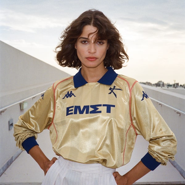
It’s interesting, because through the different clubs I'm working on, we’ve worked already with Nike on football with Inter and recently Young Boys, then adidas for Bayern Munich. With all of these brands, the focus is not very strong on smaller clubs, and even with bigger clubs there's not a huge focus on creativity. But with Kappa, because we’ve been working with them for three years now, they really go to a lot of effort in helping us. A great example of this would be the Athens Kallithea away shirt this season. I wanted to have the old Kappa logo on it, and I think with another brand it wouldn’t have been possible. These things are possible because they know of the success we’ve had. Sadly this might change a bit in the future as Kappa want people to stick to the base kits and base materials, which is definitely a pity.
Remember last year though, Venezia had the silver tracksuit? I mean that was possible only with Kappa, because if it was Nike, it's not possible. As a kid I had this 1984 Los Angeles Olympics tracksuit from the USA. It was a silver one and the stripes were red and blue and white, like Kappa. I loved that tracksuit for ages, so I went to Kappa and said we have to do a tracksuit for Venezia and I want to have this one from 1984 out of your archive, but just change the colours of the stripes to orange and green – is that possible? And they were like, “yeah, Mika, no problem. We're gonna do it, but it's pretty ugly, you know that.” And I was like, “yeah, I know it's pretty ugly, but I I think it's gonna be amazing.” And it was amazing.
Your kit designs for both Venezia and Kallithea in particular have been at the forefront of the football x fashion movement. Are you aware of the influence you’re having, setting these clubs apart as trailblazers and trendsetters in their lane?
Not really! I think it’s starting to work on me, but in the beginning, certainly, It just felt like a coincidence. But now looking back? I somehow get the feeling that it’s not and that it could be a bit our fault!
It’s not a matter of blame though – it’s like the saying, imitation is the greatest form of flattery. This season has seen a marked shift in kit designs to a much cleaner aesthetic on the most part, and a lot of that will come from what you’ve done. With that in mind, what do you see the future of kit design being?
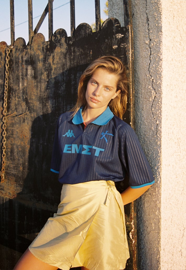
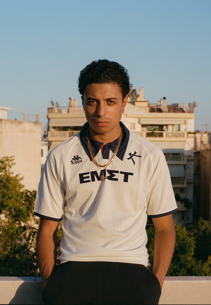
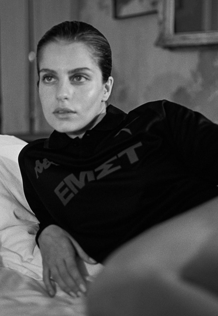
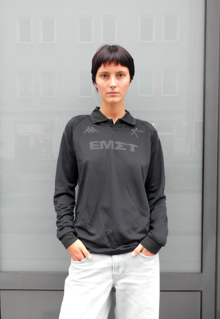
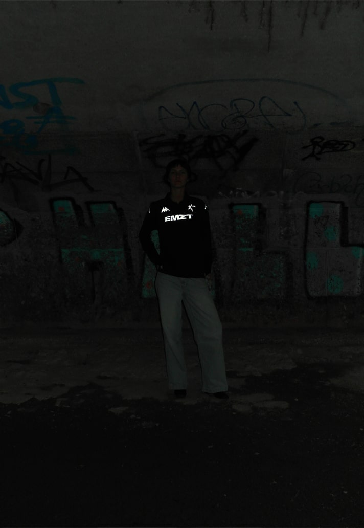
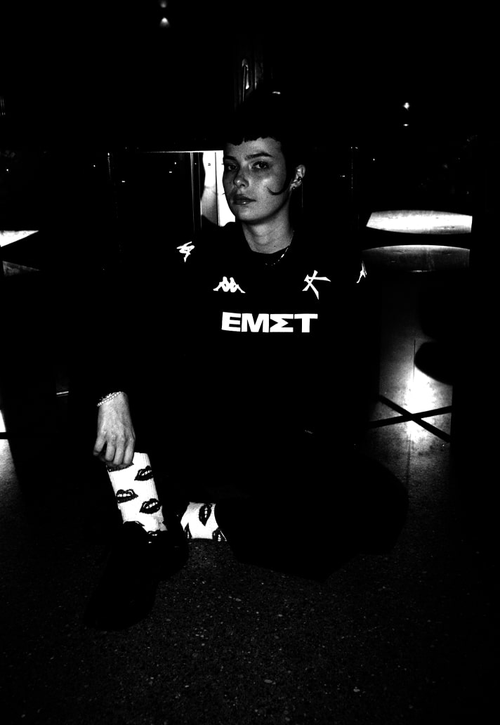
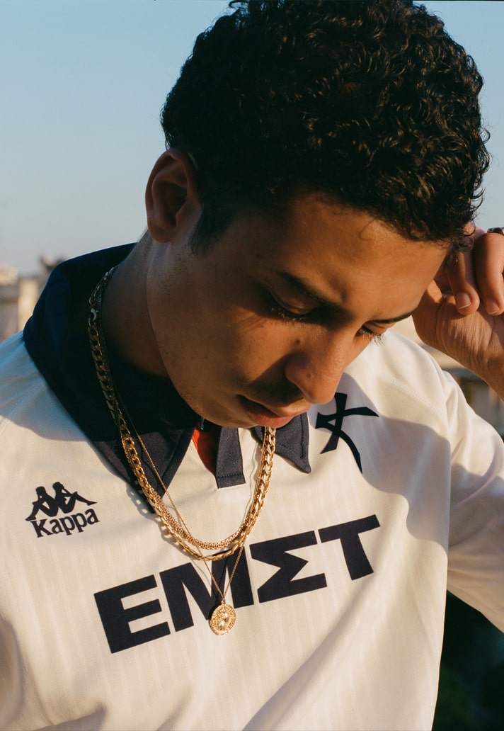
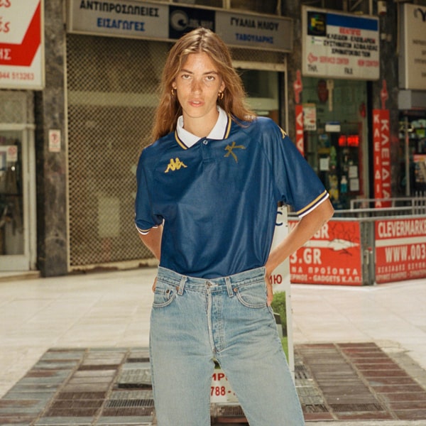
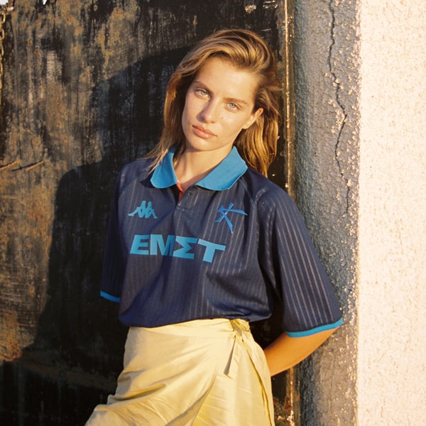
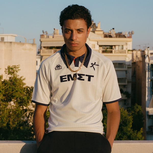
Hopefully there's a chance of once again having more variety between the clubs, because at the moment it still feels like you get a lot of base kits around with just the details on top of it. That’s a bit sad. If you look back to the 90s where you had all different cuts, and it was way more challenging and way, way more interesting. And that's what we try now with next season, and what we already tried with Kallithea this season. The blue one, the white one and the black one. All collars are different, and they all have a different cut and it's not one base kit, right? All of them have a different shape, the black one is more loose, as is the white one, while the blue one is more in shape.
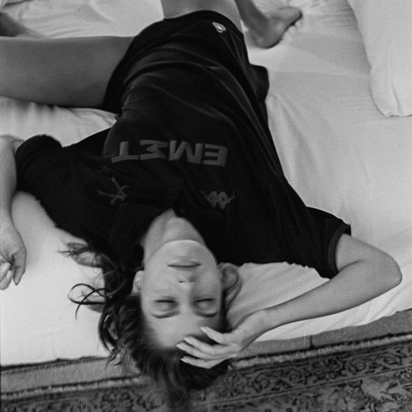
And then, I know black on black on black is nothing new, but our black one, the details are completely reflective and the back numbers are going to be in silver.
Generally we are working even more on details. Details and quality. That's something I hope with the suppliers that they go back to: better quality, because I mean, imagine you buy a kit, you have to spend 100 bucks for a jersey, you’re super happy, you know, but you wash it five times and it's gone and that's a bit sad.
If you’re nostalgic – and I’m nostaglic – you go to your club and you see the stands and all these supporters in different jerseys from different years from the 90s, some still have the jersey from the 70s. And for that you need good quality.
It's this thought of sustainability in that case, because I mean it's going to be free advertising for your brand for years to come, you know, forever. Make them to last.
Where does the balance come in though between performance and longevity?
The difference to the replicas is not that different today and sometimes just the replica is just cheaper quality and I think normally it should be different like obviously like the performance one is for a game, right, and must be sweat resistant or whatever. Things a jersey needs to have being on the pitch, obviously, because if they they are in an acrylic jersey from the 90s, the player's are going to die. But replica, that's a bit of a pity, because most of the time it's just a poorer quality. For me it needs to actually be a way better quality, more durable, because it'll never be worn on the pitch, it's always going to be in the fanbase and worn over generations.
What’s been your favourite kit design that Bureau Borsche have been involved in personally?
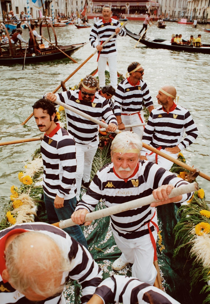
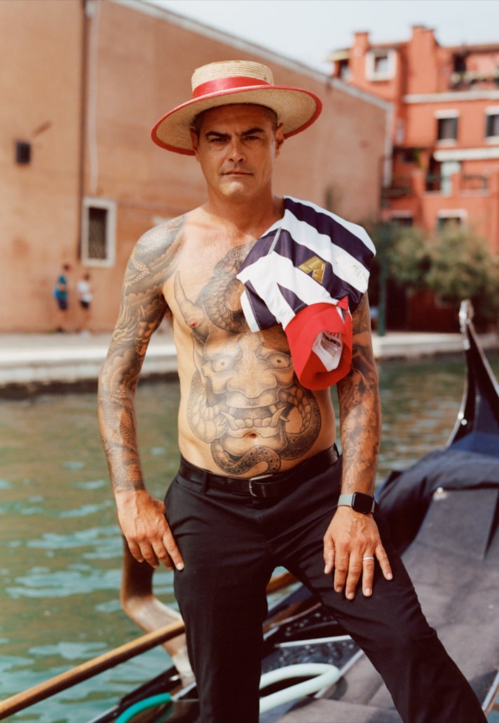
Let me think…maybe just because I was a bit scared for it the 23/24 Venezia third jersey, the gondolieri one. It has that Ralph Lauren touch, right? but it's also very touristic, you know, like we did something extremely touristic for Venezia. I was a German designer doing something which is so traditional in Italy and it was still accepted, nobody killed us for that.
I think there was maybe a good story behind it, because the client really loved it and the moment we started producing it, I was like, oh, hang on, maybe it's really a stupid idea and maybe the gondoliers will really hate it. But in the end they were quite happy with it and they said it’s the first time there's some appreciation for their job, so that was nice.
I think the most beautiful one though is Athens Kallithea away this year. You could wear it with a suit, it’s so clean.
If you could work with any one club on creating a new visual identity and kit set, who would it be?
Any? That's a difficult one. I would love to work with a Premier League club, obviously. That would be just so good. I lived in London for four years and somehow I totally missed out on going to a game – I’ve never been to an English stadium in my whole life. That's such a such a pity. So yeah, obviously a Premier League club, and second on my list is a North American club. One of these crazy North American clubs.
It's like the Wild West out there properly, isn't it?
Yeah, that's what I mean. Working for a club there would be so cool. There's also some clubs we didn't take, that we didn't work for. I think if the supportership behind the club doesn't feel right then we don’t do it. That for me is the the the most important thing.
Can you give us any hints at what we can expect from Bureau Borsche in the football world in the not too distant future?
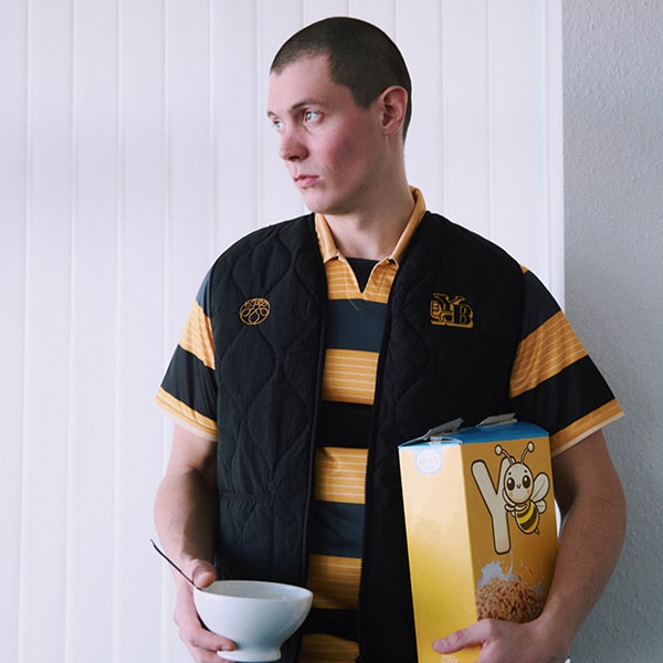
We’re working on Young Boys. We did their warm-up jersey and third jersey this season, and next season we’ll do a jersey and a fan collection. And Athens Kallithea will carry on for another year at least. We’re going to do something with a La Liga club. Then we're talking to several other clubs right now, which I can't really talk about yet, but it's going to be quite exciting!
Photography credits:
Francesca Scandella (Inter Milan)
Sam Alexander Gregg (Venezia)
Isaac Martinez (1860 e.V)
André Josselin (FC Bayern)
Ethan White (Kallithea 24/25 away)
Yiorgos Mavropoulos (Kallithea 24/25 third)
Flavio Karrer (BSC Young Boys)
Sebastian Huber (1860 e.V)
Martina Borsche
