Following several phases of design, which included consultation with fans and a focus group that represented a cross-section of supporters, Bristol City have launched a new club crest, recalling the robin of their nickname in a clean, minimalist approach that ushers in a new era for the club.
A change of crest can be a delicate matter; the aim is often to modernise the look while capturing the identity of the club and everything it stands for. Get it right and you create an image that could represent the club for decades to come. But get it wrong and you risk the anger and vitriol of the fanbase. All things that the Bristol City hierarchy had to consider prior to the unveiling of the club’s new crest, which sees the return of the robin.
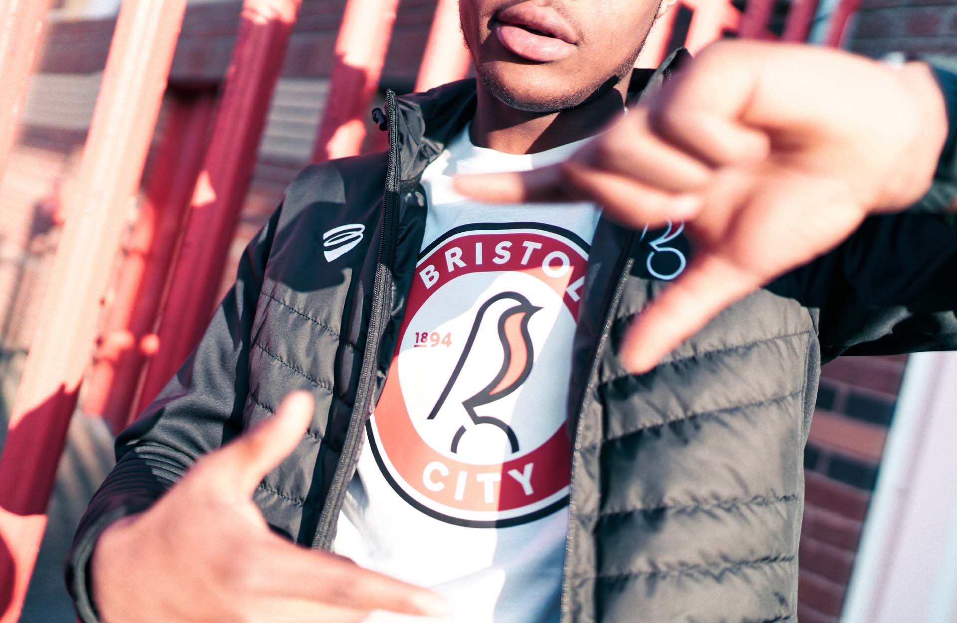
The logo also sees the inclusion of the club’s founding year, 1894, when it existed as Bristol South End. City Vice-Chairman Jon Lansdown said: “The robin has long been a symbol of Bristol City and has been part of our history through imagery, words and song. It is important that we have an instantly recognisable crest that reflects the club and we want to fully own this symbolic part of our identity.”
Players from both the men’s and women’s teams were invited to Ashton Gate where they were given their first glimpse of the new crest on the 2019 home kit. They then suited up in 2019 lifestyle and training apparel before being taken to City local pub, The Robins, for which the club had already updated the signage.
The club worked with local graffiti festival UpFest to create a series of painted murals of the new badge that were placed around the city as they went all out to ensure that their new identity was well publicised. It was accompanied by many parts of the city being lit up by projections of the new crest on buildings and on the iconic Clifton suspension bridge, while fly posters of the new badge were also all over the city.
Bristol City Chief Executive Officer Mark Ashton said: “I am sure that supporters will be delighted with what we have achieved with the crest. It is bold, creative and symbolises what this club is all about. The return of the robin is something I know fans have wanted for a long time. The updated crest takes Bristol City and Bristol City Women into a new era together and I can’t wait for what the next chapter will bring.”


