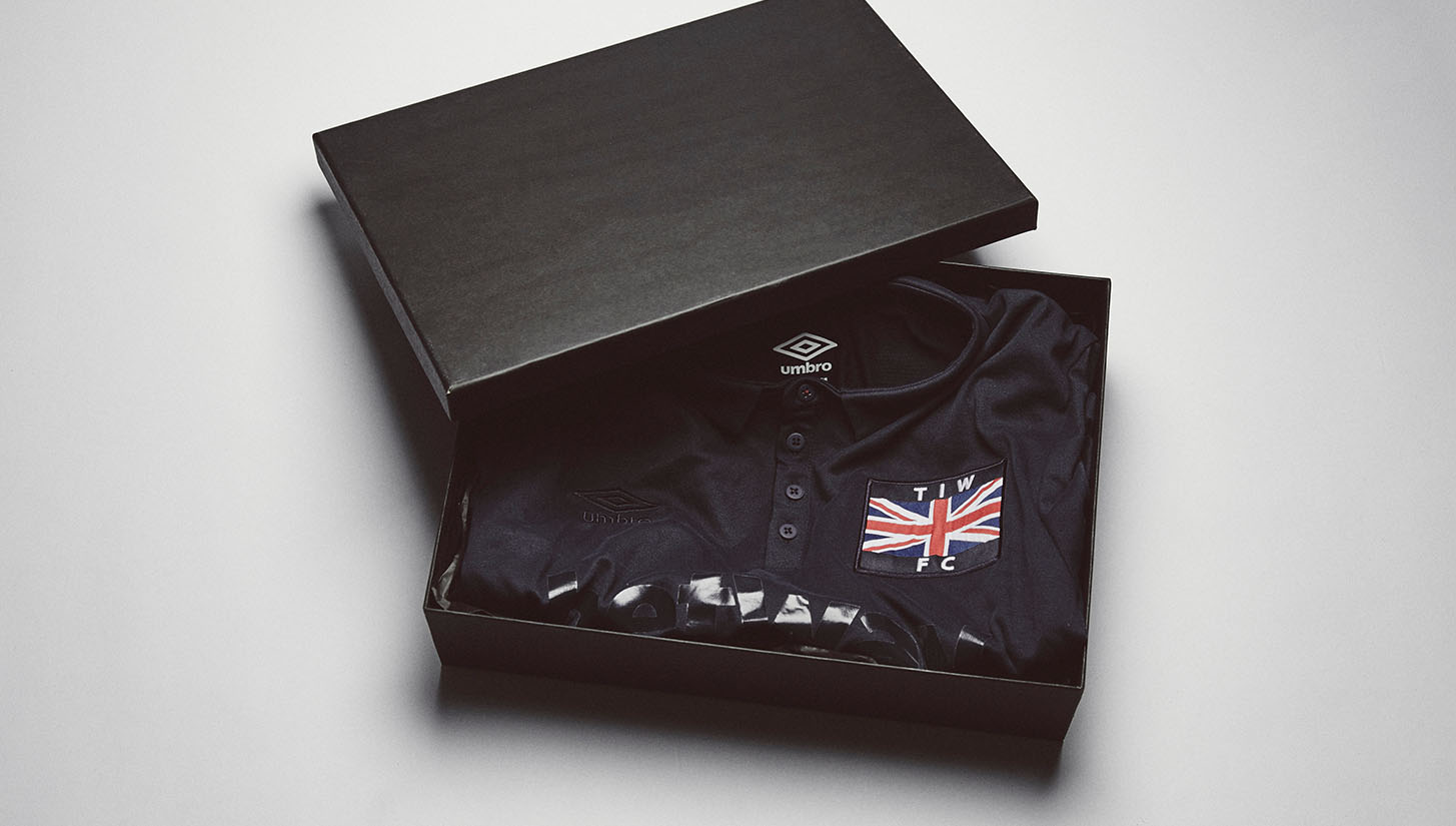
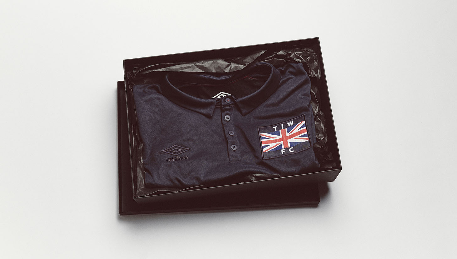
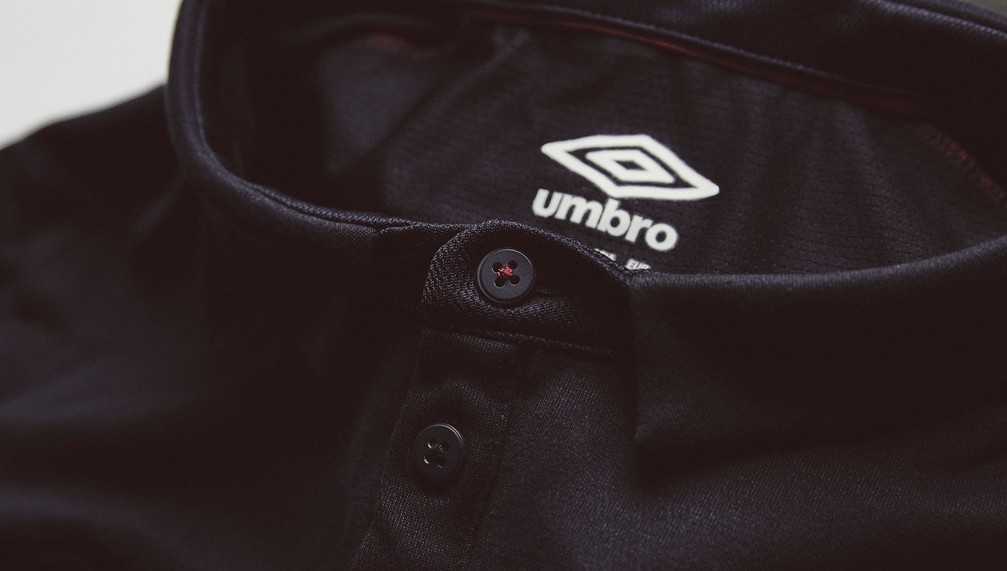
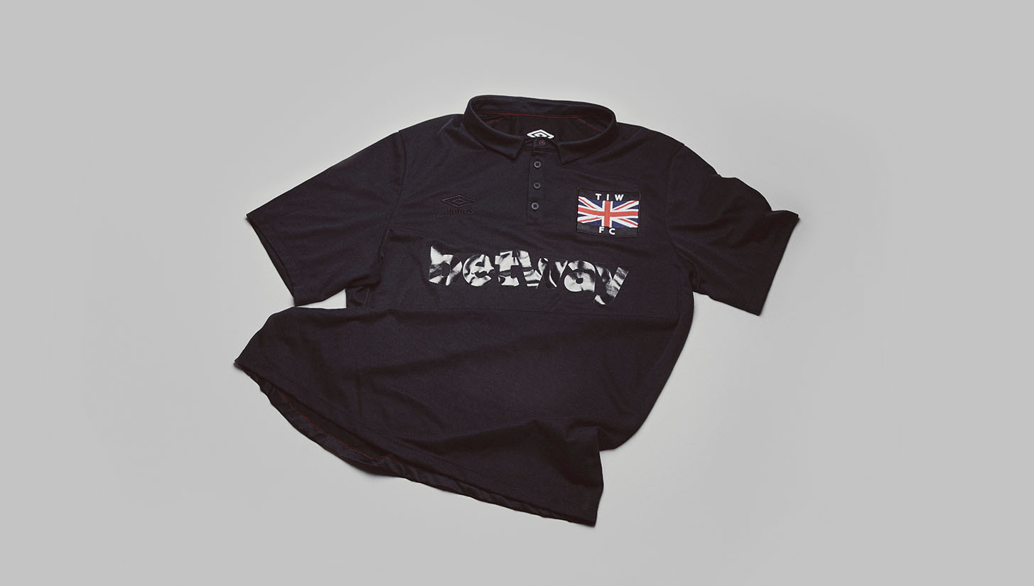
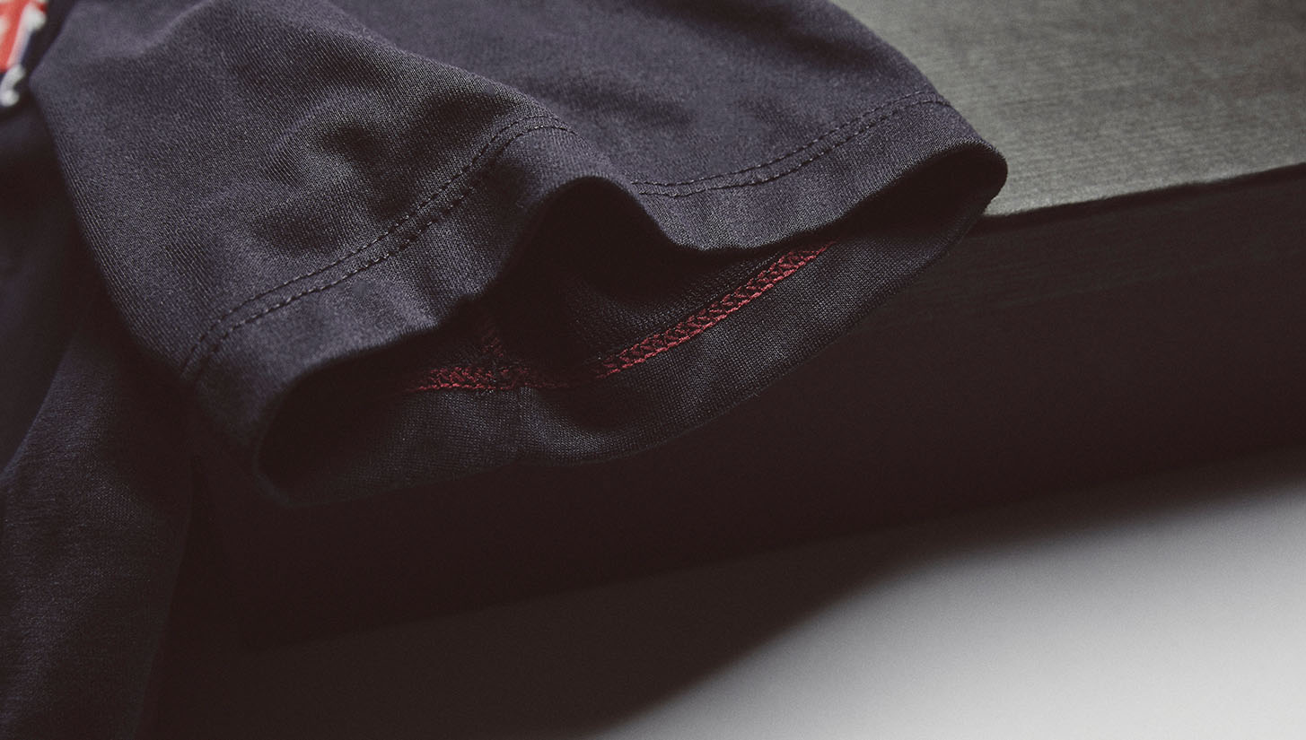
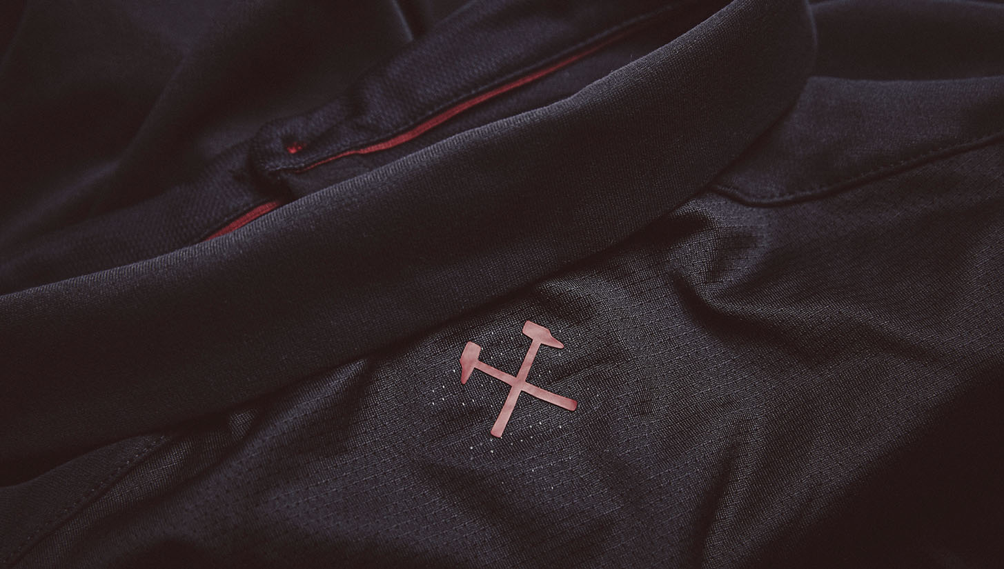
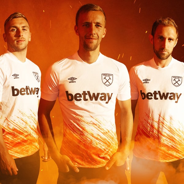
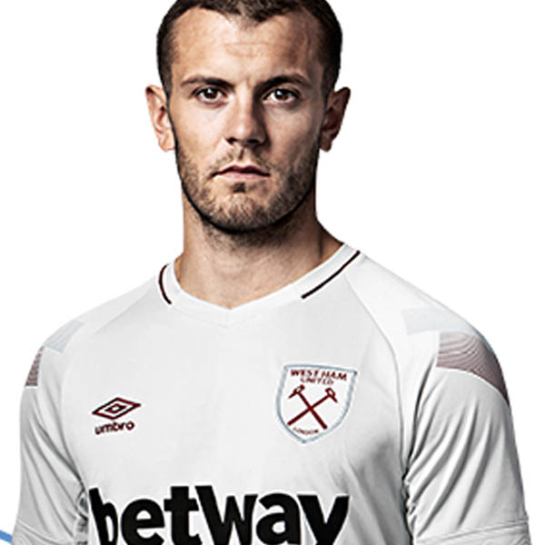
Tonal goodness all over. This celebratory kit from Umbro marks the 'Thames Iron Works' ― the predecessor to 'The Hammers' ― and represented an appreciation of the foundations that have given the club the character and traditions to this day.
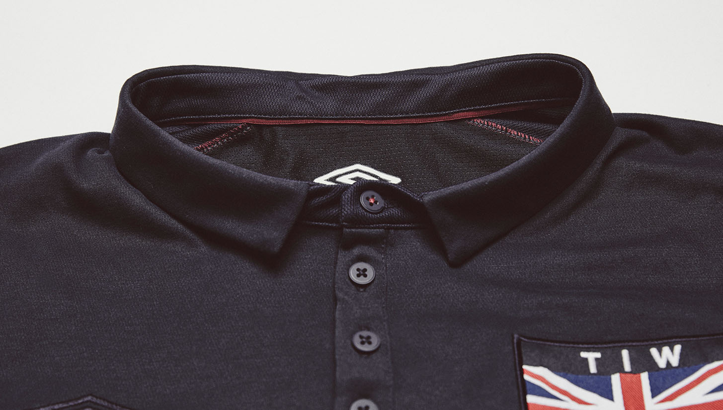
Much of this new West Ham era has been built on legacy. Proud to state 'London' on their revitalised badge and now settling in to the Queen Elizabeth Olympic Park, they are marking their roots and indeed territory at every turn. With the shirt's sponsors and suppliers turned tonal, it's a subtle offering that shouts with suave measure as the Union Flag remains in full colour and 'T I W F C' lure in the eyes.

There's no over enthused thinking; it's a timeless piece of design that will look mighty smart as the club take it on their travels in the FA Cup. Plenty of apples, plenty of pears and some jellied eels for good measure, a perfect tribute to what we'll call 'the capitals club'. If there's one thing this clearly demonstrates, it's the need for more single colour kits. Sharp and strong.

