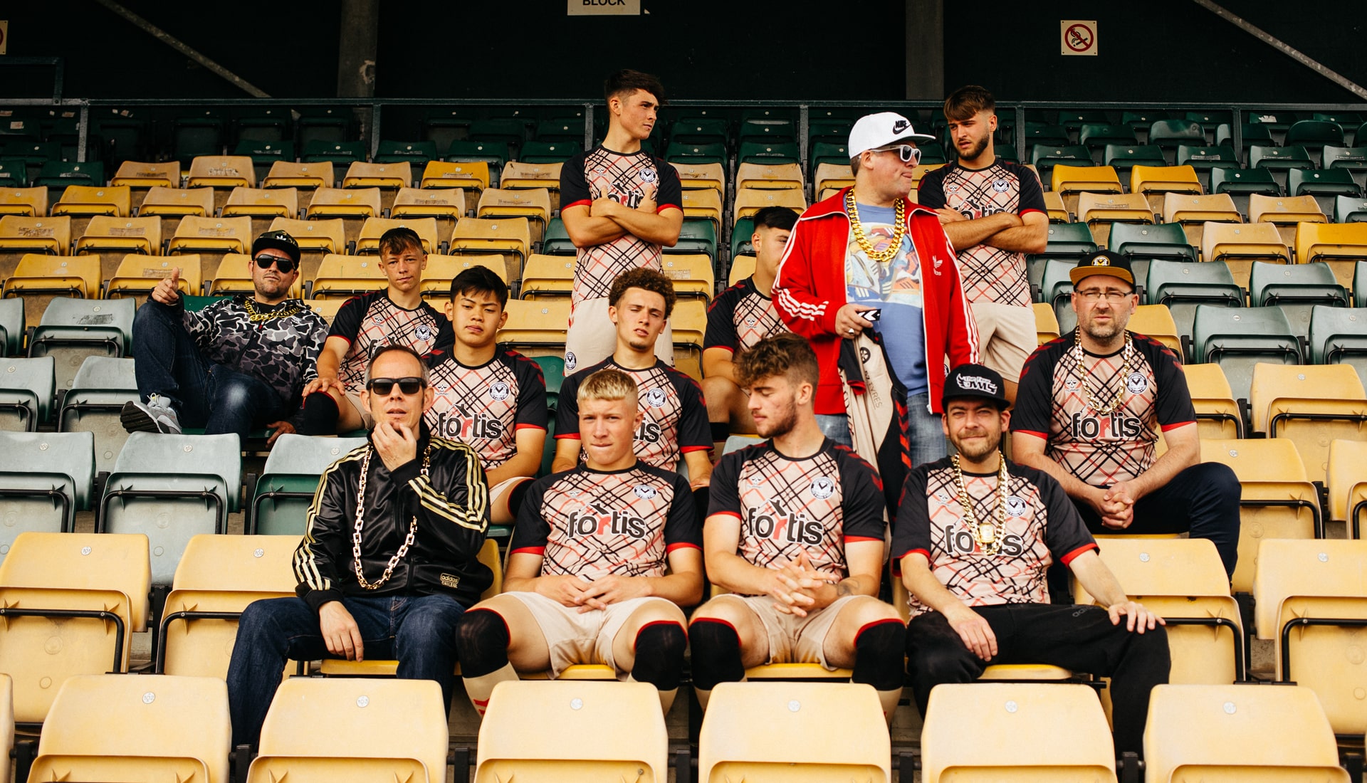
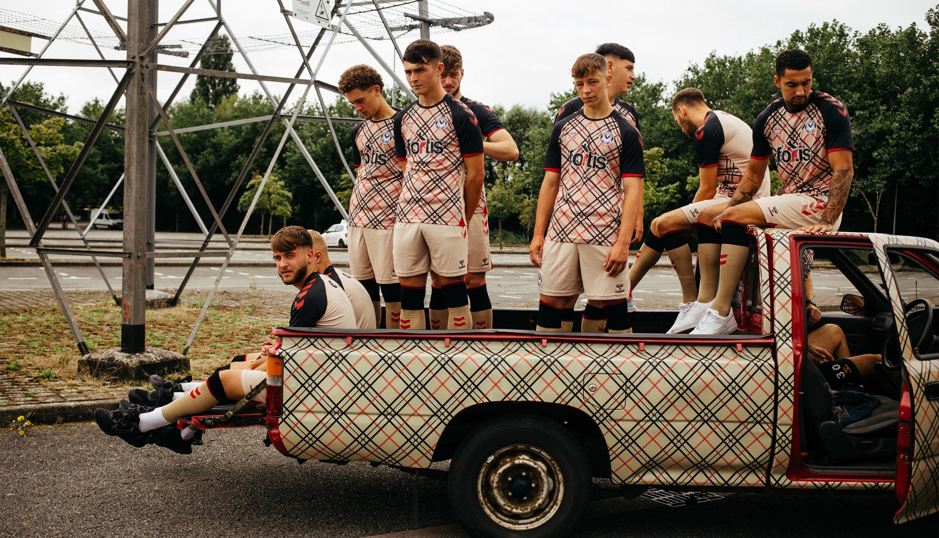
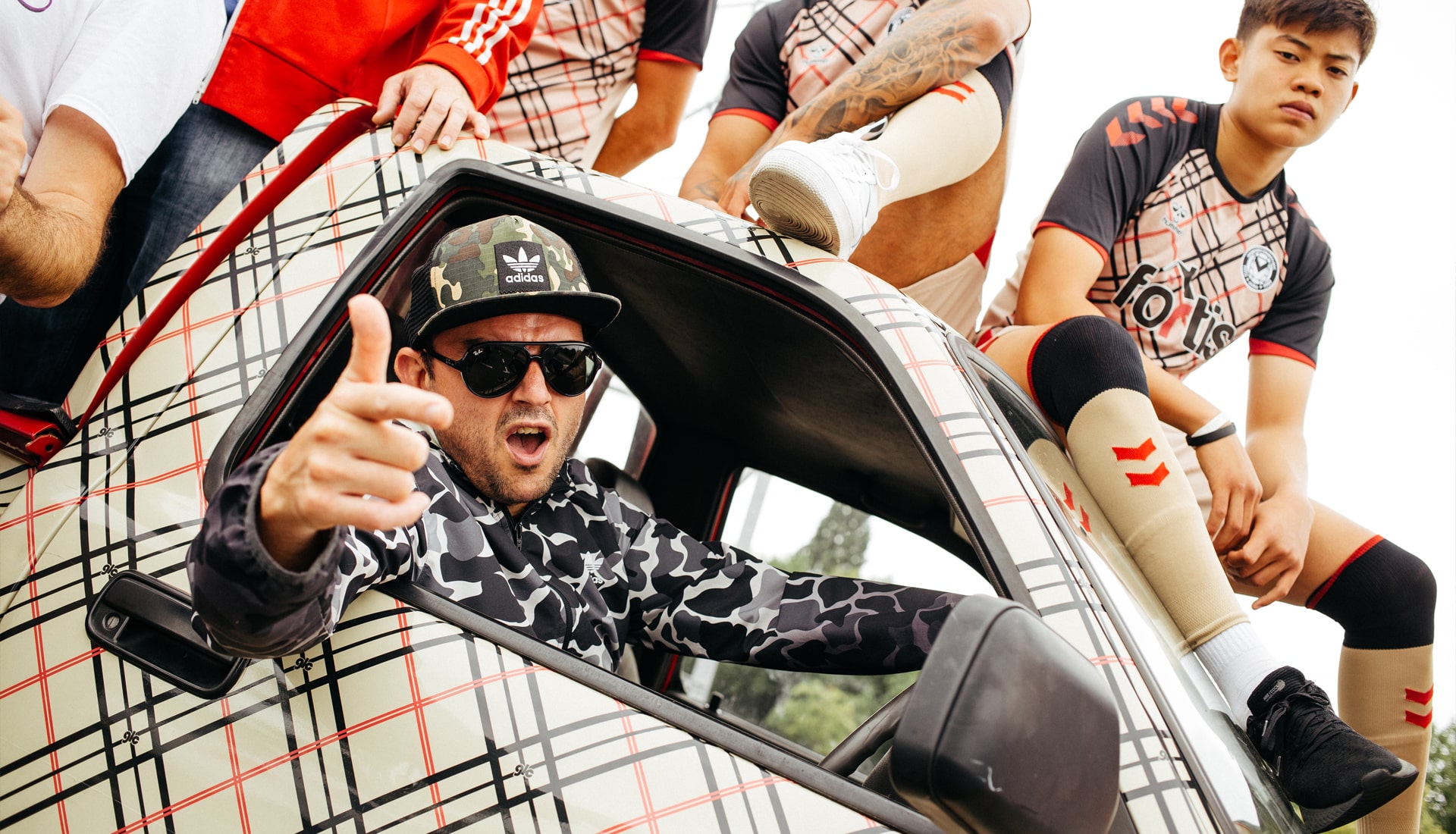
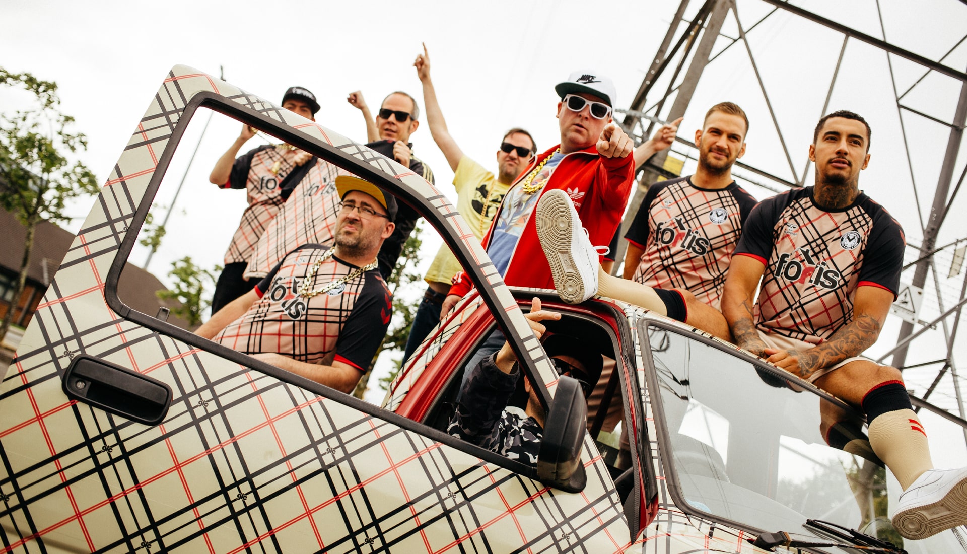
Rolling the clock back to 2004, Newport County, in conjunction with technical sponsor Hummel, have unveiled their new 21/22 Goldie Lookin’ Chain-inspired third shirt.
Back in 2004, Newport County teamed up with the legendary hometown group Goldie Lookin’ Chain to produce one of the most iconic and collectable football jerseys around. To celebrate the city's unique heritage and culture, the Exiles and GLC have decided it’s the perfect time to celebrate the famous jersey and bring it back up to speed for the 21/22 season.
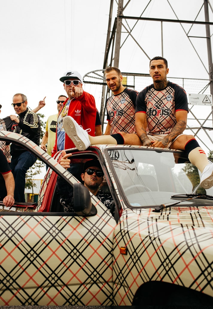
Featuring a two-colour heritage check with entwined GLC logos, the design is predominantly sesame and consists of a check pattern, which is made up of red and black lines across the front of the shirt. The club crest has also been modified to a blacked-out special edition to blend in with the rest of the shirt.
We caught up with Creative Director for Newport County, Neal Heard, to find out all about how the shirt came about.
Football shirts have been on one hell of a rise since the 04/05 season when GLC collaborated with Newport County. What's brought the two forces back together?
Well SoccerBible more than anyone has documented and led how the whole jersey culture scene has grown and morphed, in fact you could say that they (along with others like me) have led to the creation of the new – but now established – culture. With this in mind, with all manner of third shirts/crazy shirts/retro shirts, as the clubs Creative Director it seemed a great time to revisit a shirt which, though semi unheralded at the time, was actually way ahead of its time.
I'm still surprised about how boring and un-thought about the majority of kits still are. I know clubs and brands 'play' with their third kits but for me this misses the point."
How did it all come about?
Well taking all the above in mind, the club, which is now much more professional both on and off the pitch, wanted to celebrate the clubs new footing and also give the fans both of the club and those who just dig good shirts something to celebrate and so reached out to the band, also from the same city, who were enjoying a renaissance to see if they wanted to revisit the story and bring it into roaring the 20s.
The inspiration – high fashion meets suburban culture – can we say that? How would you describe it? Football can be pretty serious – there's a lot of playful energy about this launch isn't there?
It's a funny one but to all of us, this design just seemed to be in all our minds. Football can be pretty serious and to be honest the shirt design offerings out there sometimes take themselves too seriously.
GLC were all about acknowledging a side of the city's culture which maybe people had used to denigrate the place and beat it down, instead, a bit like England fans and football's coming home, GLC found a way to look at ourselves, laugh with it and celebrate it. It's kinda the mood of the city's population: we ain't here for a long time but for a good time!! So the club has to be applauded for buying into this whole attitude and taking this mantra along with the whole enjoyment side of the kit and its launch. 'A Newport City heritage GLC check' kit seemed wholly appropriate.
It shows what can be done with the design of a shirt doesn't it. Templates don't have to be ordinary. What do you take on the whole third shirt conversation: do you like to see more and more clubs expressing themselves?
Quite frankly I'm still surprised about how boring and un-thought about the majority of kits still are. I know clubs and brands 'play' with their third kits but for me this misses the point, it kinda trivialises shirts, by saying "this one is for the kids and weirdos" whereas they should put more thought into the design of the first shirt.
The shirt from 04/05 was a shirt that will forever be part of football's history where music has played so well into the game. A tough act to follow?
When I published the book ' "The Football Shirts Book – A Connoisseur's Guide' in 2016 it was quite difficult to put any shirts in the shirt and music chapter, especially where a club had actually worked with a band either in design or sponsorship, funny enough two of the only few examples were in South Wales with the county and GLC being one. So yeah, I think the main thing for us was to not just do a lazy copy but to take it on to another conversation. Which I wish most clubs and brands would do instead of retro retro all the time.
What do you think the people of Newport will think of it and moreover, what will the football industry think of it? What kind of reaction would you like to see?
Like I said, Newportonians don't take themselves too seriously, they like to be self deprecating and take the piss out of themselves, and our humour is often self deprecating, it's a Welsh thing so I think 95% of them will totally get it and think it's great. That or I'm in for a kicking next time I'm at Dave Parade!
Newportonians don't take themselves too seriously. They like to be self deprecating and take the piss out of themselves, and our humour is often self deprecating. It's a Welsh thing."
Hummel has obviously been supportive of the process but for the club to do something like this, it's fearlessly lovable. You've got to respect them for celebrating their locality in this way. Do you admire clubs that do things like this?
I have to take my hat off to Hummel, the brand is back and leading the way with lots of great designs and has become a brand where if your club signs with them, you're happy, for me that's the best accolade. They did a great job with this design and both they and the club need to be applauded.
It's not all about the jersey – socks and shorts to match, to see something like this on the pitch is incredible, isn't it – how good will it be to see that on pitch?
I honestly can't wait to see this ensemble on the pitch and just hope we have another cup run so we can give it a nice prominent airing as it deserves to become one of the iconics....
The Newport County 21/22 third shirt is available at newportcountystore.com


