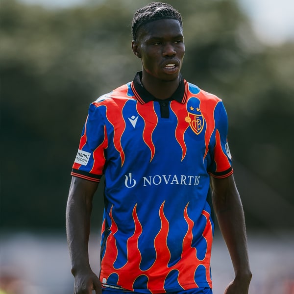
We’re now well into the 22/23 season, and most teams have now revealed and debuted their away kits for the campaign. So what better time to reflect on the best of the bunch? Here, we pick out our top 15 from across Europe.
Having already revealed our top 15 European home shirts for the season, now comes the away list, and it’s here that things start to get a bit more spicy. While home shirts have to bow to tradition, away gets a bit more play. Designers can experiment a bit more with colours and they can introduce a bit more flair if they dare. Lists of the best shirts will always be subjective, and we appreciate that you may not totally agree with this one. But you’re not going to change our minds – this is final. Tin hats on, let’s go…
15. Coventry City
Sure not to be a colour scheme that's to everyone's taste, but the Coventry City away shirt is a bespoke design from Hummel, based on the away shirt of the 1995/96 Premier League season. The purple stripes are created using three different remakes of stained-glass panels from the city’s iconic Cathedral, which celebrates 60 years since its consecration this year.
14. Juventus
The black base features a sublimated tonal graphic that takes on the iconic stripes of the Old Lady, while the dark design also puts added emphasis on that striking 'Jeep' sponsor logo.
13. Crystal Palace
Palace once again have a nice connection through their three kits from Macron this season. Sure it may look a bit like a kid has gone wild with his crayons, but we're loving the alternative approach to the club's traditional look, especially on the white base.
12. Eintracht Frankfurt
Hard to pick up on the detail of the Frankfurt shirt when it's on pitch, otherwise it certainly would've deserved a higher rank. As it is though, it's still a great design, worthy of a place on the list.
11. Parma Calcio 1913
Errea have nailed Italian side Parma's kits this season, putting a contemporary spin on the club's traditional looks through a simple strike effect that was present on the home shirt's cross, and again here for the away shirt's hoops.
10. Celtic
Scottish champions Celtic kick off the top 10 with their smart design from adidas. Thin green stripes on a black base is an update on a classic look that was last used in the 1992-94 period.
9. Inter Milan
Remember what we were saying with not being able to see the detail of the Eintracht Frankfurt shirt on pitch? Yeah, well Inter take it to a whole new level, through no fault of their own. It seems UEFA regulations have stood in the way of the unique globe print, which has had to be toned right down for European matches as a result. Shame, as this would have ranked higher otherwise.
8. Brondby
The Danish side's fastest selling away shirt in their history, the Brondby away shirt is predominantly blue with yellow trim, with an eye-catching all-over graffiti pattern that celebrates the rich culture of the club and its fans. Hummel doing their fellow countrymen a solid.
7. Venezia
While some may argue that this is not at the heights of last season's away shirt, it is still an incredible design that stands as a completely bespoke look, equal parts football shirt and fashion piece. Bellissimo.
6. Liverpool
The Reds' wavy away shirt looks like a living organism, constantly shifting in scope. One of the best aspects of this shirt is that the pattern is printed across the fabric prior to the construction process, meaning that every shirt will feature a different element of the pattern. If that's not unique then we don't know what is.
5. Norwich City
There's just something about that combination of gold on maroon that works for us. The subtle pinstripe hoops add to what is probably the best of three absolutely belting designs from Joma for the Canaries this season. And yes, we're annoyed that we couldn't get a picture of just the shirt, sans model...
4. Arsenal
Continuing the trend of beautiful away shirts that have become synonymous with the club's relationship with adidas over the last few years, this one combines a bronze cannon badge and bronze metallic trims with shades of black and carbon that showcase an AFC all-over graphic inspired by the Arsenal lettering that fans pass on their way to Emirates Stadium on matchdays.
3. Barcelona
Yep, we'll be the first to admit that we really weren't sure when we first saw the Barcelona away shirt. But since then it just hasn't stopped growing on us. The beautiful detailing, the tone of gold, the link to the Olympics... it's all there and it also looks better on pitch than we thought possible.
2. Manchester United
United have a long history with white alternate shirts, so this was already a winner for most. But it also comes with two-tone black and red Three Stripe details featuring across the shoulders and through that smart collar and cuff detail, ensuring all three core club colours come together through the kit. United back to winning ways? Certainly in the kit department they are.
1. Ajax
We will beat this drum until the cows come home: adidas and Ajax just don't do bad kits. It's one of the most consistent partnerships in the game, and it once again delivers, with a design that combines a dark navy base with red and gold details. Looks even better as part of a full kit as well.
Shop all 22/23 replica at prodirectsoccer.com


