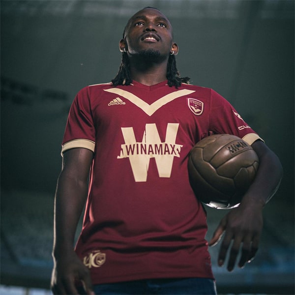
Enjoying a traditional feel, Adidas launch the Girodins de Bordeaux 23/24 home shirt, which features a wider chevron and centralised club crest and branding.
Bordeaux are one of those teams that boasts a unique identity, thanks in most part to the iconic chevron that dominates the look of their jersey designs. But while being unique is all well and good, such an element can some times cause issues for designers when they’re trying to freshen up the team’s on-pitch threads. However, adidas have nailed the Bordeaux 23/24 home shirt thanks to a simple switch up of the traditional elements.
Centralising both the Three Stripe branding and the club crest, which comes riding in atop of that iconic chevron, which itself has been widened, adidas has created a design that has a pleasing symmetry to it. The lack of a sponsor leaves a clean feeling to the aesthetics, and it’s one that we can only hope continues. Like last season, the Club and adidas have chosen a pronounced navy blue as the base tone, and it works perfectly for the white accents to play across, with the chevron being joined by Three Stripes on the shoulders, a simple detail on the sleeve cuffs, and a white border that runs down the sides and along the hem, framing the whole thing. Tidy all round.
Shop the Bordeaux 23/24 home shirt at boutique.girondins.com


