Liverpool and adidas have a strong history together, having enjoyed two successful partnerships in the past. Following news that they are set for a third stint together after next season, we’ve rounded up five kits from the archive that are ripe for a remake.
OK, so Liverpool’s season may not be ending the way many fans would have wanted, Jurgen Klopp’s tenure ending with a whimper rather than a roar, but if you’d given the option of a top three finish at the start of this campaign, most would’ve bitten your hand off. So, with the last few games likely set to play out in mildly underwhelming fashion, attention starts to drift to the future, and following the news that adidas are set to rekindle their relationship with the club for a third time following the conclusion of Nike’s deal at the end of the 24/25 season, we’re taking a look at some of the best kits from the archive that could act as inspiration for upcoming kits from the Three Stripes. Sure, we all want something original and progressive, but there’s also space for nostalgia done right, and with a minimum of three kits per season, there’s room for both.
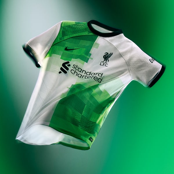
Straight off the bat, two of the most iconic shirt designs in the LFC x adidas back catalogue would be the 89-91 away and the 95/96 away, but both have been done fairly recently by New Balance (18/19 third for the former, and 17/18 away for the latter) and Nike (and 23/24 away for the latter). Therefore we’re discounting those two and are looking elsewhere…
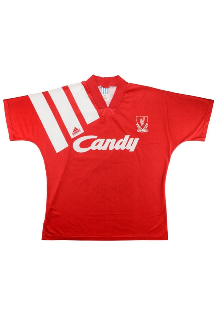
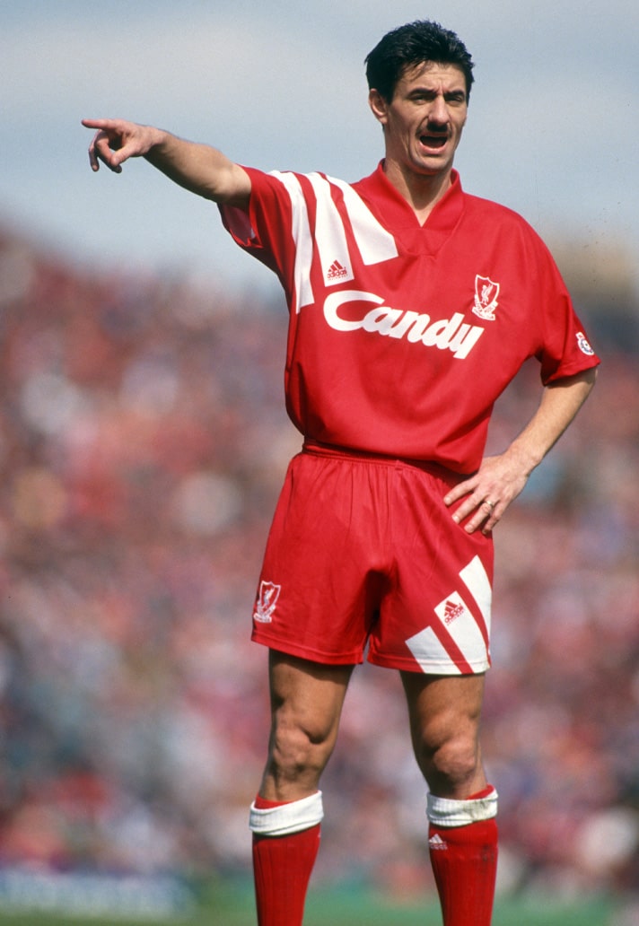
1991/92 HOME
Kicking off with when branding was big, bold and unapologetically brash. This here was the kit that Liverpool wore in the first Premier League (Premiership) season, and what better way to announce that you’re back with a club than to make the Three Stripes the central focus, plastering it across the shoulder like that? Statement.
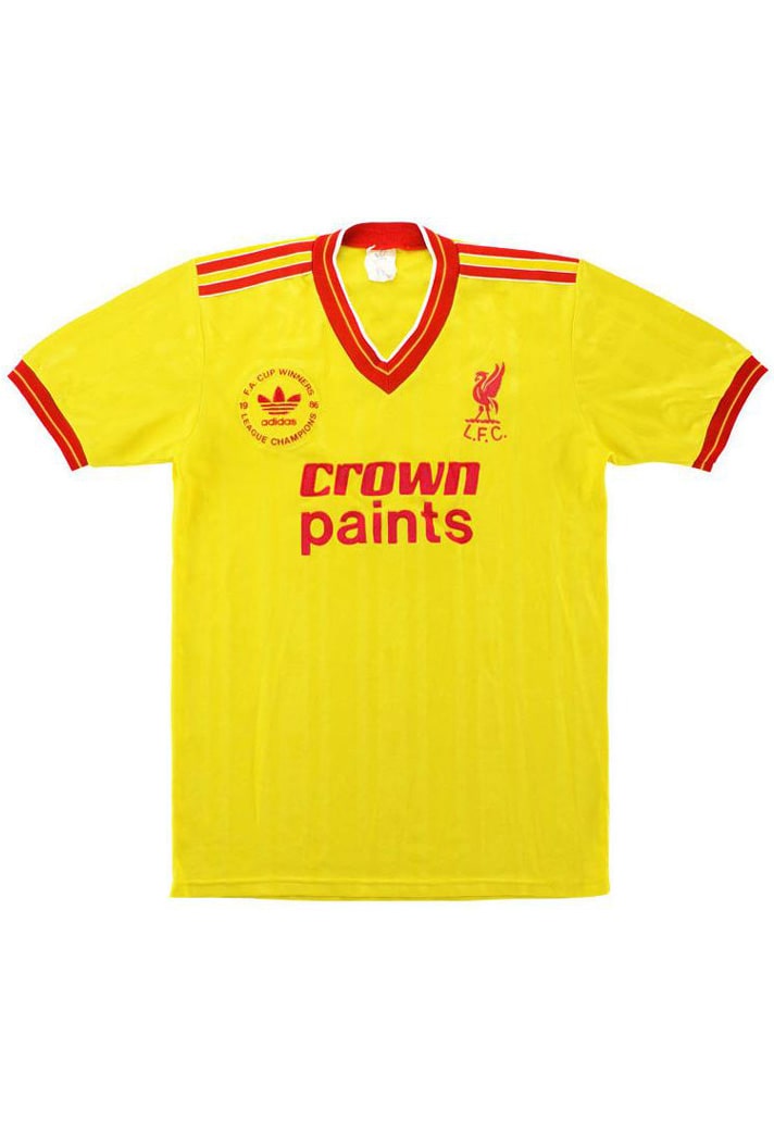
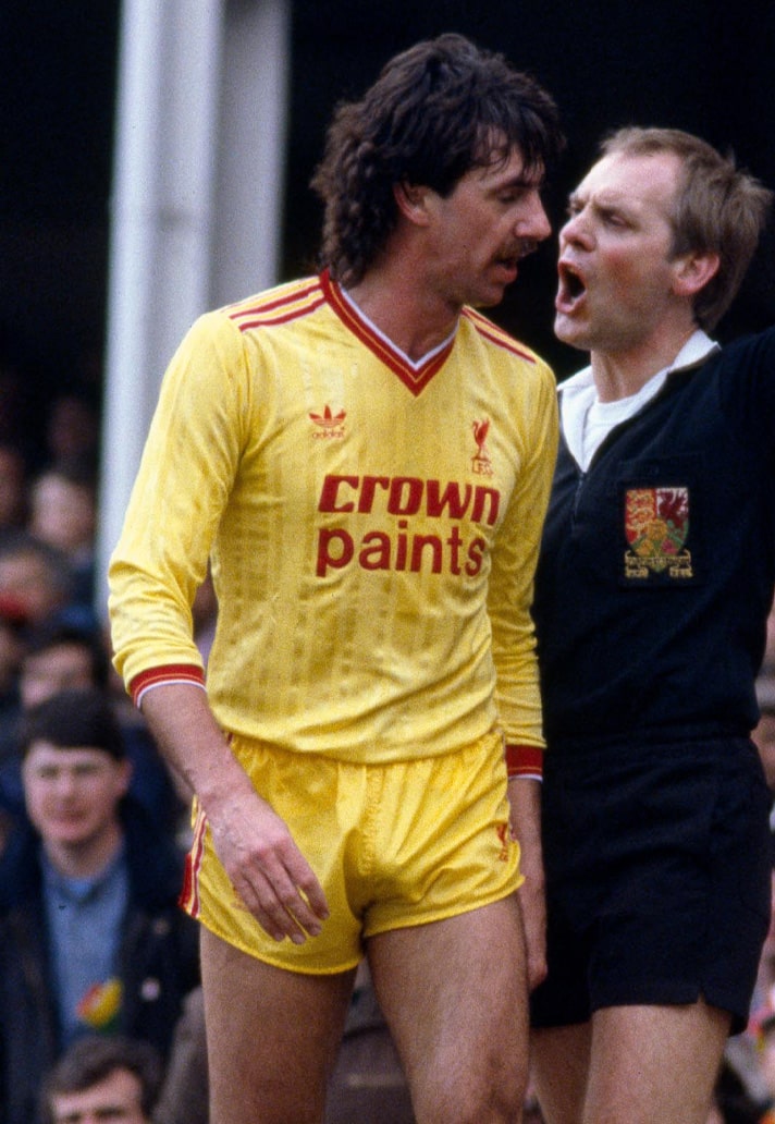
1986/87 THIRD
Right, if we can ignore Mark Lawrenson's rather short shorts and barely concealed package and focus on the shirt, what we've got is one of the club's best yellow kits in their history. Beautifully retro, with some lovely sublimation and that Trefoil logo. Would also take the away from this season, which followed the same template but in white with red trim.
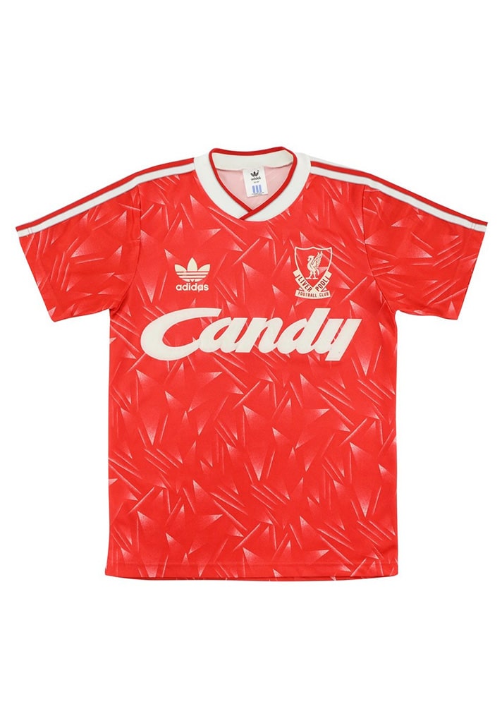
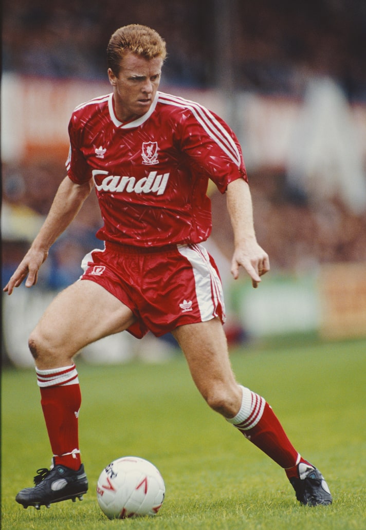
1988-90 HOME
One of the more 'out there' designs in Liverpool's home shirt history, and is absolutely of the era, but a modern reinvention of this design could absolutely work, again, with that Trefoil logo in place, of course.
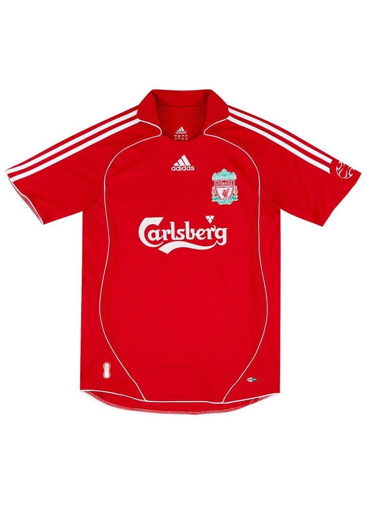
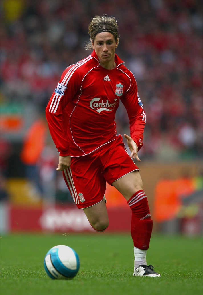
2006-08 HOME
Screams prime Fernando Torres: worn long sleeved, untucked and paired with white socks, hairband and T90s and you've got the look of a generation right there. Too soon for a remake? Just a hint of that Teamgeist vibe, stick a collar on it and we're sold. Just need Nike to rerelease the T90 now...
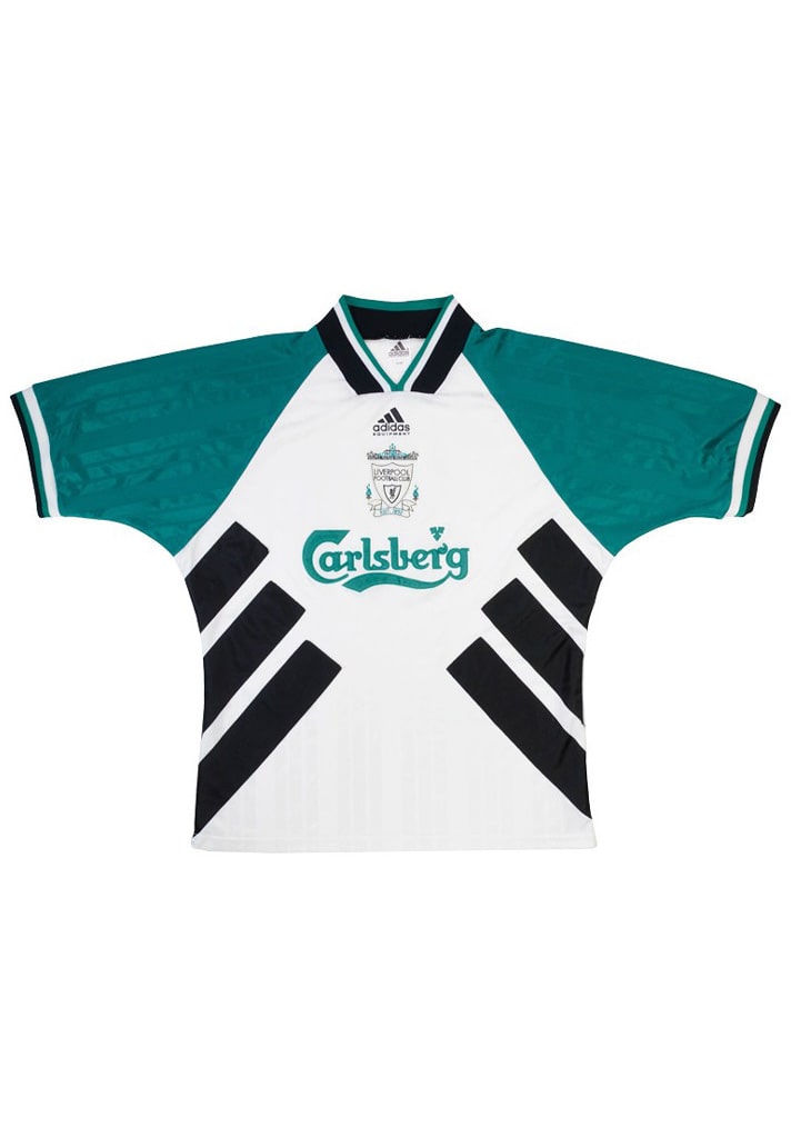
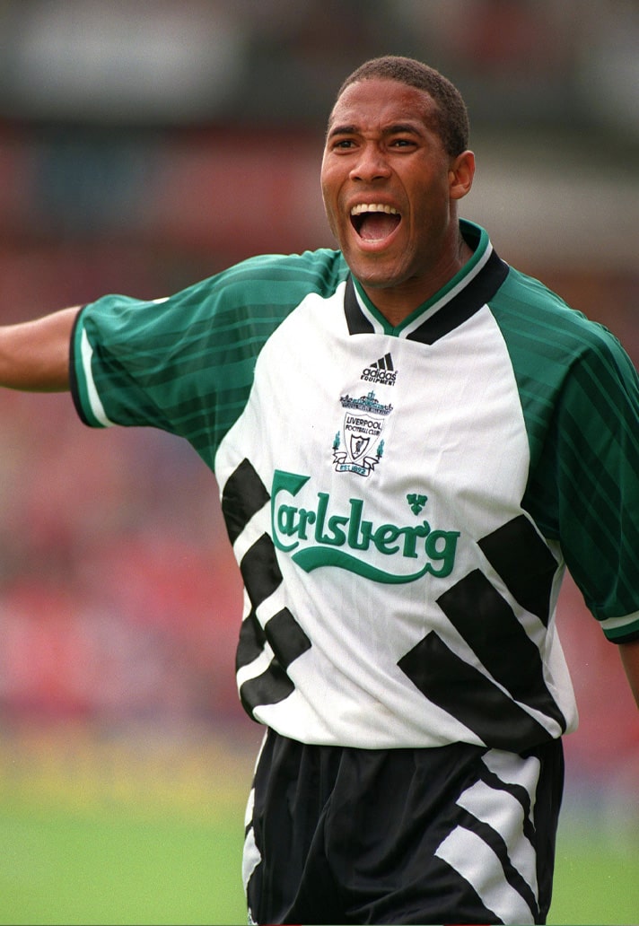
1993-95 AWAY
OK, so if we're discounting the iconic 95/96 away due to it having been done before, then there's only one place to go, and that's a year earlier and peak EQT era. There's not much better than the adidas EQT designs, and we'd love to see them make a return. Would also take the home shirt from this era which, again, was the same template, just in the club's traditional red and white. Stands out more like this though for us.
One more season of Nike shirts to go for Liverpool before we see what adidas have in store...

