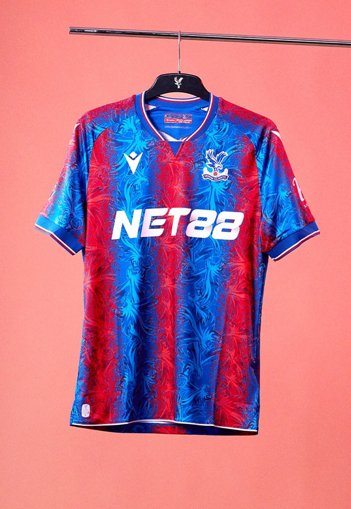
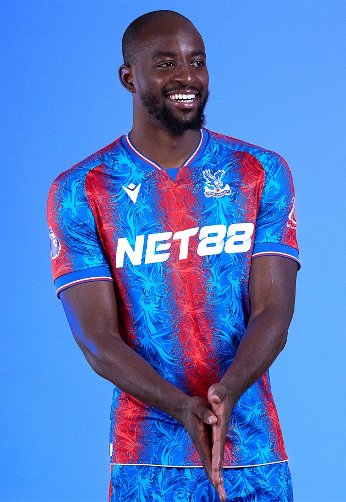
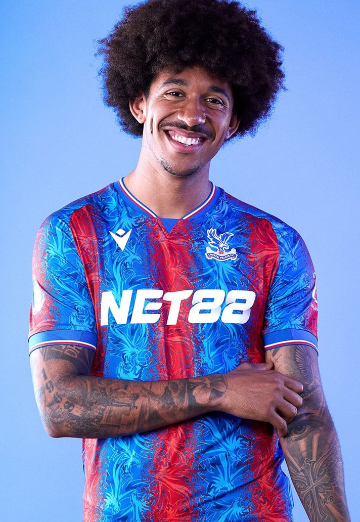
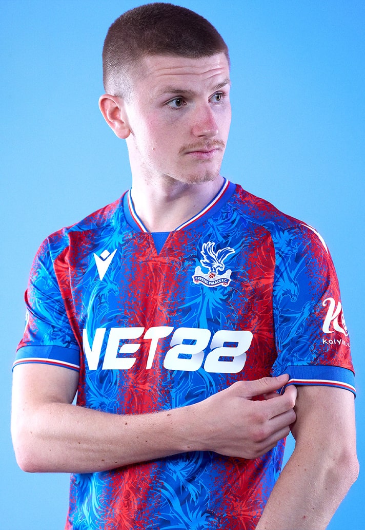
Coming out of nowhere with what we feel is a lowkey contender for shirt of the 24/25 season already, Macron and Crystal Palace have dropped their new home shirt, which pays homage to 100 years of their home ground, Selhurst Park.
Following last season’s 50/50 split design, for the 24/25 season Crystal Palace go back to their traditional red and blue stripes, but they come with an eye-catching difference. Rather than plain old stripes, Macron have presented the stripes with a contemporary twist, embedding the eagle from the club’s crest within in a repeating graphic. It’s bold, brash, and we love it. The look is finished off with a fine red, white and blue trim sported around the collar and sleeves, with matching shorts. As part of the club’s celebrations to mark 100 years since the official opening of Selhurst Park, the kit also features a commemorative ‘stamp’ on the back collar of the shirt.
There was a mixed reception for the kit upon its reveal. Whilst we understand that there will be some purists who find this a little too far outside of their comfort zone, for us in the SoccerBible office, we can’t help but applaud the bravery of the design, which treads the line of progression and tradition to perfection. Beside that, we can’t help but feel that if this was, say, a Barcelona shirt, then there would be a far wider acceptance and appreciation (subbing out the eagle for something more relevant, of course).
As it is though, Palace are a more niche club, and Macron is a smaller brand than a Nike or adidas, so it’s easier to hate on them both. But, we also understand that jersey culture is an objective field, and one man’s work of art is another man’s scribble-fest, and that’s fair enough. This hits the right notes for us though, and combined with how Oliver Glasner had Palace playing on the back end of last season, and its an exciting time for Palace fans.
Pick up the Crystal Palace 24/25 home shirt at shop.cpfc.co.uk

