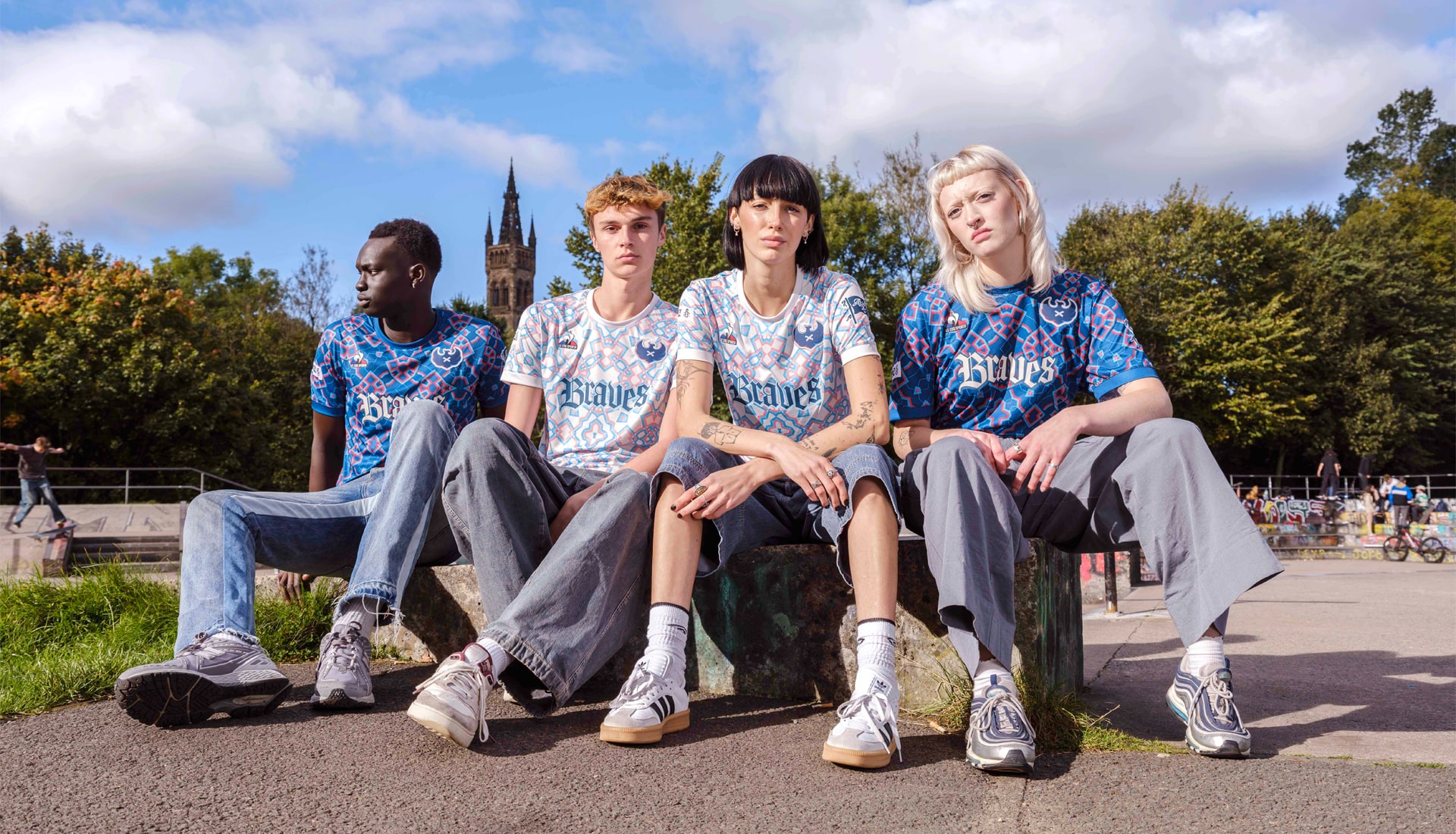
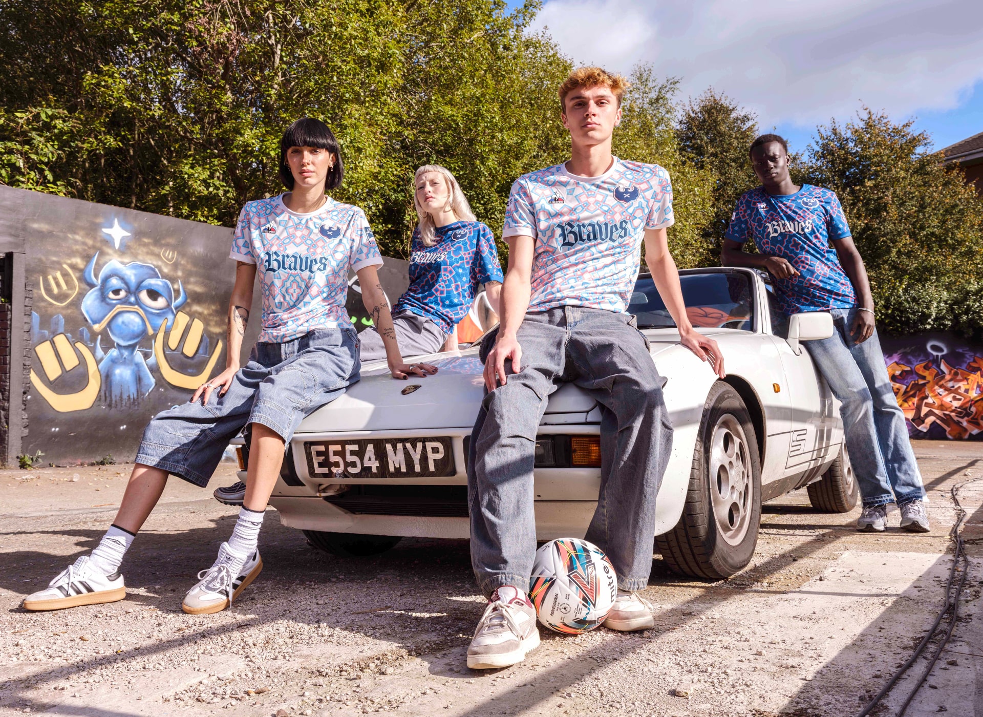
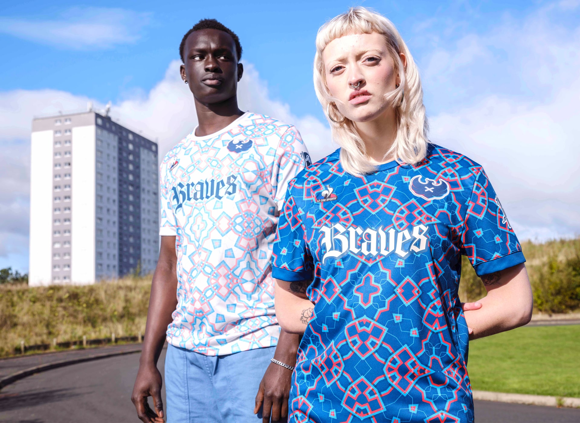
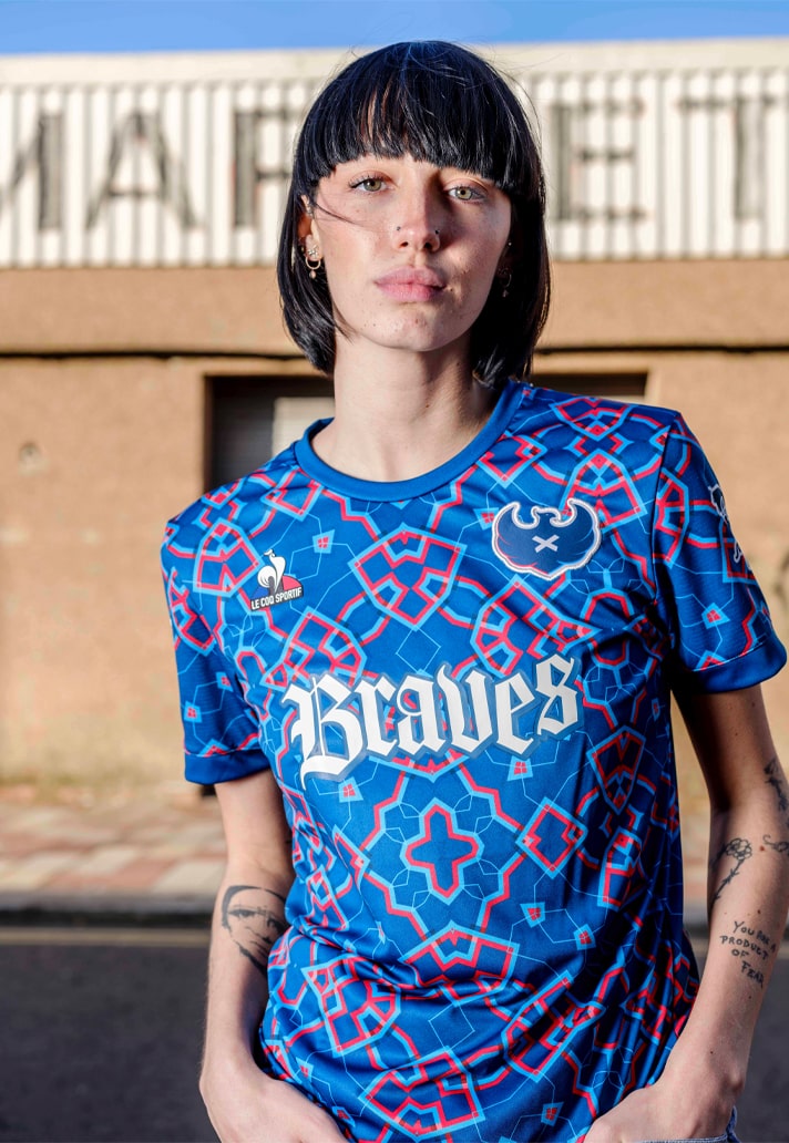
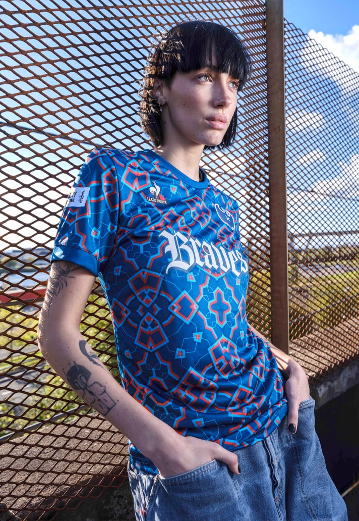
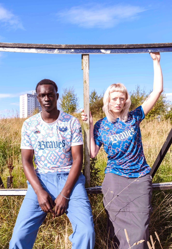
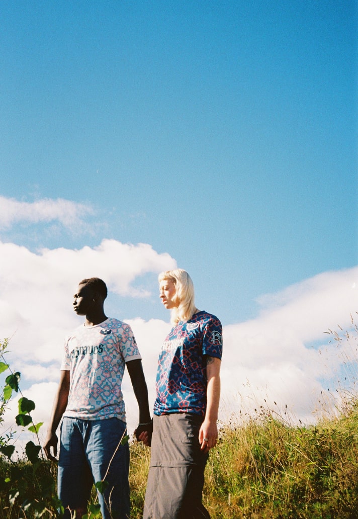
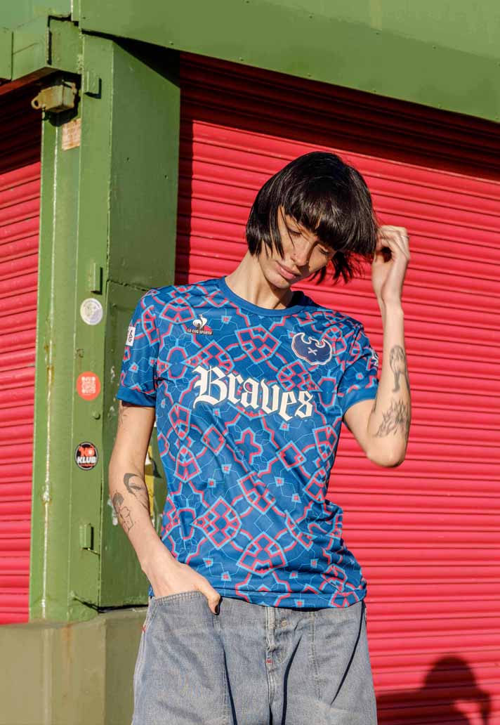
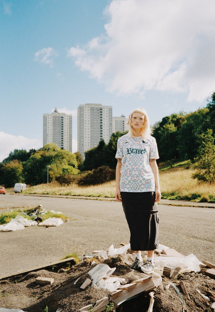
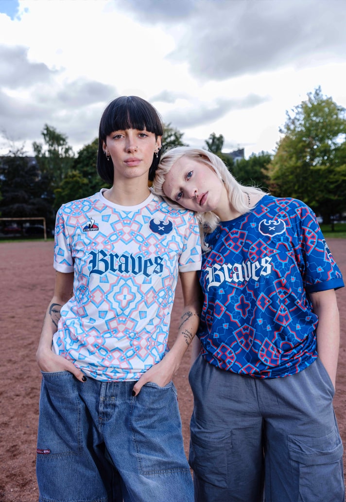
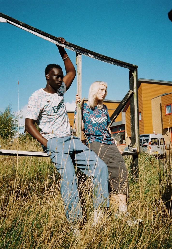
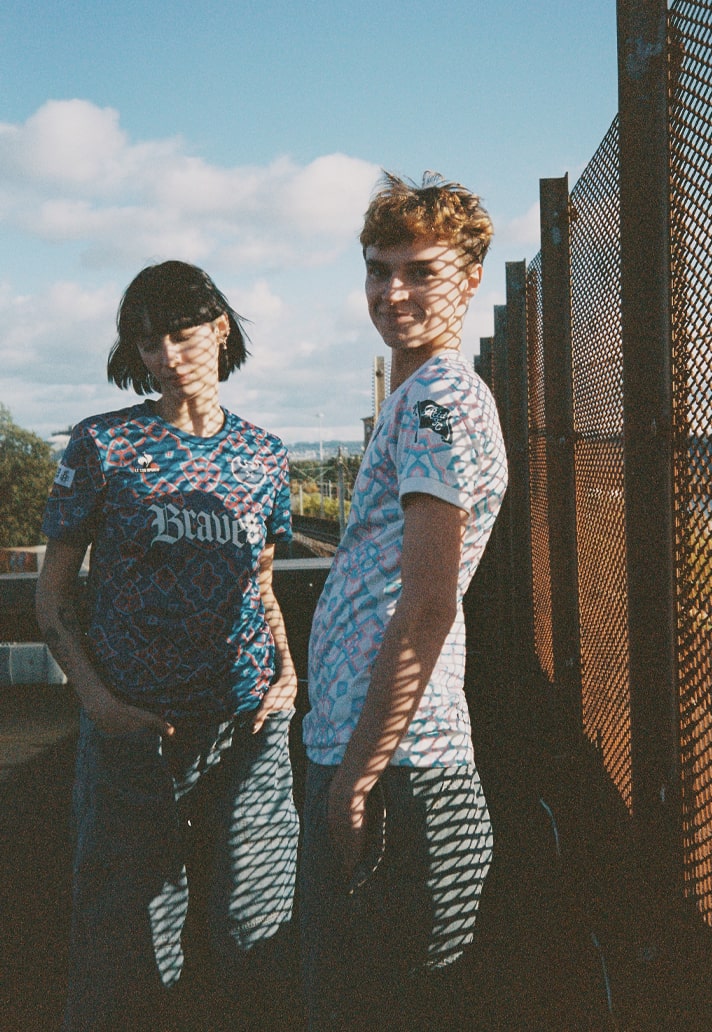
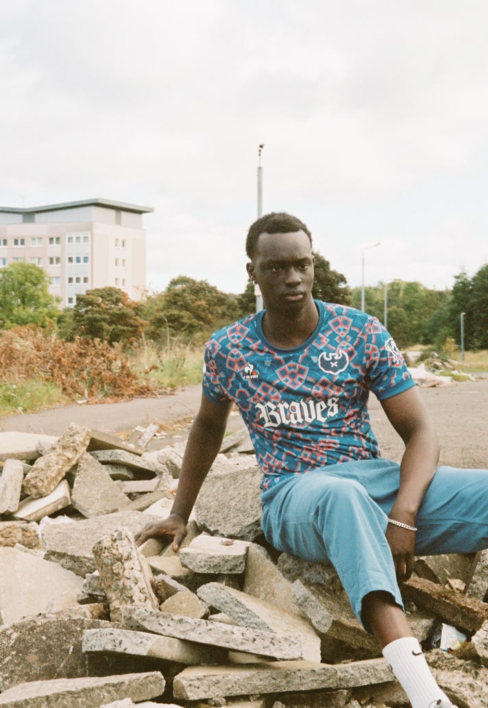
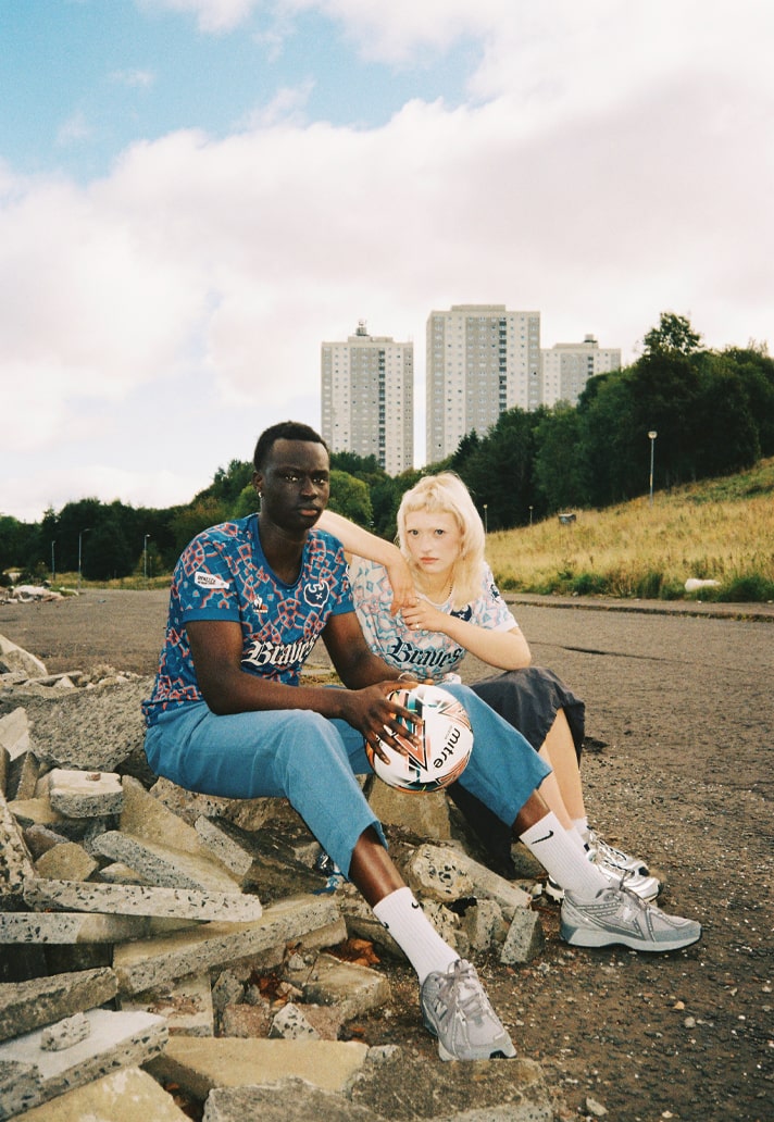
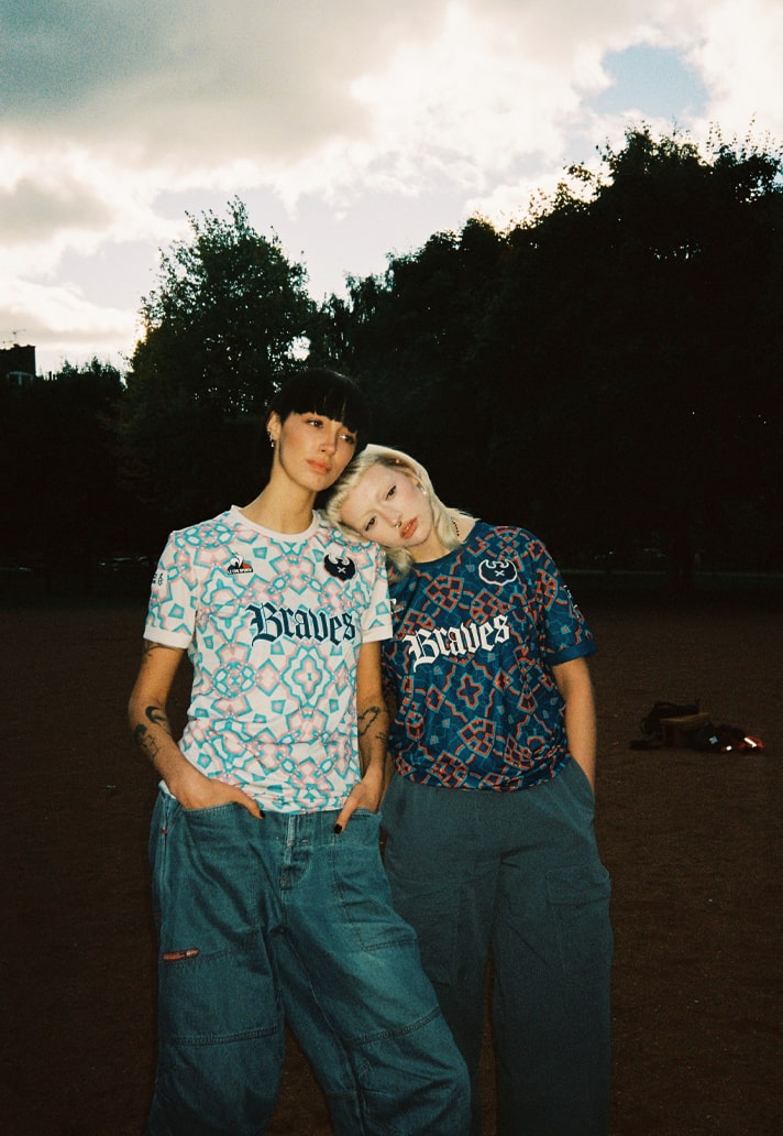
Scotland’s youngest professional team, Caledonian Braves, have just dropped two of the most attention-grabbing designs of the 24/25 season, and we touched base with Chris Ewing, Braves’ founder and Chairman, and Ed Cowburn, Acid FC’s Founder and Design Director to find out all about them and the club.
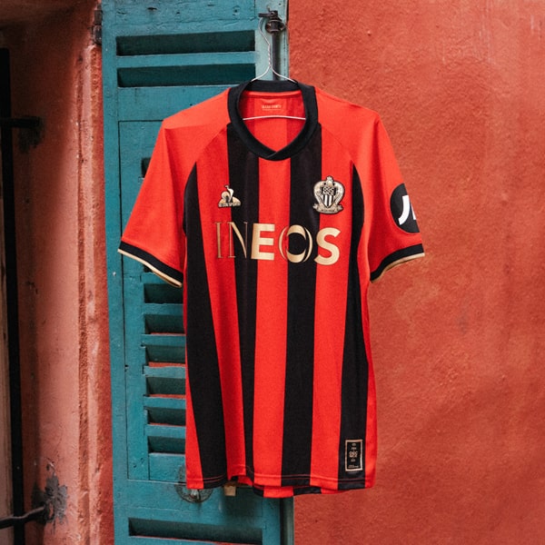
Every season a kit drop comes out of pretty much nowhere, slapping you in the face and demanding your attention by breaking tradition, bucking trends, and bringing something entirely fresh to the table. Last season it was Isthmian League North Division side Walthamstow FC, and back before that it was Red Star Paris. And this season, it comes in the form of Caledonian Braves – Scotland’s youngest professional club – and Le Coq Sportif, who make a welcome return to the UK market. And the connecting thread between these kits? Well, that’ll be design studio Acid FC.
So, there’s a lot to unpack here. Let’s start with the club itself. “It all started in 2004 as I stood holding a pint in the Glasgow School of Art when a French girl on an Erasmus exchange programme complimented my T-shirt.” As good a start to any love story, that, coming from Braves’ founder and Chairman, Chris Ewing when we spoke with him recently. And so it has grown to be that, fuelled by passion, the Braves, who were founded in 2019 and currently play in the Scottish Lowland League, are going about making their mark in the world. Like any five year old, they’re finding their feet and trying to figure out exactly who they are, but thankfully they have some responsible adults to guide them in this journey, namely the 5,500-strong (and growing) ownership group (including notable shareholders such as the Boston Celtics coach, former NBA players, and even NASA members) who’ve invested over $1.5 million to support the club’s ambitious aim of reaching the top tier of Scottish Football.
“‘Community’ is the buzz word nowadays, but what if we flip that narrative and show that you don’t need to rely on a specific geographical location to be a community club?” Ewing explained of his radical approach to football club ownership. “What if we can create a community of people around the world who share the same values and ambitions? Opportunity is my favourite word in the English language and what an opportunity we have. One like no other and one which is rarely seen in football.” It’s an opportunity that he’s clearly grabbing with both hands now that the previously mentioned pint is but a distant memory. “We’re proving to people that you don’t need to be a millionaire to own a football club.”
So how do you go about putting a club like Caledonian Braves on the map, so to speak? One avenue is undoubtedly to tap into modern football culture in a way that perhaps some of the more traditionally rooted clubs may not be so keen to do. “How do we compete with other, more established clubs in the West of Scotland?” Ewing muses. “The football x fashion space is really exciting at the moment. I have often said that I would like Caledonian Braves to be relevant and to be about more than just a game of football on a Saturday. Hopefully we can do that by speaking to people in a language that they understand and for most people that’s football, music, fashion and art. If we can bridge that gap and enter into that space with the Braves, we would be delighted.” And that’s where the new kits come in.
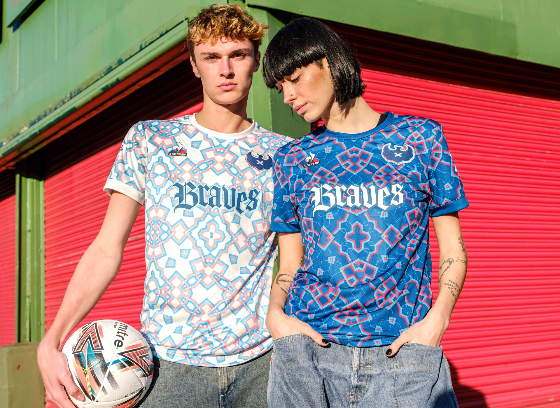
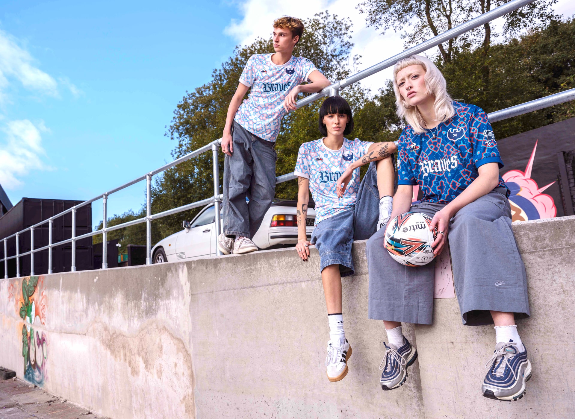
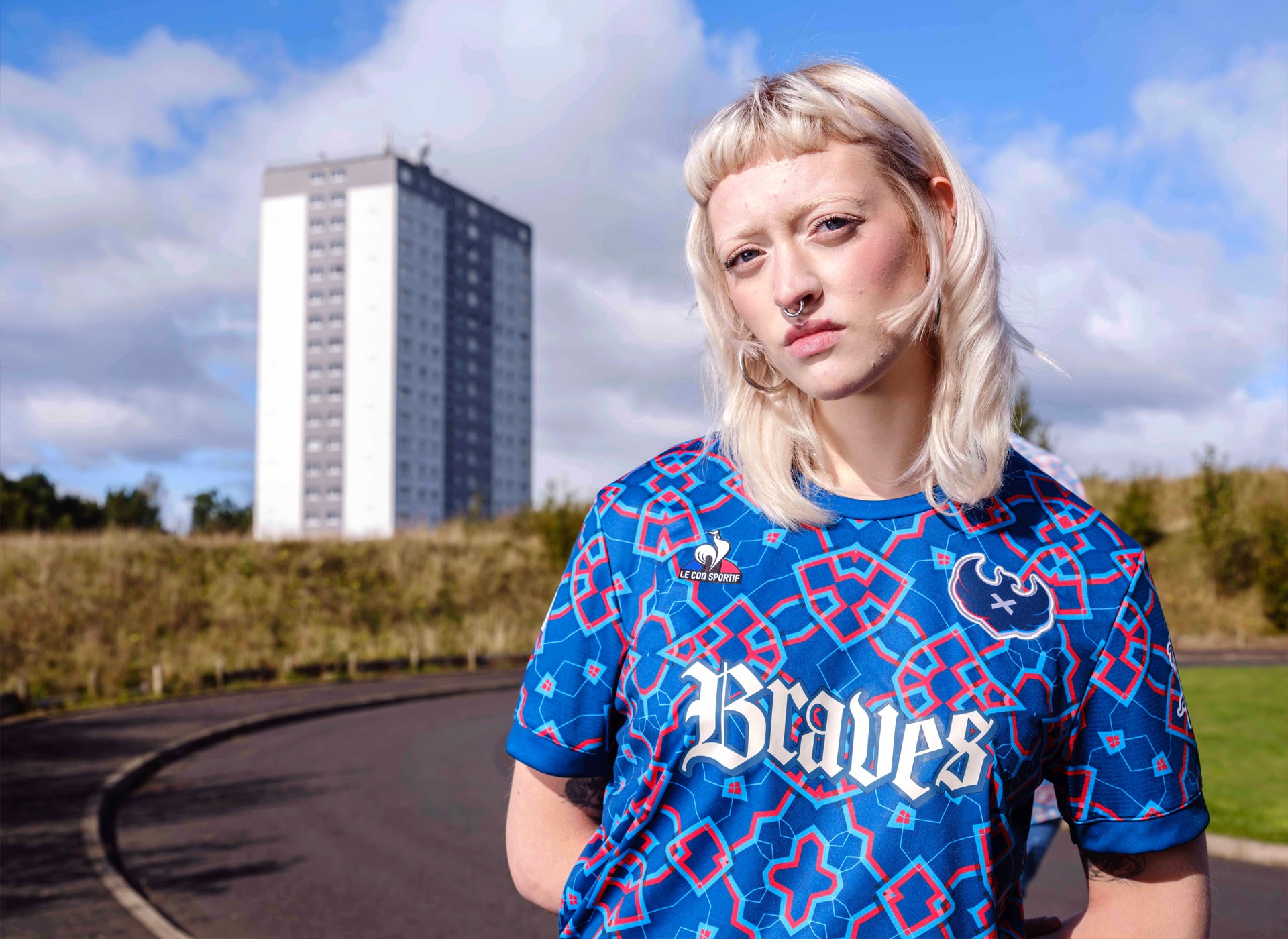
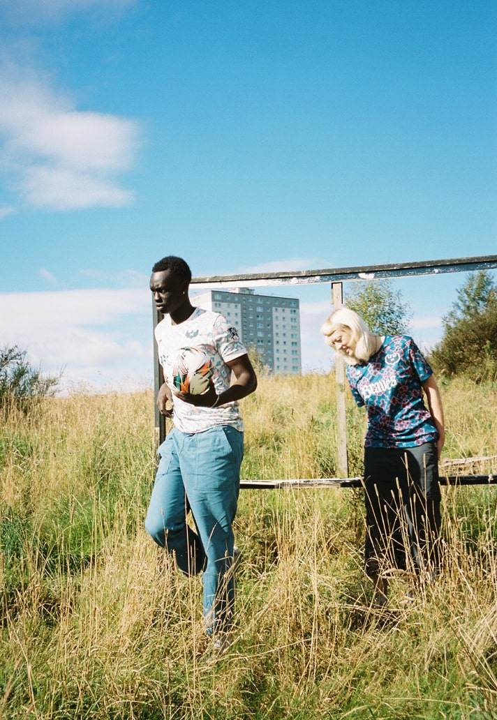
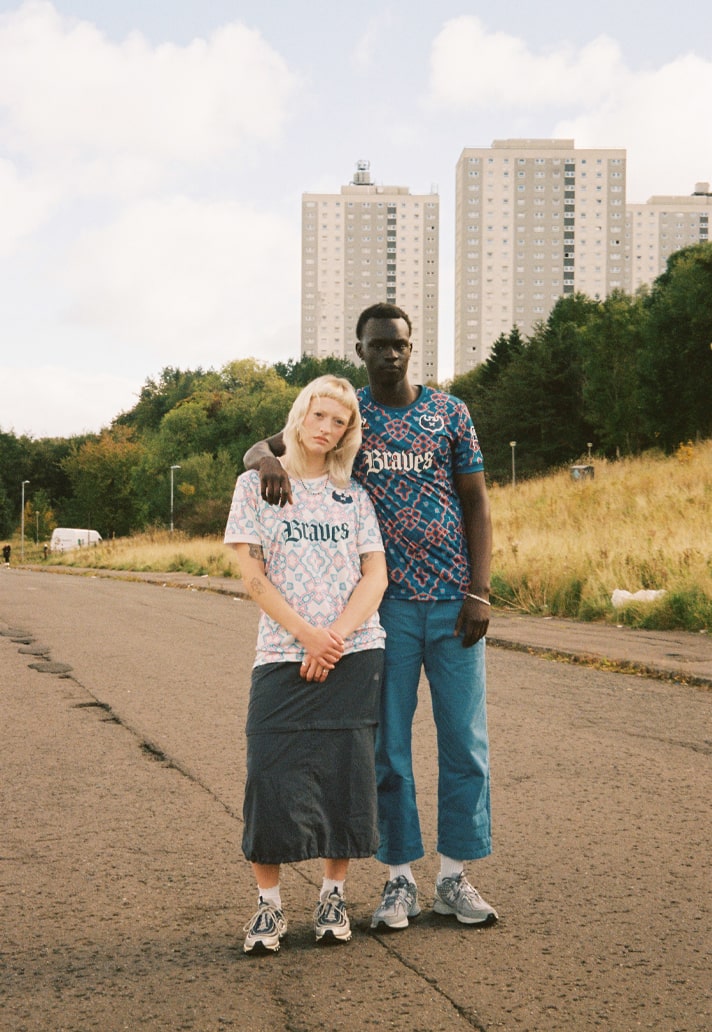
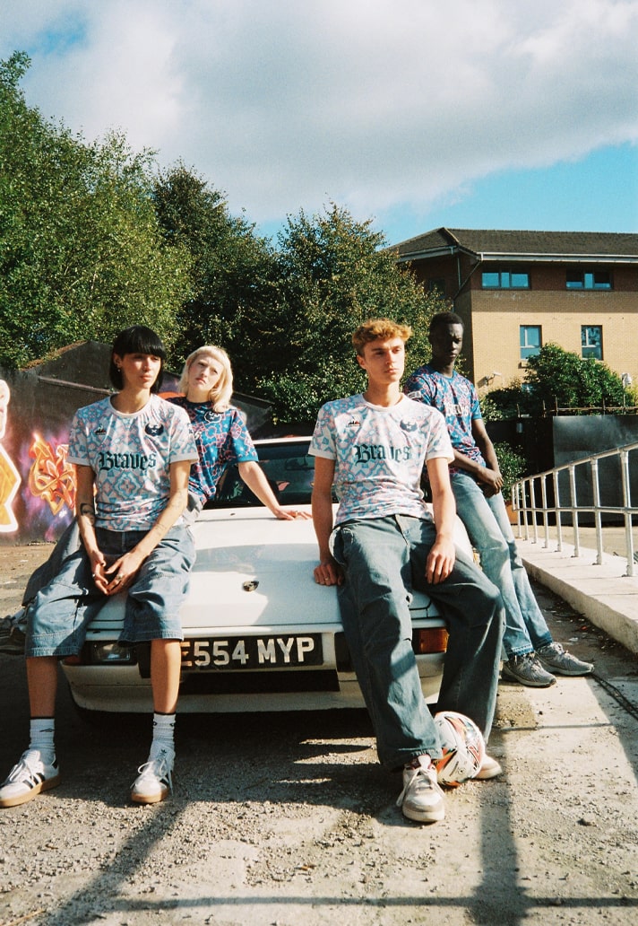
So, where do you start with them? Easy. You take something Scottish – tartan. Not the stale, moth-eaten stuff your grandda wears, but something fresh, raw. Something with a pulse. You riff off the French Tricolore. Why? The Braves came out of Paris, the Edusport Academy. Young, hungry French kids shipped to Glasgow to grind out their future (“Young French footballers coming to Glasgow to learn English – there’s a touch of irony in that maybe,” Ewing says, chuckling). You slam the two worlds together until you get a new tartan one that’s pure F-you energy wrapped in a punk ethos, because nothing says “new blood” like reworking the old into something unrecognisable. “We were keen to create a kit that could transcend the terraces onto the streets; one that represents a modern Glasgow, a disrupter, working class and not afraid to take on tradition.” Job done. But Ewing can’t take the creative credit here. No, that’s all Acid FC.
“Living in Paris, I know Red Star FC quite well and have always admired the work that David Bellion does there,” Ewing said, elaborating on just how Acid FC became involved. “On the back of Acid FC's recent collaboration with Red Star, I reached out to Ed (Cowburn) to see if he would be interested in getting involved with the project. We had a few zoom calls but after our first face to face meeting in Wetherby Service Station, I knew Ed was the man for the job. We hit it off immediately and I was reassured that he understood exactly what direction I was trying to take the club.”
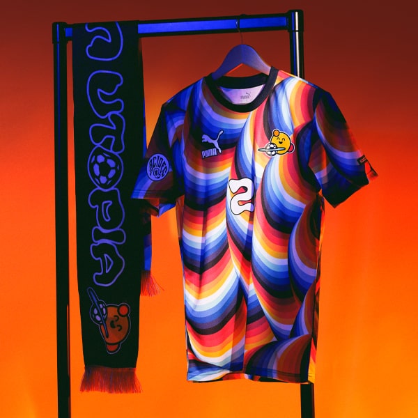
Acid FC is a design outfit that’s close to our creative hearts, after we worked with them back in 2019 on our Utopia collection with PUMA. But since then, their journey has continued on an upward trajectory, and we touched base with Founder and Design Director, Ed Cowburn, to get the inside track on it all, from creating kits for your home town club, to designing a new visual identity for one of the most exciting new clubs out there.
Acid FC has been a force in football kit design for a good few years now. Give us a brief overview of your journey and what you’re about?
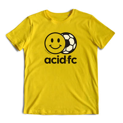
Acid FC started back in 2018 as a creative outlet for me to explore football culture and play with bold designs. It was just on Instagram and a side project from my day job of running a cycle wear brand I founded in London. I hoped that it could lead to doing things in football as it's my real passion and I always felt it was my true calling.
Thankfully, others saw the potential too and I got a random call from David Bellion – Creative Director at Red Star FC in Paris in 2019 and we got to design their kits for adidas. It's become a bit of a cult classic with its wallpaper inspired design that is a history of the club, fans and culture.
Since then we've designed kits for Leeds United, but have pushed more into the streetwear side with collections for St Pauli, Cancun FC, CD Leganes and most recently the Chicago Bears with Mitchell & Ness. Oh, we also won a D&AD award for the kit we did for Walthamstow FC, which used a William Morris wallpaper print as the basis on the design. To my knowledge a first in kit design.
You’ve worked with Leeds United a couple of times in recent years. As a Yorkshire lad, how much of a dream come true was that?
I still have to pinch myself that it happened. As a Leeds fan and wannabe kit designer from an early age – I remember distinctly lying on the floor armed with paper and felt tips watching Football Focus when I was about 11 or 12 – it really was the dream project. To get the call from adidas to come in and pitch a concept that the club green lit and take on all three kits and warm-ups etc. was amazing but with massive pressure. To my knowledge it's the only time a full kit range has been created with a single idea at the centre, in this case the peacock (Elland Road Stadium was originally The Old Peacock Ground, a pitch owned by The Old Peacock pub that still stands opposite the stadium).
I feel a huge responsibility for any kit we create as we are fans and understand that their club is everything, but when it's your club this is ramped up to the top. I know the home kit was a winner as it was super classic, the away was contemporary and the ultimate peacock styling but the third rhubarb and custard inspired mash up was going to get a reaction. And so it proved. There's a ton of deep story telling in the kits, where every design decision has a reason linked to the club history and it's not just about the first reaction when you see the kit. I'm really proud of them.
From Red Star Paris to Leeds to Walthamstow and beyond, the kits you’ve had a hand in developing have been some of the best around. How do these projects come to fruition?
Every project is different and they often take a long time to develop. For larger clubs you're looking at 18 months to two years out from when the kits launch, so it takes a lot of discussion and planning. It takes a lot of hard work on this side of things before we even start designing and a fair pitch of planets aligning. Much of it depends on the individuals like a David Bellion or clubs that have more of a desire to be genuinely disruptive and willing to take a risk and try new ways of creating kits that really stand out, tell authentic stories and make fans fall in love with their club all over again.
Bringing us nicely on to Calendonian Braves – tell us how this one came about?
Credit to Chris Ewing the founder and Chairman of the club. He called us and laid out what the club was about and it struck a chord. They are the punk rebels upsetting the traditional way of things and with no history having only set up in 2019 it's a complete blank canvas to create something. That really appealed as the antithesis to working with clubs with decades of story to play with.
What was the brief that was given to you and how much freedom did you have to create?
Literally a blank canvas. We had full freedom to go away and be Brave (pun intended!). Nothing was off the table.
Tell us all about the design, the inspiration behind it and just how you went about bringing it to life?
Myself and Chris talked a lot about what he wanted the club to be and how broader culture could be brought into the conversation. We discussed Glasgow as an important centre of art and music but also its architecture and the global view of Scotland – as the crowd funded nature of the club with it's "Own a Wee Scottish football club" campaign meant we wanted the design to feel 'Scottish' but in a contemporary way.
The obvious place to start was with tartan and with it's place in fashion and music culture as the pattern synonymous with punk we challenged ourselves to come up with a new way of using that as the foundation. We made a French tartan based on the Tricolore as the Braves had started (and still have links) as a French youth programme to bring talent up to Glasgow to develop and play.
This tartan was then twisted, repeated, broken and reformed to create a new pattern. Something that looks kaleidoscopic but with hints of Charles Rennie Mackintosh, stained glass and pub carpets.
The pattern was then flipped for the away bring in softer tones. It's something we've done before with Red Star and Walthamstow. If you've done your job properly then a design can be used again with alternative colours.
How was it working with the club and Le Coq Sportif? The Braves are obviously fan-owned, so how much input – if any – did they have in the design of the new kits?
They too let us take the lead really. You obviously have to follow their tech packs and guidelines but it was great that they too had faith in us to deliver. To be able to get them back into UK football after a bit of a break is cool and it's a brand I remember so well from Maradona in ‘86.
The kits feature a slightly tweaked and stripped back club crest – Whose idea was that, and was there any opposition at all?
At Acid FC we like to ask questions of clubs and brands about what is possible. If you don't ask, you never know what might have been possible, so we looked at the badge and wanted to strip it back and elevate the phoenix. It's a strong mark and more like a super hero logo than a football club badge. Maybe I can get Chris to invest in a giant spotlight for when they play night matches? [laughs].
Hopefully the fans and owners see the strength of it. I always prefer badges and graphics that have an element of having to ask what it is. If you know, you know sort of thing. Makes you feel part of something special.
Sticking ‘Braves’ in the sponsor slot is a beautiful move, particularly with the added element of movement – again, whose idea was it to do away with a ‘traditional’ sponsor, and were there any obstacles in doing it?
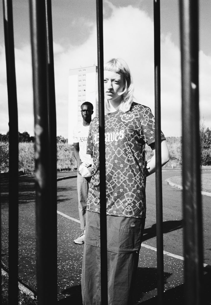
Being able to bring typography into the kit design was important for this project. I think the choice of a classic gothic typeface like this ties in the heritage angle of Scotland's roots which a lot of the new owners have responded to, but also by moving and twisting the letters you get that link to punk. It's dynamic and bold.
We of course talked at length about how it stops potential investment in terms of sponsorship but it was more important that the kits had that total coherence. Plus, we all know how a sponsor logo can have a negative impact on a design.
What’s your favourite thing about working on a project like this?
Personally, I love the early stages of any new design project. From the brain storming of as many random sparks that then allows you to find the focus on specific areas to develop. That's my flow state where you get lost for hours/days. Sometimes you go down wormholes that end up being dead ends and it's binned but I never see that as a failure as it may be used another time and it usually means it clears the path to a better solution. There's always a point in the process where you have the "Eureka" moment and everything drops into place. That's what I live for.
What’s better – seeing teams wearing something you’ve created out on pitch, or fans out and about?
When I started Acid FC I think I was more excited to see the kits in action on the pitch but I'd say now it's far more about the fans. Football clubs are really about them, the players come and go and they don't get a choice of what they have to wear!
You’re obviously entrenched in the football x fashion space, with a strong leaning towards jersey culture. What direction do you predict it will take in the next five to ten years?
It's such an interesting place at the moment. You've got a lot of nostalgia going on with the retro badges and call backs to designs of the past. Mixed with wild patterns and extremely clean stripped back aesthetics. It feels that the graphic side is where the interest is rather than the technology, fabrics and template side of things. I've been saying for a while that brands are all doing similar things and that if you took the manufacturers' logos off kits you wouldn't necessarily know how the brand was. I think brands need to feel their aesthetic and build something visually unique. I was taught that the strongest brands are those where you don't have to see a logo to know who it is. That’s what I want to get to with Acid FC.
What does 2025 look like for you?
We are developing our own brand, a streetwear label inspired by football so that takes a lot of hard work behind the scenes as well as raising investment. I hope 2025 will make the start of a new chapter for Acid FC but one that will of course include more collaborations and plenty of kit designs.
Photography by Sam McArdle and Brian Sweeney.
The Caledonian Braves 24/25 home and away shirts are available online at classicfootballshirts.com, and for pre-order on the Caledonian Braves website.
