With the majority of kits now out for the 24/25 season, we’ve taken the liberty of rounding up what we think are some of the best designs that you might possibly have missed upon their initial release.
From around May to September of any given year, clubs across Europe release their kits for the coming campaign. And there’s loads. Seriously, if you stop and think about it for a beat, it’s mind boggling – every team across Europe, releasing at least two, but often three or even four kit designs. So it’s no surprise that some may fly under the radar a bit. Whilst the marketing departments of the bigger teams across the continent earn their bucks by ensuring their kit drops are in the spotlight, it often means that a lot of smaller clubs and their technical partners release their kits to little or no fanfare or deserved plaudits. And then they're lost to the relative obscurity that the lack of coverage for lower leagues creates. Well we’re here to put right those wrongs (to a certain extent, at least), rounding up what we feel are some of the best kit designs from 24/25 that may have gone unnoticed.
You won’t find any of Europe’s giants here; quite the opposite for the most part in fact. But what you will find is a collection of some of the most exceptional designs from a host of different brands. There’s definitely been a trend set this season across the board that has seen designers leaning into the less-is-more ethos, and that’s apparent here, with a host of beautifully clean designs. That’s not to say they all veer down that lane, but it's certainly the popular approach. So in no particular order, here's some of the best 24/25 kit designs that you may have missed.
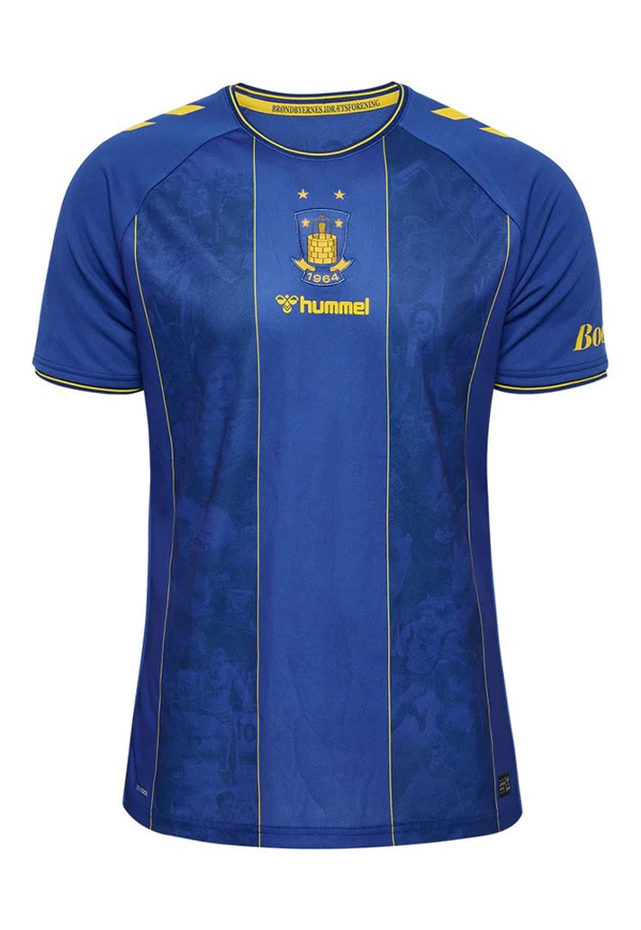
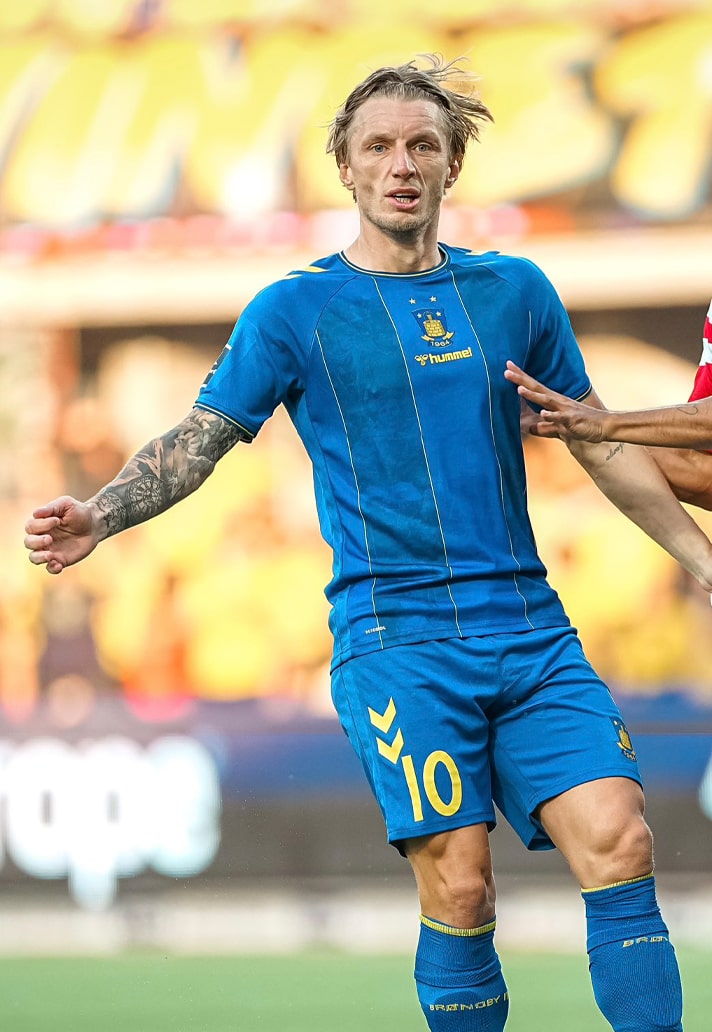
Brondby Away
There's a number of sponsor-less shirts on this list, and it just serves to accentuate many of the already clean aesthetics that we harped on about in our intro. Case in point: Brondby's away shirt. Sorted by their compatriots at hummel, the elegant design sees a nice tonal blue base with subtle stripes and yellow accents. Add a nice sublimated graphic in the alternating stripes and you've got a winner.
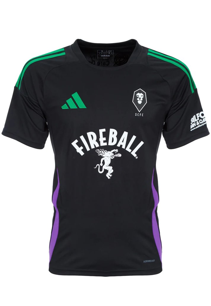
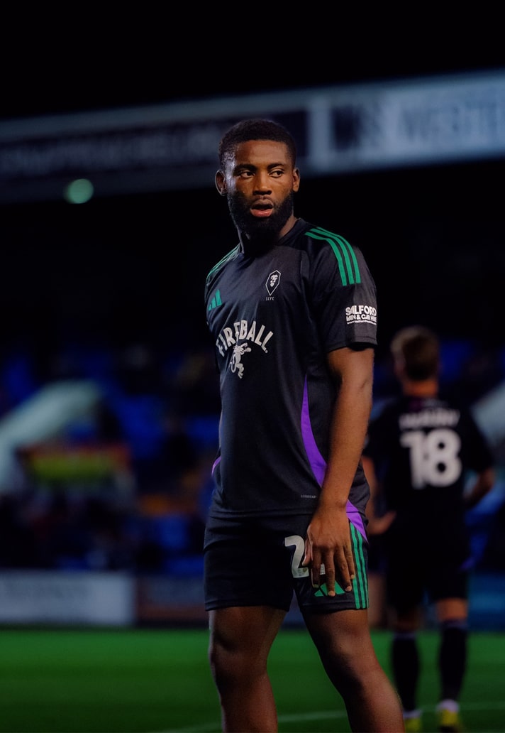
Salford City Away
A lot of the focus for Salford City may well be on their famous ownership group, but they deserve some attention for the simplicity of their away shirt design from adidas this season. The black base is joined by simple green and purple accents, in a nod to Emmeline Pankhurst, the leading British women's rights activist who led the suffrage movement, (the colours taken from the Suffragette movement, lending the design a deeper meaning).
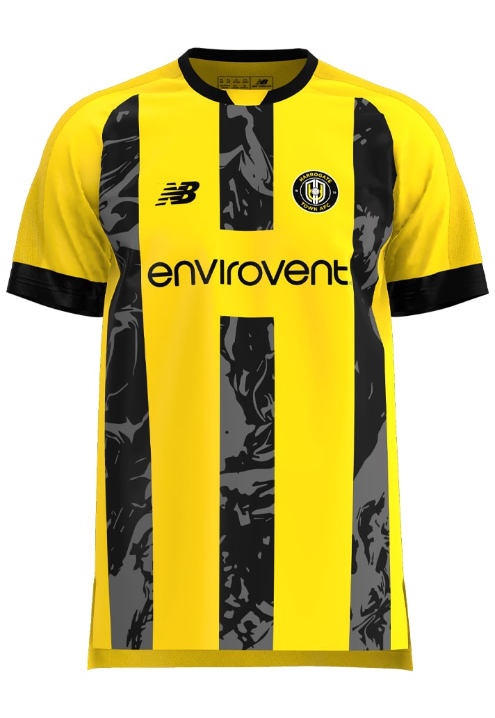
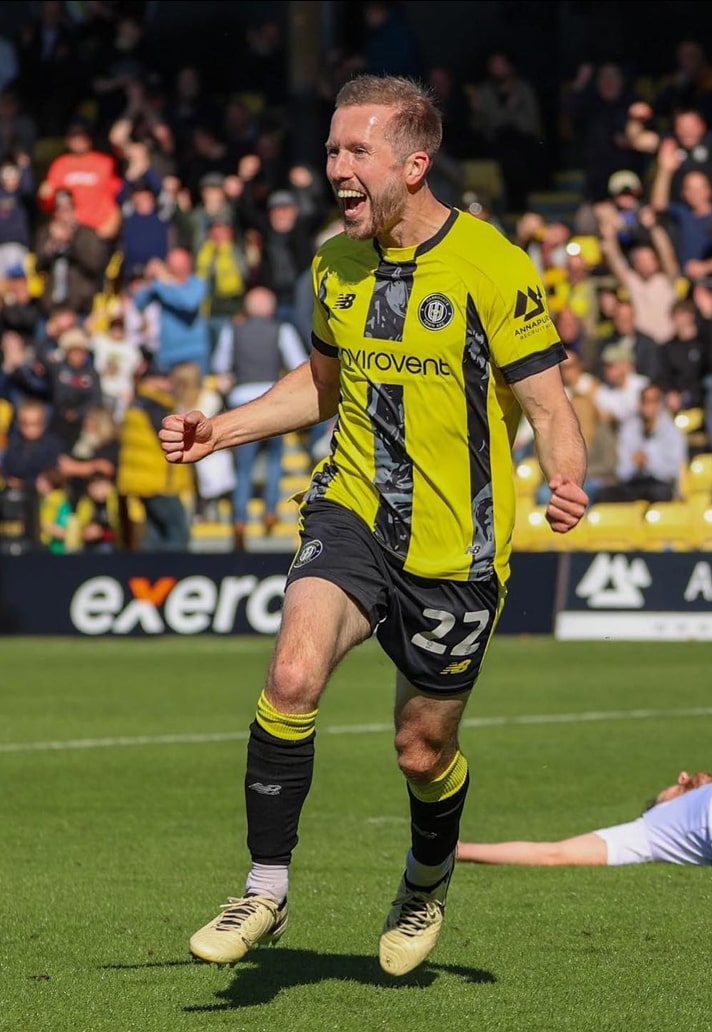
Harrogate Town Home
EFL League Two side Harrogate Town get some bespoke treatment that caught the eye from New Balance, with their home shirt design. It features a yellow base, overlaid by black-and-grey visually textured stripes, elevating your run-of-the-mill striped effort.
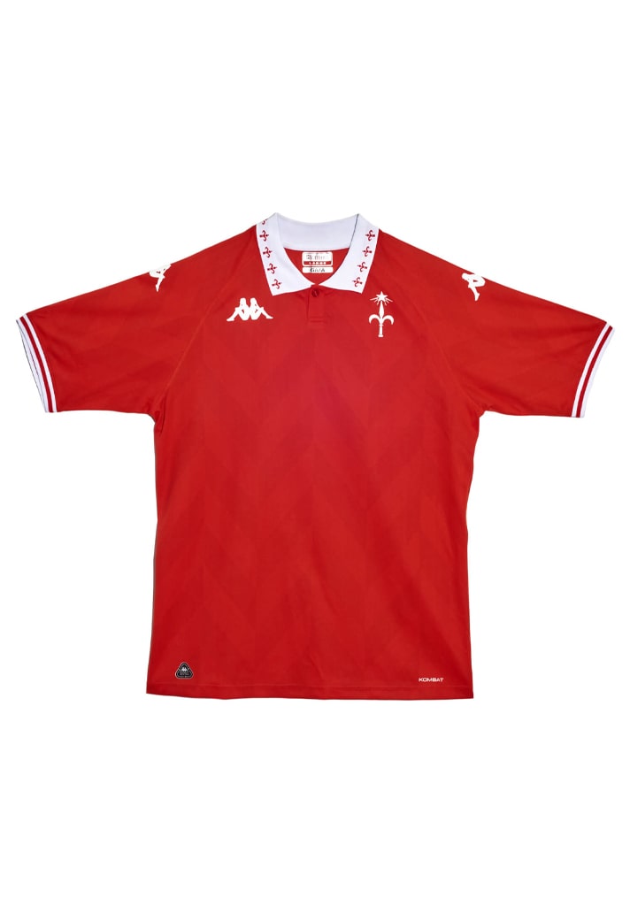
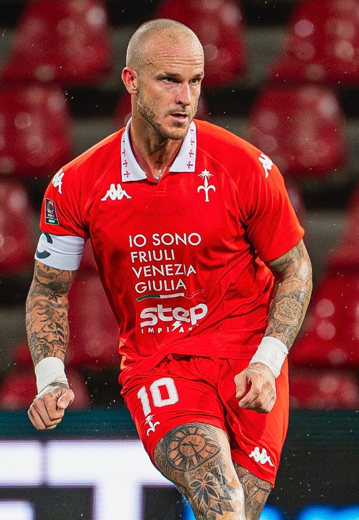
U.S Triestina Calcio Home
You can always rely on Kappa to drop some absolute gems, and Serie C side Triestina Calcio are one of the beneficiaries. Could easily have featured their away kit as well, but settled for the home shirt on the merit of that beautiful collar execution and the bold red base colour. Sponsor on the player version isn't the best, but doesn't detract from what is a great design.
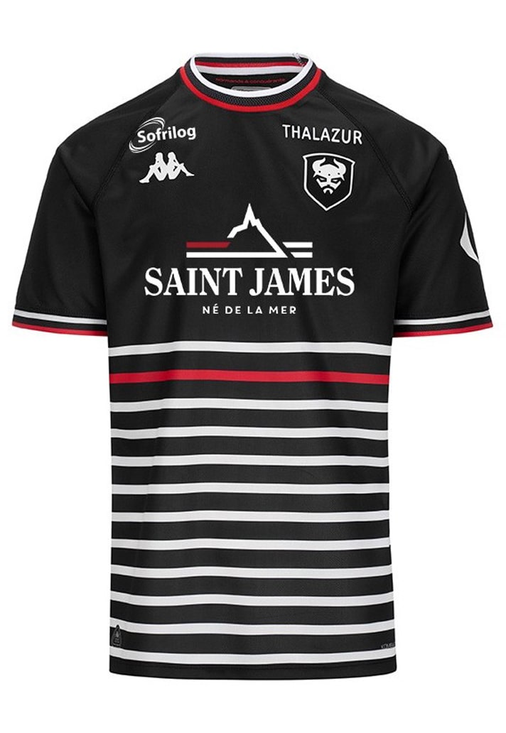
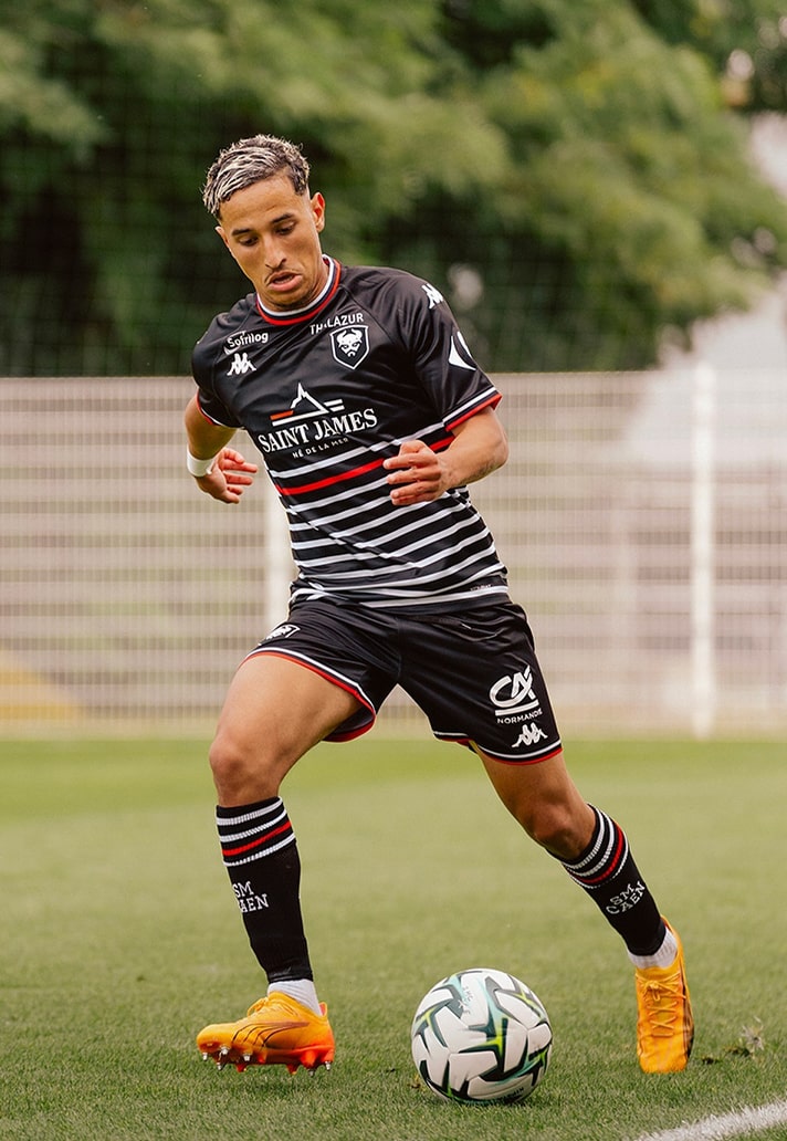
SM Caen Away
Probably the most fashion-forward design on this list, thanks in most part to it being the result of a collaboration with fashion brand Saint James. The design is a modern take on the “marinière” look, with the black base joined by white and red striping in the lower abdomen area.
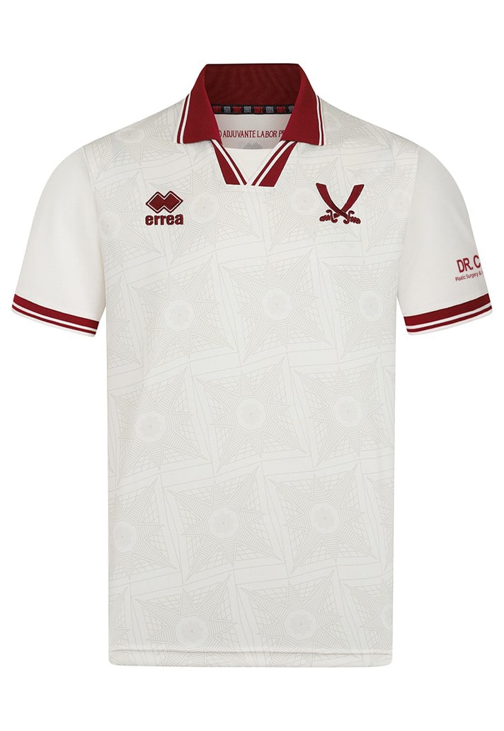
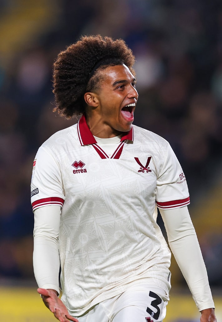
Sheffield United Third
Doesn't get much cleaner than this from Errea. The ivory cream coloured shirt dovetails with a sophisticated maroon trim on the knitted polo collar and sleeves, whilst the subtle pattern within the main body matches the outline of the Lantern Tower ceiling inside Sheffield Cathedral, where the third kit was officially launched. And the whole thing is topped off with that sublime stripped back club crest. Superb.
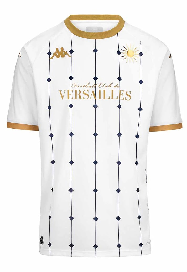
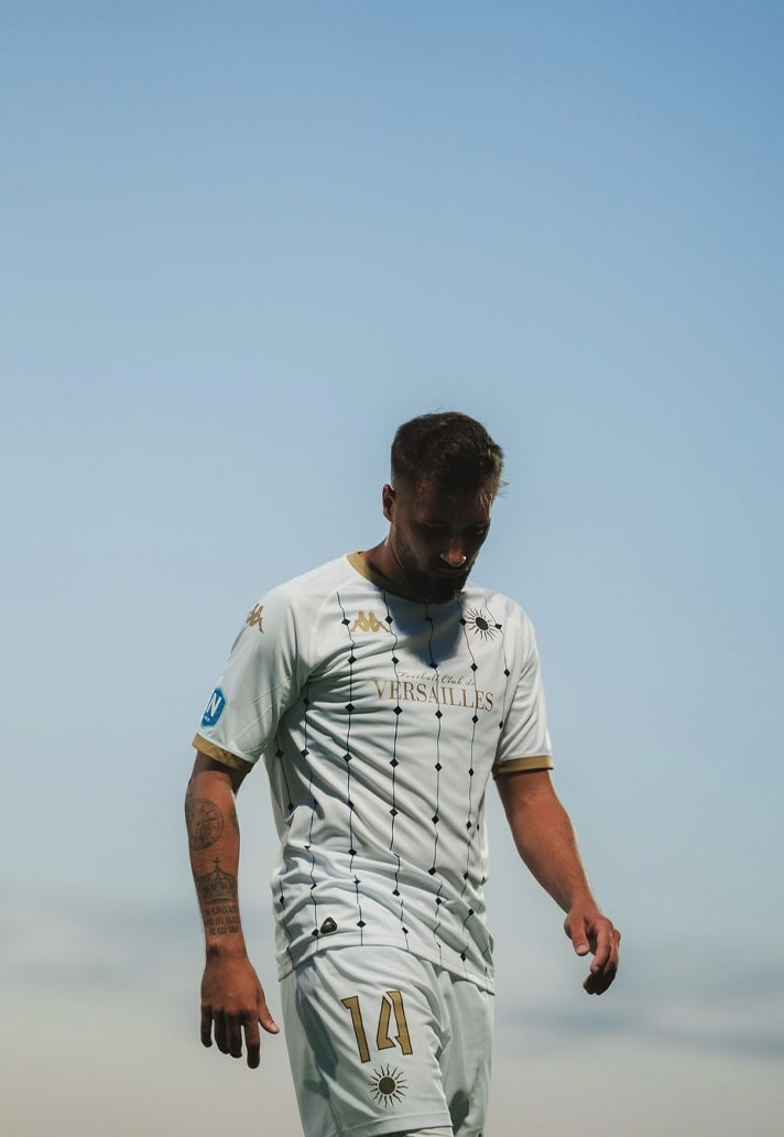
Versailles Away
Another from Kappa, this one did catch some heat upon launch in fairness, but, given they play in the Championnat National, we figured that if you did miss its launch, then you likely aren't seeing it again, and so it earns its place. Another elegant design from Kappa, it lined up alongside an equally beautiful home shirt, although that was a little too close to the Athens Kallithea home shirt from the 22/23 season, and so we went with the away option. It sees a white base overlaid with a geometric grid design based on the beautiful octagonal "Cabochon" tiles that were popular in France during the reign of Louis XV.
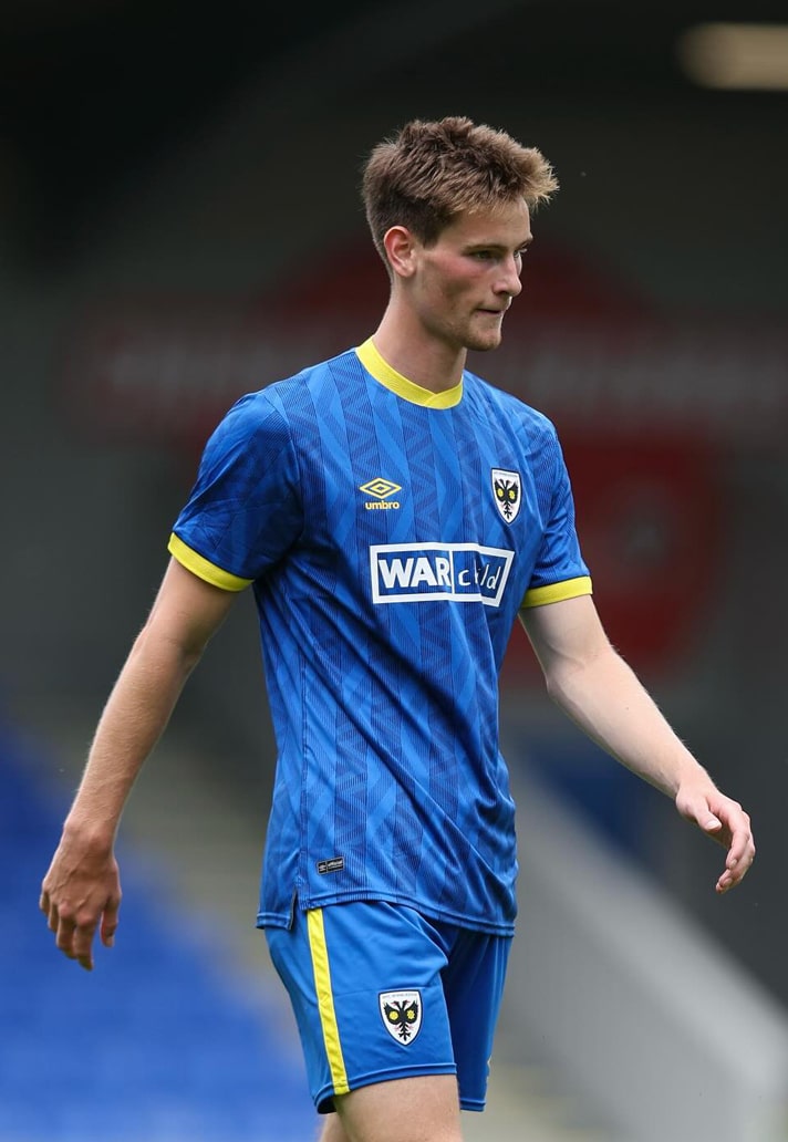
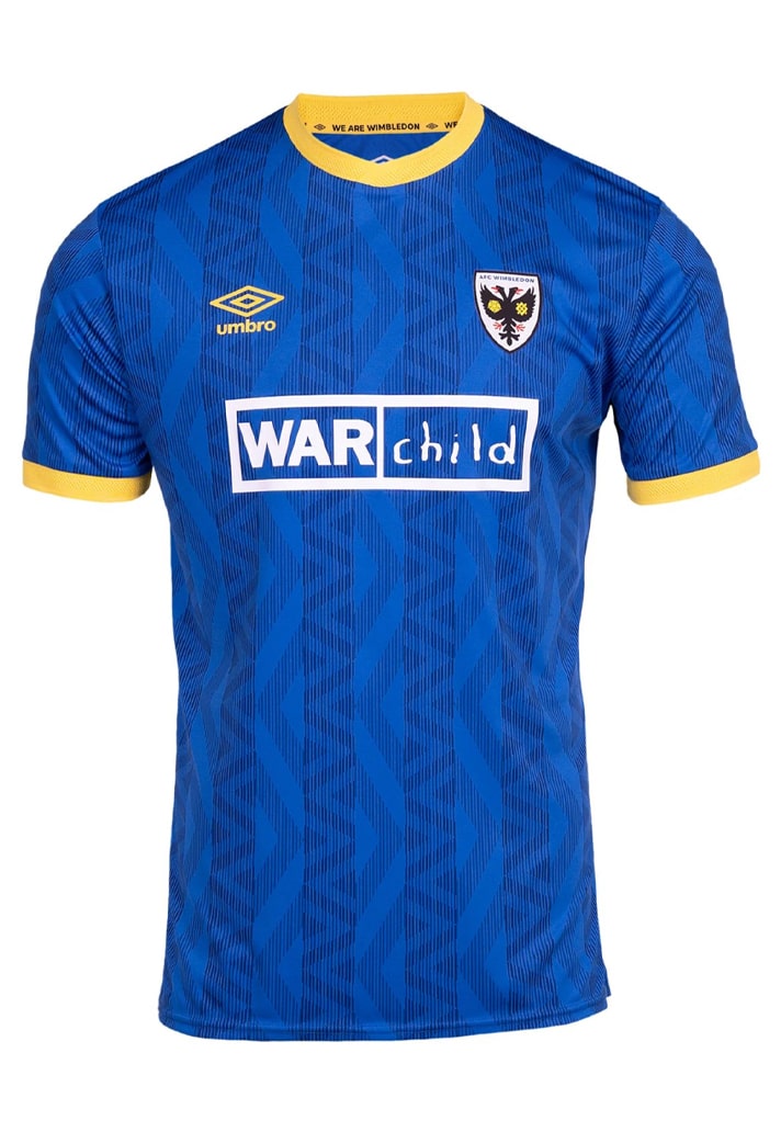
AFC Wimbledon Home
Sometimes a sponsor can diminish a design, ruining an otherwise clean look. But it can also have the opposite effect, and that's the case with Wimbledon's home shirt, which sees main partner Sports Interactive (the manufacturers of Football Manager) handing position to the War Child charity. It sits centrally on a design from Umbro that harks back to original Wimbledon FC’s glory years of the 1980s and 1990s, with vertical tonal stripes featuring alternating diamond and wavy sublimated graphics, topped off with yellow crew neck and matching cuffs. Absolutely one to get in long sleeve if you can.
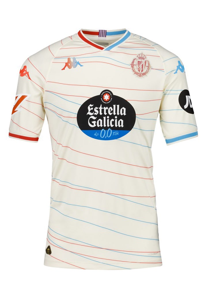
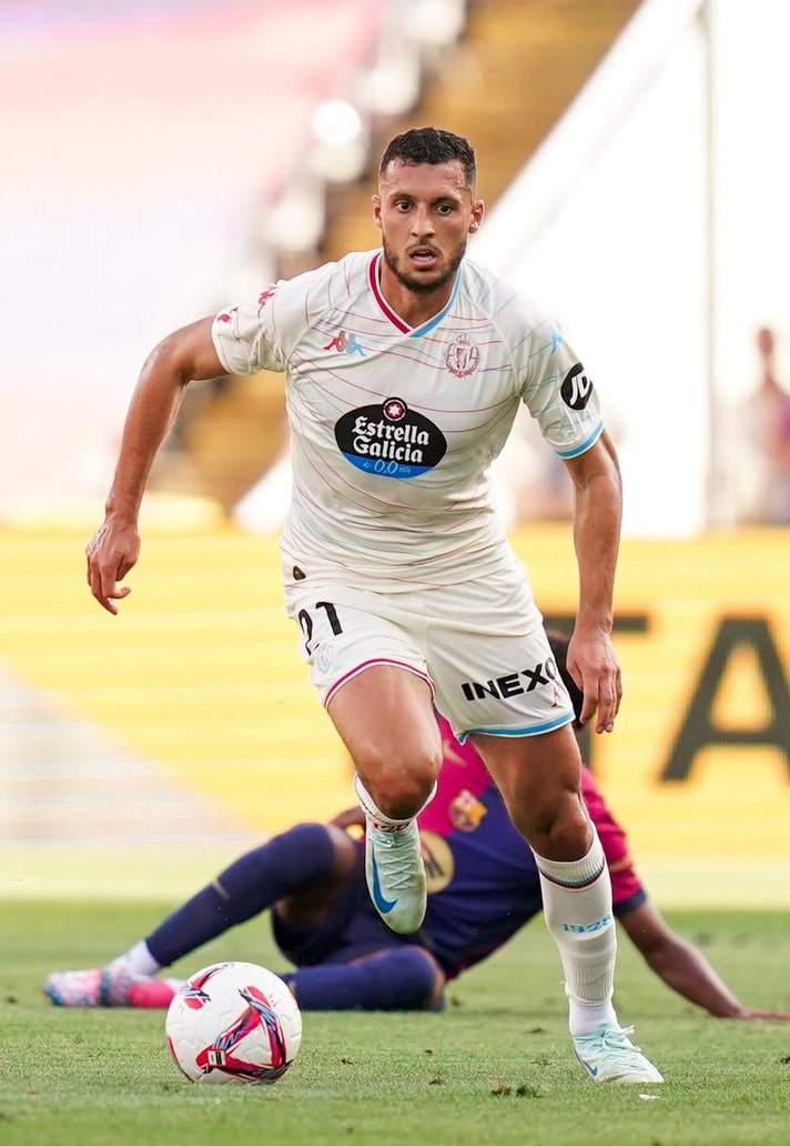
Valladolid Away
We've always found the Estrella sponsor a little jarring on the otherwise tidy Valladolid designs from Kappa, but here it sits on a predominantly off-white base with a pattern of thin horizontal blue and red stripes, and it works. Red works the right side of the jersey, fading to blue on the left – a split that is most apparent on the collar and cuffs. It's different, and we applaud it for that.
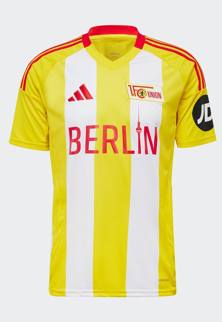
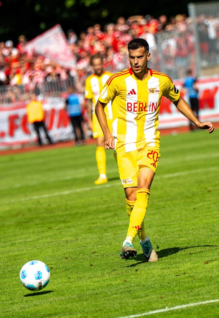
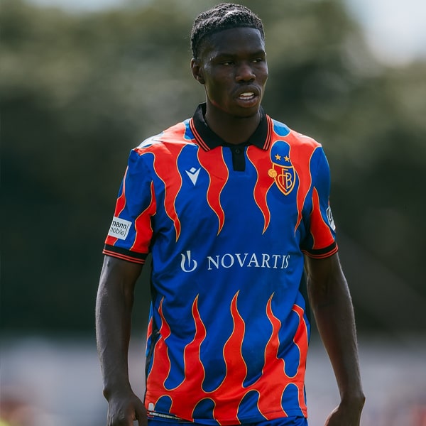
Union Berlin Third
The beauty of the Union Berlin third shirt design from adidas is in the bold brashness of the colour selection (inspired by the yellow trams, buses and underground trains of Berlin). Combine that with the "Berlin" wording in the sponsor slot (a feature on all of the club's jersey designs for the season) and it's a visual treat.
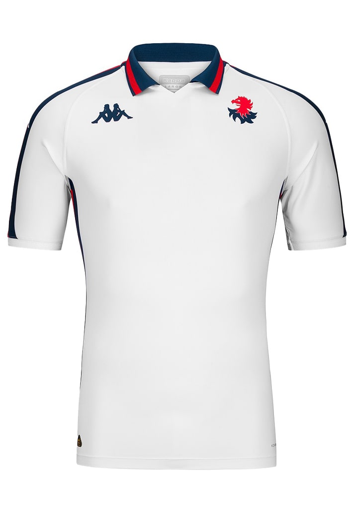
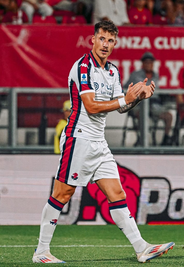
Genoa Away
One of the bigger clubs to make this list, and at first glance at the lay down of this shirt you may be forgiven for thinking it's just a plain white shirt. But the beauty of this one comes when viewing from angles, when the club's traditional blue and red colours – used here as accents – come in to play. Couple that with the collar, and it's well deserving of its place on any 'best' shirt design list.
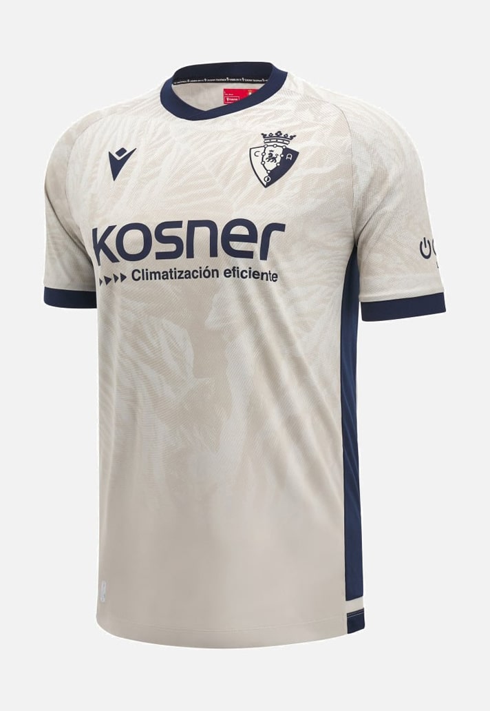
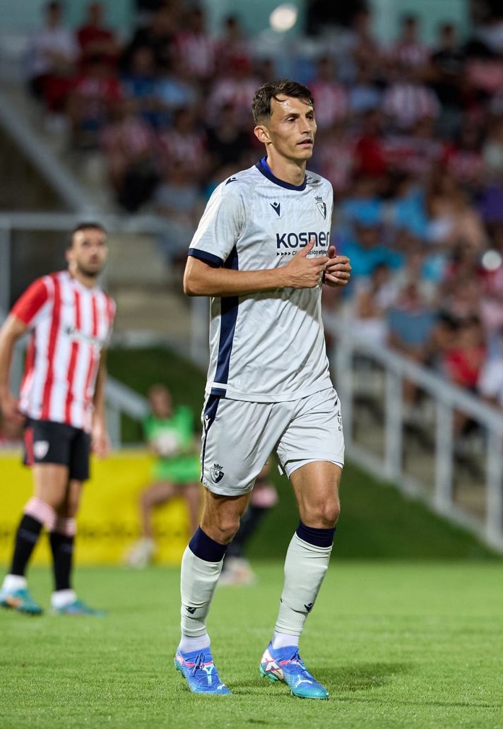
Osasuna Away
Macron and Osasuna earn their place on this list with a design inspired by the Las Bardenas desert surface. It’s represented in a tonal graphic of embossed ridges and ravines that run through upper of the sand-grey based jersey, topped off with navy accents in the collar, cuffs and side panels. You may not see the detail from afar, but close up this is a rival to any shirt on this list.
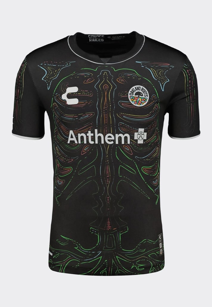
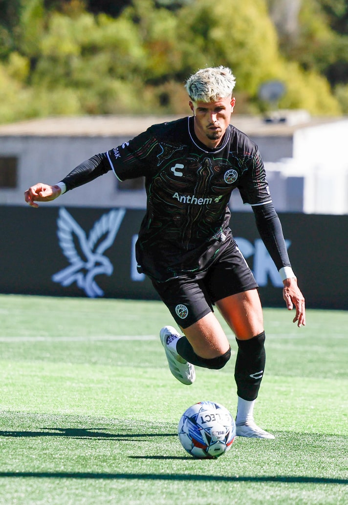
Oakland Roots Third
In Celebration Of Hispanic Heritage Month, Oakland Roots revealed their limited edition 24/25 third shirt from CHARLY quite recently, and it sees a unique skeletal graphic on the front and a roots graphic on the rear, both symbolising the deep connection the club has to the local community. You ain't seeing anything like this in the Premier League at present, thats for sure.
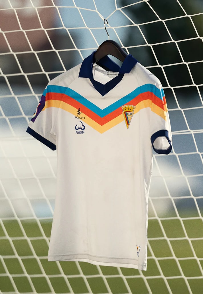
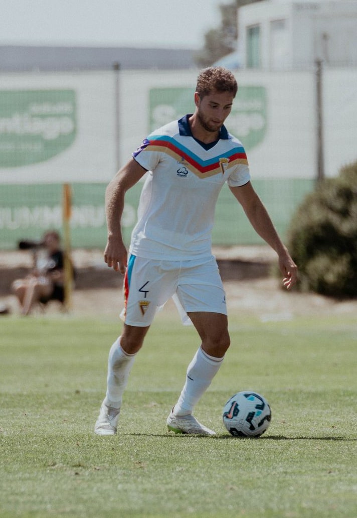
Atlético Clube De Portugal Away
Following promotion to Liga 3 for the first time in their history in 2022-23, Lisbon-based Atlético CP now deserve some serious attention thanks to their 1970s-inspired throwback away jersey from Portuguese brand, Lacatoni. It features a dark blue V-neck and shirt collar above a clean white base, the look elevated thanks to the absence of a sponsor. But the pièce de résistance is the multicoloured chevron that runs all the way across the chest and shoulders, mirroring the bands of red, blue and yellow found on the triangular club crest.
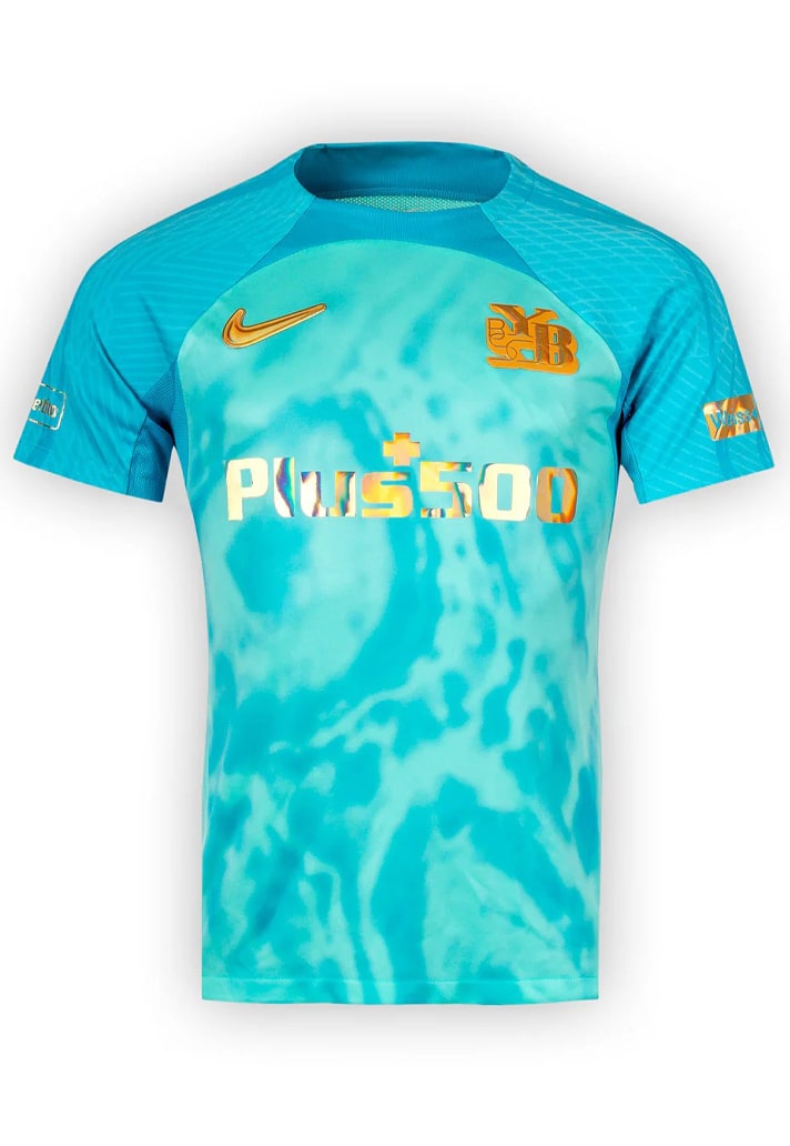
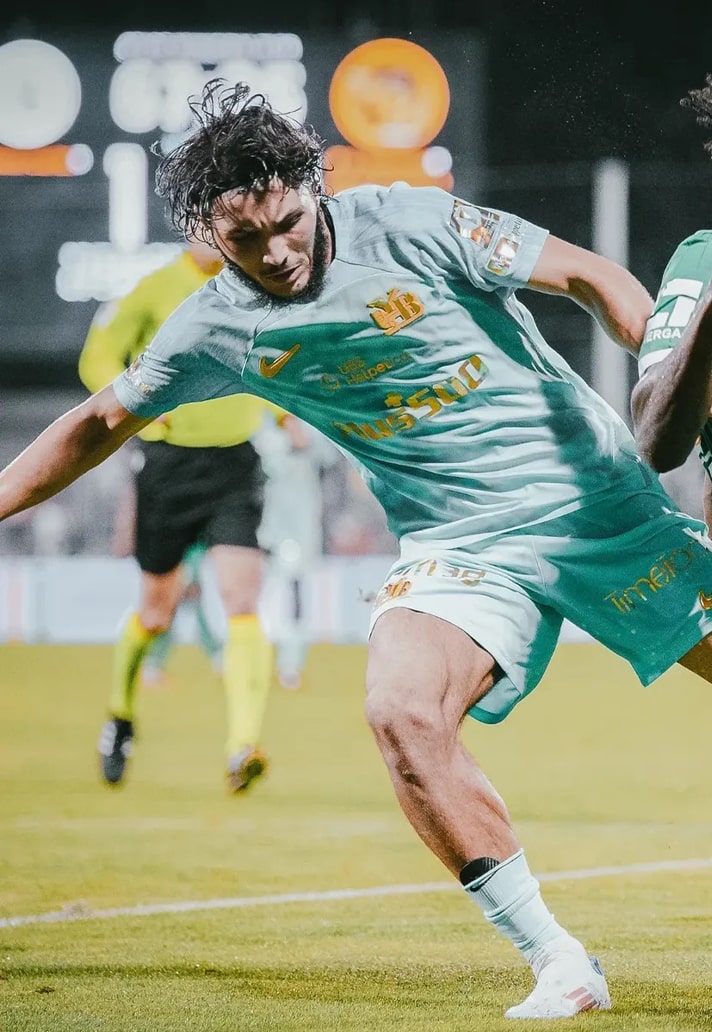
BSC Young Boys Third
Designed by the renowned studio Bureau Borsche, and limited to just 1898 shirts, the BSC Young Boys third shirt from Nike is likely to be one of the best on show in this season's Champions League. The design is a tribute to the clear waters of the River Aare, the pulsating lifeline of Bern, and it sees a bright aquamarine base with a rippled effect, with the shimmering gold logos supposed to replicate the effect of light bouncing off the surface.
Shop 24/25 replica at prodirectsport.com/soccer